All that glitters: lighting tips to brighten your home

Wrenda Goodwyn • special to the Fort Myers News-Press/USA Today Network • Sept. 4, 2021

Lighting is a lot like jewelry. It can be the final piece that that you put into your decorating plan. Or you can take a fantastic lighting fixture and build an entire room around it.

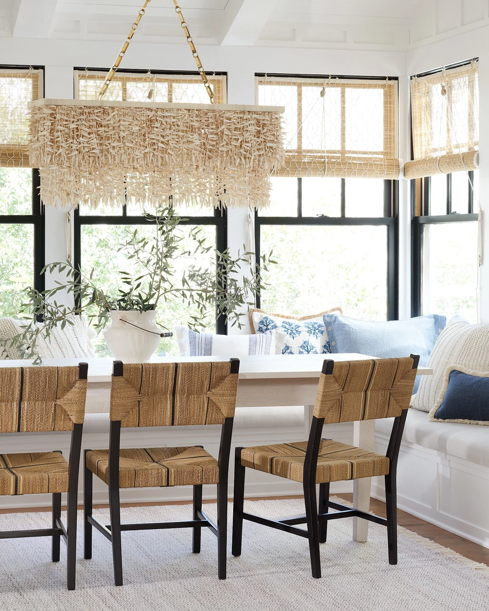
Beachy, glam statement piece Biscayne chandelier over white dining table with natural chairs, blue white throw pillows, and big windows for natural light.

A beachy, glam statement piece for a dining room or entry, this Biscayne chandelier from Serena & Lily is a mix of brass and coco shells. Made by hand, it features two tiers of cascading coco slivers, crowned with slender abaca and finished with an elegant brass chain. Photo: Serena & Lily.

Books have been written about lighting in the home and I promise I will not write one here. Just a few suggestions.

We all know that really great design is in the details. Lighting is one of those details that is many times overlooked and often is the last item in the budget. As a Southwest Florida interior decorator I see far too many beautiful homes where lighting is an afterthought and builder grade lighting has not been updated. Here’s a little secret: you don’t have to spend a fortune to make it look spectacular. There are lots of options in all price ranges.

Lighting is especially important in open floor plans where it can be difficult to light dark corners. You need two things before you start randomly making purchases: think strategically about the entire home and have a plan.

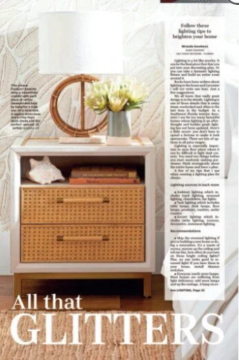
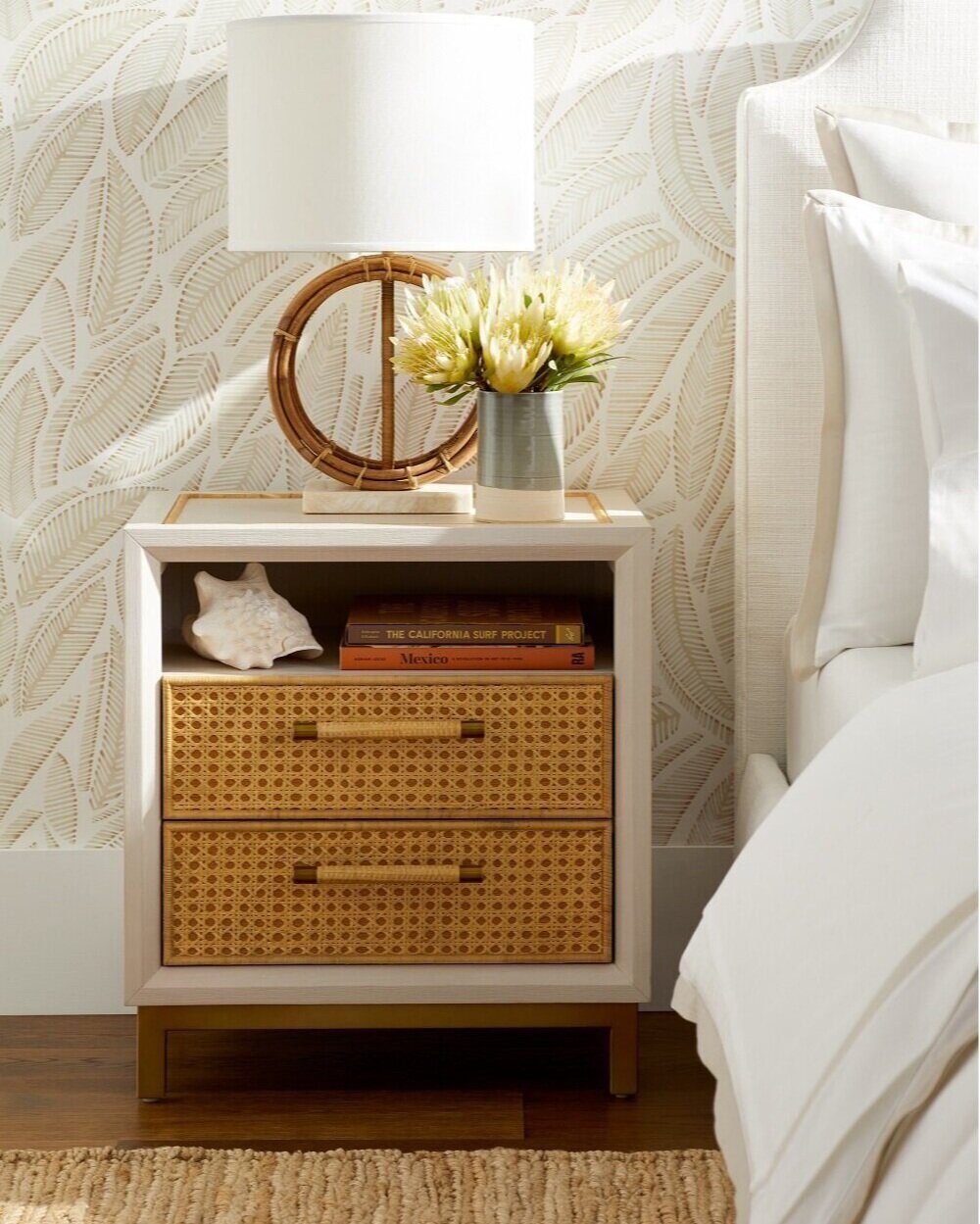
This unique Freeport bedside lamp is beautifully crafted with each piece of rattan steamed and bent by hand for a truly one-of-a-kind look. A square stone base and a crisp linen drum shade add the perfect amount of polish. Photo: Serena & Lily.

This unique Freeport bedside lamp is beautifully crafted with each piece of rattan steamed and bent by hand for a truly one-of-a-kind look. A square stone base and a crisp linen drum shade add the perfect amount of polish. Photo: Serena & Lily.

A few of my tips that I use when creating a lighting plan for clients:

Lighting sources in each room

• Ambient lighting which includes track lighting, recessed lighting, chandeliers, fan lights.

• Task lighting which includes table lamps, desk lamps, floor lamps, pendants, vanities, under counter.

• Accent lighting which includes niche lighting, sconces, decorative, statement lighting.

Recommendations

• Skip the recessed lighting if you’re building a new home or doing a renovation. It’s a waste of money, messes up the ceiling and tell me this, how often do you turn on those bright ceiling lights? Plus, no one looks good in recessed light! If you have them in your home, install dimmer switches.

• Everyone needs more lamps. Most homes are suffering from light deficiency: add more lamps and up the wattage. A lamp on every table is a good rule of thumb.

• Gourd lamps in lots of colors are good for living rooms; a mini accent lamp on the kitchen counter, laundry room, bathroom.

Simple and striking, the Cornwall sconces add a touch of elegance with an elongated brass finial. Photo: Serena & Lily.

Simple and striking, the Cornwall sconces add a touch of elegance with an elongated brass finial. Photo: Serena & Lily.

• The eyes love pairs so make sure you have some pairs instead of a collection of mismatched lamps. It makes a huge difference. Think about your favorite hotel room: two lamps by the bed, two lamps on the dresser/desk and a standing lamp in the dark corner. Remember: less is more. Not too many styles.

• If you have a home with high ceilings throughout, hire a lighting designer to get it just right and avoid shadows.

• Select your largest lights first. Pendants over the island/bar area, chandeliers, entry lighting.

• Hang dining or eat-in area chandeliers/large lighting between 30 and 36 inches above the top of the table. This range assumes you have an 8-foot ceiling. If the ceiling is higher, the recommended standard is to raise the chandelier 3 inches for each additional foot of ceiling height. For example, if your ceiling is 10-feet-high, you might hang your chandelier 6 inches higher than you would in a room with an 8-foot ceiling. This guideline is generally the same for hanging pendants over a kitchen island or bar.

All that glitters: chandeliers

They are romantic and sexy. The right one with the perfect dimmer switch setting makes anyone look beautiful. They are dazzling and add style and a touch of refined culture to a space. They go anywhere in the home, including bathrooms, closets, a walk in pantry. I have even seen one in a laundry room. You can spend a little or you can spend thousands.

Chandeliers are an accessory that can make an entry or dining room. It does what the perfect necklace does for an outfit. In southwest Florida, many homes sacrifice chandeliers for ceiling fans but I find that women are most likely willing to say goodbye to a fan to add a beautiful, sparkly chandelier.

Wrenda Goodwyn is a Southwest Florida interior decorator, A.S.I.D. associate and gold member of the Interior Redecorators Network. She helps homeowners throughout Southwest Florida with timeless, affordable ways to create beautiful spaces and solves decorating problems. Her articles appear the first Saturday of each month. For more information, visit her website at spectacularspaces.com. Call her at 239-850-5800 or e-mail wrenda@spectacularspaces.com. For more decorating tips, articles and photos, visit spectacularspaces.com/blog

Clipping from September 4, 2021 article in Fort Myers News Press about improving home lighting with bright fresh bedroom photo.


Quick Decorating Tips for a Happy Home (some are free!)

Wrenda Goodwyn • special to the Fort Myers News-Press •June 4, 2016

Try something new with color with this perky blue and green setting with a large-scale graphic pattern (Midland) that has a leaf-like motif and gives a nod to old Federal style wallpaper. The wallcovering shown here is Troy, a small-scale texture with characteristics of a basket-weave. Photo credit: Courtesy of Thibaut.www.thibautdesign.com 

There are a few things that really drive decorators and designers crazy. But the good news: the minute we walk into your house, we can spot them and help you correct them quickly. Today, I am sharing my short list with you and guess what? Many of these can be corrected before you finish reading this article and you don’t even have to get in your car to drive up and down 41 looking for more “stuff” to bring into your house! 

So, if you’re happy with your home sweet home but it doesn’t seem quite right, read on and maybe the one little tweak that you need is listed below. 

Be realistic about a budget.

I've never been into a client’s home that I couldn’t improve.  As a Southwest Florida interior decorator, I have seen it all. Realistic budget. No budget. Tiny budget. I base my decorating on affordable solutions for home décor and I’ve had lots of practice of making a home look great without wrecking your finances. 

It’s important to keep in mind that reality home shows are not a home interior professional’s friend. They give the impression that a designing couple can breeze through your home, redo it from the inside to the outside, all for a song. Quick, beautiful, cheap, fast. It’s just not so and what they do not include are the behind the scene costs and a realistic, honest budget. 

Pretty painted chest set against the backdrop of Thibaut’s Portofino wall covering. These large, stylized, flowers and other fun details make this a striking accent wall. The wallpaper is rotary screen printed, which uses a lot of ink to make the flowers slightly textured. Photo credit: Courtesy of Thibaut.  www.thibautdesign.com

So having said that, whatever your budget, be realistic and honest with yourself. A lot of my tips below are free or require little $$. Others may be something to work toward (phase two, as I say!). The more realistic you are, the happier you will be with your home. 

No plan? Then it doesn’t matter where you are going.

Now that you have a budget nailed down, take some time to get your thoughts organized and develop a plan. This is key to a happy outcome. What are the priorities? What can you do without spending a lot? Do you need a total redo or will a good design plan help to sort out where to begin? Do you need the professional help of a designer or can you do it yourself with a plan? No plan? The result will be a house filled with rooms that all have a different look. 

Please: Say goodbye to these. Now.

Refrigerator magnets. Fake flowers. A lot of junk on top of kitchen cabinets. Enough said about this. 

Pull furniture away from the walls.

Get rid of the uncomfortable conversation area and create some space. A U-shaped arrangement is best.  Sofa and two chairs or two sofas.  We realize the sized of the space dictates placement. Give it a fresh look. 

Declutter. Declutter. Declutter.

I know, I talk about this all the time. But you have to do it over and over. Things have a way of accumulating when you aren’t looking. And without this key element, you may as well not try to make a change. You will just be rearranging the clutter. 

Create a palette: don’t just throw color around.

If you get the color palette right, everything else falls into place. This is my most popular service and the one that homeowners have the most difficulty establishing. And here’s why: it’s not all about putting paint on the wall. It is about creating a color scheme for the entire home and carrying the color throughout in fabric, accessories, window treatments, pillows, etc. This is definitely the tricky part of decorating. The fun part and the most important after your budget and your plan.  So spend some time on this one.   

Decorating: it’s all about you.

It’s not about your neighbors, your relatives who come to visit each year, your bridge club or a friend who has a daughter who is a decorator in another state. We hear these sources of input all the time! Filter out the noise and keep in mind this is your home and your opinion is the only one that counts. 

Curate your own art gallery.

Take a fresh look at your art work. I like to select a space on a wall and make it look like a museum gallery. Place everything on the floor. With painter’s tape, mark off the area you wish to cover on the wall. The best height for your key pieces: eye level. This is usually 57-58 inches from the floor. Once you have the arrangement, you are ready to create your gallery. 

Paint your entry door on both sides.

If you don’t have the time or budget for anything else, give your home a lift and do this one. And here is a tip: paint both sides of the door for a professional design look. My advice: if you love a color but are afraid that it just will not work in your home, use it on the door. 

Don’t fear wall coverings!

For a long time, we focused on paint and textures for walls. It seems that wallpaper (as it was called) went by the wayside. But it’s back and it’s fabulous. Textures, sheens, feathers. Take a fresh look and at least try it for a powder room or an accent wall. 

Don’t love it? Paint it or pass it on.

Have an antique that you no longer love? Like an armoire or chest? Paint it! What good is it if you no longer want it in your home? Our tastes all change and color can change everything. Otherwise, pass it on and let someone else love it. 

Think about white.

It looks beautiful in magazines. White walls. White sofas and chairs. Gorgeous and carefully styled. Do you have the lifestyle for all white? Will you be able to accent with beautiful artwork and accessories to carry it off? If the answer is yes, go for it! If not, rethink this commitment. 

Come into the light!

We can never have enough and right now your home is likely lacking in this area. Because all of us seem to overlook this important element in our homes.  Check all four corners of your rooms for proper lighting. Remember: we need overhead, task and ambient lighting. Make sure you use dimmers and if this is not possible, plugin adapters work fine.  Chandeliers, floor lamps, mirrors and glass doors also reflect light. 

Decorative painting. Ugh.

This was a trend that has (thankfully) passed on. I am not speaking of the beautiful treatments for recessed ceilings. Rather the unfortunate fad of things like sponge painting, globing things like wadded up paper on the wall, stenciling and other horrors. When it comes to wall treatments: a good quality paint in a beautiful color and finish or the most outrageous wall covering you can afford on an accent wall. 

Say goodbye to your unicorn collection.

We all have collections that made sense at one time. But time is the problem. It may be time to say goodbye. If it’s not a priceless collection or one that you absolutely love, it may have outlived its value. So when you are doing your decluttering, you may want to say goodbye and let someone else love it. 


Wrenda Goodwyn is a Southwest Florida interior decorator, A.S.I.D. associate and certified gold member of the Interior Redecorators Network. Her @home article appears the first Saturday of each month. Visit her website at spectacularspaces.com. Call her at 949-1808 or e-mail wrenda@spectacularspaces.com. For more decorating tips and photos, visit spectacularspaces.com/blog
 

Home sweet rental home: Make it yours and keep the landlord happy

Wrenda Goodwyn • special to the Fort Myers News-Press • April 9, 2016

Colorful adhesive tiles from Mirth for an entry, bathroom or kitchen.  Photo  Courtesy of Mirth.

Renting. It's a lot like moving into a home that you own. Almost.

You want to repaint the walls. Replace the carpeting.  Hang some artwork.  Update the kitchen. Get new window treatments. Toss out the grungy switch plates. And a lot more.

In other words: you want and need to make the space your own.

But there is the landlord to think about.

Changing drawer and cabinet pulls to personalize your rental decor. Photo courtesy of Anthropologie.

Changing drawer and cabinet pulls to personalize your rental decor. Photo courtesy of Anthropologie.

Maybe you have sold a home and have temporarily moved into a rental space until you decide what to do with the rest of your home-owning life.  Perhaps you are a boomer and plan to free yourself of the responsibility, throw caution to the wind and travel for the rest of your life and keep a rental apartment as a place to come home to. As a Southwest Florida interior decorator,  I've had clients in both rental situations. And many more.

Eventually, we all seem to end up in a rental home for the long or short term.  And the fine line between making it your own and crossing over to where the landlord decides not to give you the deposit back when you leave...well the lines can be a bit blurry.

Before you paint that red accent wall in the entry, you may want to consider a few rental-friendly tips that will have you saying "home sweet home" in no time. And even if you never plan to rent, these tips will serve you well if you are in a temporary situation or just don't have the budget to do everything right now.

It's only paint

It an accent wall or a bathroom with color on the walls will make you happy, do it. Just be prepared to paint it back in a neutral tone when you leave. This alone, can make all the difference in how you feel about your rental space.

Accents

Drawer and cabinet pulls will change your kitchen and bathrooms. Replace them with something that you like and take them with you when you leave. And while you are at it, dump the old switch plates and replace them with new ones. Favorite: the colorful Nannette pull from Anthropologie. 

Change the flooring (some of it).

Peel and stick floor tiles have been around for a while but today, you can find a selection that is colorful and fun. And easy to apply. Sources: Mirth Studio and Home Depot. Try this in an entry, bathroom or kitchen to completely change the look.

Pottery Barn's Lucianna Medallion pole pocket drape  is a great "fix" to add your own look to windows or sliders. Photo courtesy of Pottery Barn.

Window treatments

These are often the worst part of what a landlord leaves for tenants. At best, you may have not so attractive blinds. But this is where you can put some fabric and color into your decor. Invest in some drapes. Or at least drapery panels to give your rooms a little love. One of my favorite, inexpensive go to sources:  the Moorish tiles drapes at Pier One. Or the Lucianna medallion-pole-pocket-drape from Pottery Barn. They come in a variety of colors and great for a temporary fix.

Kitchen backsplash

For a tile look, Tic Tac adhesive tiles. Photo courtesy of Tic Tac Tiles.

This is one of my favorite fixes. Since I always spec a neutral backsplash for my clients when redoing their kitchen, I love the fact that you can do the same thing with Tic Tac adhesive tiles or the Smart Tiles from Home Depot. Completely change the look of your kitchen and remove them when you leave.

You won't believe it's removable wallpaper

ReUsable wallpaper tiles by Hygge and West are removable so you can take them when you leave your rental or enjoy them for a long time. Photo courtesy of Hygge  and West.

You would be surprised to know how many of my clients use this in part-time homes or if they just aren't sure about using wallpaper. And the result: spectacular. You can find these in Target, Bed, Bath and Beyond and other big box home stores. They vary in quantity and in price depending upon how much you want to invest.  My favorite is Hygge and West.  These removable wallpaper tiles can go with you and are reusable. And you will want to reuse them. Beautiful colors and designs that are ideal for renters and temporary installations. A game- changer for a rental property.

Lighting

Overhead lighting may not be the best in your rental home. So invest in a few floor lamps that warm up your rooms. And they will go with you to your next home. If the builder's grade lighting in the bathroom is not working for you, try a lamp on the counter to tone down the glare. Or invest in inexpensive lighting over your mirror.


Wrenda Goodwyn is a Southwest Florida interior decorator, A.S.I.D. associate and certified gold member of the Interior Redecorators Network. Home Inspirations appears the first Saturday of each month. Visit her website at spectacularspaces.com. Call her at 949-1808 or e-mail wrenda@spectacularspaces.com. For more decorating tips and photos, visit spectacularspaces.com/blog
 

Home resolutions (easy) to make you love your space (a lot)

Wrenda Goodwyn • special to the Fort Myers News-Press• January 3, 2015

Stage your coffee table and make it the focal point of the room. Photo: Pottery Barn.

The houseguests have departed. The decorations are packed up (well, most of them). Home sweet home may be looking a little sad without the twinkly lights.  And while it's nice to have all of the space back, it may be looking a little drab. Maybe time for a refreshening. Not a total redo. A few tweaks for positive changes that make you feel good about your home.

Stage a coffee table and make it the focal point of the room. Photo: Pottery Barn.

Welcome 2015! Each year, I forgo the impossible, guilt inducing resolutions that are broken before my Christmas tree is picked up by the recycling truck. Instead, I come up with a list of resolutions for the home.

As a Fort Myers interior decorator, I help my clients make major changes in their homes with new color choices. Giving old furnishings a new look with beautiful upholstery. Purchasing a new accent piece or rug. Changing accessories, artwork, lighting.  Giving an outdated bathroom a spa look. Deciding if now is the time for a room renovation.  Pick just one of these for your home interior resolution in 2015 and you will have a major change.

Design a gallery wall for your entry. Photo: Pottery Barn.

My resolutions are designed to be stress-free. Isn't that what we want for the New Year? Some you can do when you finish reading this column. Others will require a little thinking and planning. Whatever you select, happy decorating. I wish you a spectacular home in 2015!

•    Love everything in your home. If not, get rid of it. Open the space for something new. Just because you have had it forever doesn't mean it is still working for you. Donate it and let someone else love it.

•    Declutter. The New Year is the time. Be brave. A lot of our "stuff" has past emotional attachments. Let it go and love the extra space and calm that results.

•    Open the windows and breathe. Seriously, those windows do open! Let the toxins out (as well as the holiday smells)  and enjoy the fresh air. In southwest Florida where we run the air conditioning nonstop, this is important. Do it now!

•    Make your outdoor space more livable. Whether it is a tiny balcony or a spacious lanai with a pool, make it part of your living space. Furniture, lighting, artwork, a rug to pull it all together. Increases your space and gives you a reason to enjoy the outdoors this time of year.

•    Be realistic and don't believe everything you see on TV. If you have worked endlessly on your home and have everything you want but something is still not quite right, it may be time to call in a professional to help you rethink your space. The home shows are just that: shows. They make it look easy and inexpensive.  It's neither. Remember this is television and what looks great may not always be practical in real life.

•    Bring some new color into your home. Whether it's a new palette for the walls or a new color scheme for accessories, this is the most impactful change you can make. Visually and emotionally, it changes everything.  And for the money, it's the best value.

Add new color and give an old piece a new look for 2015. Photo: Kravet.

•    Exercise restraint. Before you blast out the door to start making purchases, stop and make a plan. Think about how you want your home to feel and what you can do to get there. Avoid mistakes.

•    Check out your lighting. One of the biggest mistakes I see in homes is lack of or incorrect lighting. And this is relatively easy to fix. We need task (work), ambient (overall) and accent (on a particular object or part of the room). Sometimes all you need to do is increase the light bulb strength!

•    Add a gallery wall. Pull your artwork or photos together on one wall for a museum or art gallery look. Go with a dark color as a backdrop. Short on space? An entry is a great place to do this.  

•    Stage your coffee table.  You likely have everything you need! A pretty tray,  favorite books, accessories, flowers. Gorgeous!

•    Tidy up the laundry room. Paint it a color that you love but are afraid to use in any otter room. Add a piece of art. Reorganize and declutter. You may enjoy doing the laundry!

•    Always go for timeless over trendy. Will you love it in five years? Buy it. And buy the best you can afford with major items like your sofa.

Wrenda Goodwyn is a Southwest Florida interior decorator. Home Inspirations appears the first Saturday of each month. Visit her website at spectacularspaces.com. Call her at 949-1808 or e-mail wrenda@spectacularspaces.com. For more decorating tips and photos, visit spectacularspaces.com/blog

Related posts:

Resolutions for a happy new year

Fill home sweet home with happiness

Design forecast: Fearless, bright, bold and brassy

Wrenda Goodwyn • special to the Fort Myers News-Press• November 8, 2014

 
Mid-century modern dining by Stanley Furniture. Photo: Wrenda Goodwyn

Mid-century modern dining by Stanley Furniture. Photo: Wrenda Goodwyn


At High Point Market in North Carolina, along with 75,000 other buyers and designers from all over the world, I did my best to cover 11.5 million square feet of space that provide dazzling displays of thousands of new products.

This home decor mecca is Disneyland for designers. It takes place for one week each fall and spring. With so much to see that it's easy to find yourself on visual overload. In addition, there are opportunities to meet famous designers, take courses from experts and there are lots of opportunities to meet your favorite television personalities (my design crush: Tom Filicia). There is even a seminar that teaches you how to navigate Market, as it is called, and to make the most out of your time.

 
Lots of creative uses of books. Photo: Wrenda Goodwyn.

Lots of creative uses of books. Photo: Wrenda Goodwyn.


But who has time for that course with all of the spectacular showrooms waiting with beautiful, pretty things. The temptation is to just take the plunge with your to do list. And so I did.

As a Fort Myers interior decorator, this is where I go for design inspiration, to look for new ways of creating beautiful rooms and to shop for my clients who are looking for something new and fresh. Whether it is an eclectic piece to be used as a focal point in a room or for to shop for furnishings and accessories for an entire home.

 
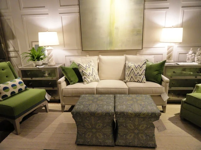
Pretty and popular apple green accents with neutral tones. Photo: Wrenda Goodwyn.

Pretty and popular apple green accents with neutral tones. Photo: Wrenda Goodwyn.


If you can't find it here, it doesn't exist. Not that every showroom can be covered. Despite the miles that I put on my new, sensible walking shoes. So take a trip with me as I offer a peek at a few of the amazing, edgy, stunning new trends that I saw at Market. You will soon be seeing these in your favorite retail spots and magazines.

Trends

The market spotters were predicting "bright, bold and brassy," and that sums it up perfectly. Home design has taken a turn that is not for the faint of heart. Fearless decorating with bright tones and accessories that don't take themselves too seriously.

Brass and gold continue to be very important in home décor----not shiny brass or gold but wonderful antiqued and textured gold as well as brass with a natural patina.

 
Bold and sassy! Photo: Curry & Company.

Bold and sassy! Photo: Curry & Company.


Lighting

The jewelry of interior decorating, lighting is the hottest accessory and it takes center stage in every room. Never has lighting been prettier with more sparkle and bling! The choices are stunning. Think gold.

In the Currey and Company showroom, a showstopper in itself, each piece hanging from the ceiling looked like a sparkling gold bracelet twisted into arty shapes.

 
Orli Chandelier of Wrought Iron finished in Contemporary Gold Leaf. Photo: Currey & Company.

Orli Chandelier of Wrought Iron finished in Contemporary Gold Leaf. Photo: Currey & Company.


Wrought Iron with contemporary gold leaf and brass are popular finishes. And the dazzling La Mer Wall Sconce of wrought iron, shell and glass is a perfect accessory for a sophisticated coastal look that blends beach-inspired design with a traditional or contemporary look.

 
La Mer Wall Sconce. Photo: Currey & Company.

La Mer Wall Sconce. Photo: Currey & Company.


Color

As we said, bold and fearless! Lots of blues including navy, indigo, robins egg.  Red is also trending in sofas and accessories along with corals and pinks. Orange, jade, teals and that beautiful apple green are everywhere.

Furniture

Lots of soft curves that soften the silhouette of a chair or sofa and add visual interest. Canopy beds are trending with a breathtaking, modern new look. Blending antiques with almost any style as an accent piece. Reclaimed/distressed pieces. Driftwood. Lot of gold and brass tables. Table bases and coffee tables have emerged as artwork with sculptured designs. Bar carts are the rage with lots of gold and glass. Ottomans in bold patterns and jewel tones.

 
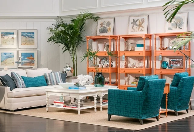
Coastal living retreat. Photo: Stanley Furniture.

Coastal living retreat. Photo: Stanley Furniture.


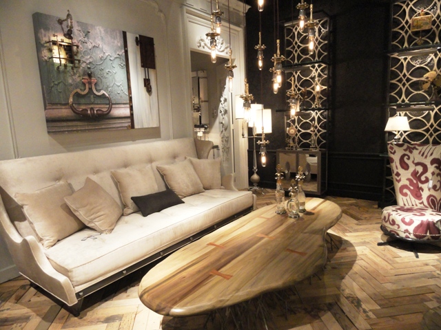
Carved wooden coffee table. Photo: Wrenda Goodwyn.

Carved wooden coffee table. Photo: Wrenda Goodwyn.


And with furniture, it's all about customization. Changing the shape of a leg, an arm or a cushion, even changing the dimensions of a piece to fit a unique space, offers choices like never before to the consumer.

According to Kravet, premiering its new furniture showroom at Market, a lot of designers today are embracing an updated traditional look, which could mean a tufted sofa with a slim track arm, or a comfortable arm chair with sleek details.

 
Kravet Denham Chair. Photo: Kravet.

Kravet Denham Chair. Photo: Kravet.


There is a resurgence of the chaise lounge, and they are popular in today’s interior design schemes. With regard to pattern and color, Kravet embraces a bright bold fabric statement on furniture, however many designers are choosing upholstery that is durable and neutral, which is a great investment for the life of your furniture, and your room.

Brass and bronze occasional tableswere everywhere with some of the most popular at Vanguard Furniture to complement the extensive furniture collection that is popular with southwest Florida homeowners because of its personalization options. And furniture is painted every color imaginable!

Art and accessories

So many fresh, new choices here. Artifact decor is hugely popular as an accent. Buddha's in every color are a huge accent piece with all styles of decor. Books have taken on a huge role in artwork and accessories serving as a focal point and covered in papers and fabric. Glass is seen in bold colors and shapes.

 
Popular Buddha is incorporated into all styles of design. Photo: Wrenda Goodwyn.

Popular Buddha is incorporated into all styles of design. Photo: Wrenda Goodwyn.


Rugs

Bold and exotic. Intricate patterns. Lots of metallics. Washes and patinas create a soft look.  Viscose yarn is used with pearlescent shimmer to add dimension to neutral tones. Easy care with custom sizing, beautiful indoor/outdoor selections.

 
Blue Bye You. Photo: Company C.

Blue Bye You. Photo: Company C.


Summary:

Have fun with the latest trends and don't take your decorating too seriously!

DSC05219.JPG

For more details on trends and other fun sightings at High Point Market, visit www.spectacularspaces.com/blogor call Wrenda Goodwyn at 239-949-1808 or wrenda@spectacularspaces.com

Vintage meets modern: Pretty, uncomplicated lighting that's made in America!

                                         &nb…

                                                                      All photos courtesy of Barn Light Electric.

I've been doing some sourcing for a client who is beginning a complete redo of her home and lighting is a huge part of her makeover. She loves the industrial look but I wanted to soften it a little. And then I found it. Lighting that does not take itself too seriously.

barn-light-electric-sophie-soho-industrial-pendant

Barn Light Electric is American manufactured and the collection of interior/exterior lighting fixtures and accessories reflects a vintage-meets-modern style that includes everything from warehouse shades, gooseneck wall arms and porcelain enamel lighting, to pendant lights and sconces. It's uncomplicated and classic.

barn-light-electric-ribbed-glass-jadite
barn-light-electric-lighting
barn-light-electric-schoolhouse-vanity-light

So, I headed to Titusville for a look at their new showroom and to see for myself. I was impressed with the quality and I love the yummy colors. These are a great choice for kitchens, sconces, bathroom vanities and outdoor spaces.

barn-light-electric-porcelain-stem-mount-pendant

Why porcelain? Unlike other painted finishes, porcelain enamel can be restored to its original condition by washing with mild soap and water. After five, ten, or even twenty years, porcelain enamel is the one finish that retains its beautiful original color. Porcelain enamel successfully resists harsh weather and work conditions; extreme humidity, cold, and heat are no match for porcelain enamel. This type of finish does not deteriorate or corrode when in contact with chemicals found in most industries – it retains its original shape, glossy color, and texture, ultimately providing years of extended use compared to other fixtures.

barn-light-electric-liughting

And it is stunning in a simple, classic, industrial with a touch of coastal sort of way. Perfect for my client. And for my next redo of my own home space.

barn-light-electric-seaside-sconce