Inspiration from Kips Bay Decorator Show House

Wrenda Goodwyn • special to the Fort Myers News-Press/USA Today Network • March 26, 2022

There was a lot of interior decorating inspiration to bring home from my visit to the Kips Bay Decorator Show House in Palm Beach this week. The three main takeaways: Lots of bold (really bold) color. Spectacular ceiling treatments. Beautiful lighting in every room.

Twenty-four acclaimed designers and architects from all over the country participated in showcasing their talents and the best that interior design has to offer. Every square inch of the home is filled with every product and idea that you can imagine. Visual overload doesn’t begin to describe it. Disneyland for designers and décor enthusiasts does. So worth the drive to the other coast!

Brilliant colors on cover article of Fort Myers News-Press by wrenda goodwyn with inspiration and tips from the Kips Bay Decorator Show House in Palm Beach in March 2022

The décor is vibrant, optimistic and happy with shades of citrus colors like that beautiful tangerine we see so much of now. And green. Lots of green in every shade you can imagine. Pantone’s color of the year, Very Peri, a bold lavender shade, also made it into many rooms with color, ceiling treatments and accessories.

The pandemic has definitely given us all a chance to rethink how we want to live in our homes and look for ways to find happiness and joy in our décor. Each room offered lots of options to consider.

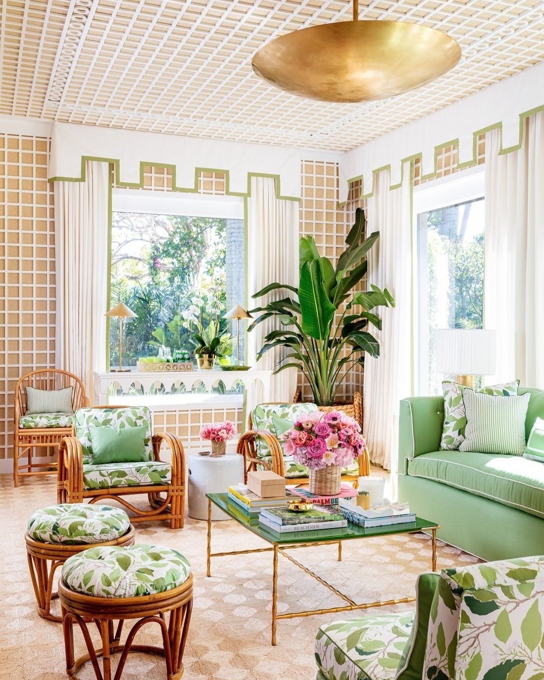
A modern take on the traditional Palm Beach sun room at the Kips Bay Decorator Show House with treillage walls and ceilings that work with dogwood leaf patterns and rattan furniture to bring the outdoor inside.

A modern take on a traditional Palm Beach sunroom says “come in and stay a while.” Designed by Paloma Contreras, the treillage walls and ceilings work with the dogwood leaf pattern and rattan to bring the indoor inside. Photo: Nicholas Sargent, Sargent Photography.

The home was built in the 1920s and is listed on the National Registry of Historic Places. Because of its age, it presented many challenges to the designers who brilliantly hide them. For example, what does one do with slanted walls? Cover them with a beautiful screen!

In the pink is a poolside paradise at the 2022 Kips Bay Decorator Show House in Palm Beach with  pink striped cabana for shade and umbrellas and white settes and lounge chairs in a garden-like pool setting including a pink back gammon game

“In the pink: a poolside paradise” by Janie Molster, offers lots of spots to soak up the sun. An entertaining pavilion is ready to get the party started and a romantic, fabric-draped pergola is perfect for enjoying time in the shade for a game of (pink) backgammon. Photo: Nicholas Sargent, Sargent Photography.

As a Southwest Florida interior decorator, I am constantly on the hunt for inspiration that I can bring back and adapt them to my client’s homes. A few of my takeaways are listed below. But first, a little information if you decide to venture over to the “other” coast. The home is open until April 3 so there is still time to visit.

If you go:

5th Annual Kips Bay Decorator Show House

3001 Spruce Avenue, West Palm Beach

10 a.m. - 4 p.m. daily through April 3, 2022

Kips Bay 2022 Decorator Show House in West Palm Beach is listed on the National Registry of Historic Homes is filled wityh inspiration and tips to use in home décor.

All proceeds from the Show House will support the Kips Bay Boys & Girls Club in the Bronx, New York, and the Boys & Girls Clubs of Palm Beach County.

A few of my takeaways:

• Rich bold colors with a lot of whimsy. Artwork, wallcoverings, paint and even a custom hood lacquered to match the cabinets.

• Small space or wall imperfections? Cover a wall with a gorgeous folding screen. It adds depth to a small room and covers a lot of things we would rather not see.

• Wallpaper the ceiling! This is beautiful when set within a coffered ceiling or a ceiling where you can add architectural elements. The sky is the limit on how creative you can be.

Wonderland dining room at Kips Bay 2022 Decorator Show House designed by Beth Diana Smith is grounded by a pink patterned rug and a lilac wallpaper on the ceiling. Focal point is a lotus chandelier and a monkey accent table.

The “Wonderland Dining Room” designed by Beth Diana Smith is filled with patterns and accessories. The space is grounded by a pink rug and a lilac wallpaper on the ceiling. This room was a major draw with its focal point lotus chandelier and a monkey accent table. Photo: Nicholas Sargent, Sargent Photography.

• Make the exterior part of the interior. I know, we say this all the time. But carry it a step further with rugs, rattan tables, a chandelier, surround drapes to protect from the weather and you have a cozy outdoor room that is part of the home.

Reimagined closet by Lewis Design Group at the 2022 Kips Bay Decorator Show House in Palm Beach with hand-painted wall paper and fabrics on the sette and Roman shades in green and yellow that play off the palm fronds covering the walls.s

Much more than a placed to get dressed, one could spend a lot of time in this “Reimagined Closet” by the Lewis Design Group. The hand-painted wallpaper is the room's focal point and green and yellow fabrics on the settee and Roman shades play off the palm fronds covering the walls. Photo: Nicholas Sargent, Sargent Photography.

• Lattice on a grass cloth wall and ceiling gives the room the feel of a garden party.

• Bar carts. They are everywhere. And they don’t even have to be a traditional cart. A pretty vignette created on a tabletop, kitchen island, beautiful tray or console are perfect. The key is to creatively arrange colorful, pretty things that make you happy every time you make a refreshing beverage!

Jewel of the jungle designed by Catherine Austin at the 2022 Kips Bay Decorator Show House with whimsical and bright  breakfast area and galley kitchen with vibrant green cabinets and a lacquered custom hood trimmed in brass.

Visitors would be happy to spend a few days in this guest house. With kitchen and dining room designed by Catherine Austin, she took cues from her favorite travel spots, like Marrakech, Costa Rica, the Cote d’Azur and Palm Beach, to create the home's bright and whimsical breakfast area. The adjoining galley kitchen has vibrant green cabinets and a lacquered custom hood trimmed in brass. Photo: Nicholas Sargent, Sargent Photography.

Wrenda Goodwyn is a Southwest Florida interior decorator, A.S.I.D. associate and gold member of the Interior Redecorators Network. She helps homeowners throughout Southwest Florida with timeless, affordable ways to create beautiful spaces and solve decorating problems. Her articles appear the first Saturday of each month. For more information, visit her website at spectacularspaces.com. Call her at 239-850-5800 or e-mail wrenda@spectacularspaces.com. For more decorating tips, articles and photos, visit spectacularspaces.com/blog

Quick Decorating Tips for a Happy Home (some are free!)

Wrenda Goodwyn • special to the Fort Myers News-Press •June 4, 2016

Try something new with color with this perky blue and green setting with a large-scale graphic pattern (Midland) that has a leaf-like motif and gives a nod to old Federal style wallpaper. The wallcovering shown here is Troy, a small-scale texture with characteristics of a basket-weave. Photo credit: Courtesy of Thibaut.www.thibautdesign.com 

There are a few things that really drive decorators and designers crazy. But the good news: the minute we walk into your house, we can spot them and help you correct them quickly. Today, I am sharing my short list with you and guess what? Many of these can be corrected before you finish reading this article and you don’t even have to get in your car to drive up and down 41 looking for more “stuff” to bring into your house! 

So, if you’re happy with your home sweet home but it doesn’t seem quite right, read on and maybe the one little tweak that you need is listed below. 

Be realistic about a budget.

I've never been into a client’s home that I couldn’t improve.  As a Southwest Florida interior decorator, I have seen it all. Realistic budget. No budget. Tiny budget. I base my decorating on affordable solutions for home décor and I’ve had lots of practice of making a home look great without wrecking your finances. 

It’s important to keep in mind that reality home shows are not a home interior professional’s friend. They give the impression that a designing couple can breeze through your home, redo it from the inside to the outside, all for a song. Quick, beautiful, cheap, fast. It’s just not so and what they do not include are the behind the scene costs and a realistic, honest budget. 

Pretty painted chest set against the backdrop of Thibaut’s Portofino wall covering. These large, stylized, flowers and other fun details make this a striking accent wall. The wallpaper is rotary screen printed, which uses a lot of ink to make the flowers slightly textured. Photo credit: Courtesy of Thibaut.  www.thibautdesign.com

So having said that, whatever your budget, be realistic and honest with yourself. A lot of my tips below are free or require little $$. Others may be something to work toward (phase two, as I say!). The more realistic you are, the happier you will be with your home. 

No plan? Then it doesn’t matter where you are going.

Now that you have a budget nailed down, take some time to get your thoughts organized and develop a plan. This is key to a happy outcome. What are the priorities? What can you do without spending a lot? Do you need a total redo or will a good design plan help to sort out where to begin? Do you need the professional help of a designer or can you do it yourself with a plan? No plan? The result will be a house filled with rooms that all have a different look. 

Please: Say goodbye to these. Now.

Refrigerator magnets. Fake flowers. A lot of junk on top of kitchen cabinets. Enough said about this. 

Pull furniture away from the walls.

Get rid of the uncomfortable conversation area and create some space. A U-shaped arrangement is best.  Sofa and two chairs or two sofas.  We realize the sized of the space dictates placement. Give it a fresh look. 

Declutter. Declutter. Declutter.

I know, I talk about this all the time. But you have to do it over and over. Things have a way of accumulating when you aren’t looking. And without this key element, you may as well not try to make a change. You will just be rearranging the clutter. 

Create a palette: don’t just throw color around.

If you get the color palette right, everything else falls into place. This is my most popular service and the one that homeowners have the most difficulty establishing. And here’s why: it’s not all about putting paint on the wall. It is about creating a color scheme for the entire home and carrying the color throughout in fabric, accessories, window treatments, pillows, etc. This is definitely the tricky part of decorating. The fun part and the most important after your budget and your plan.  So spend some time on this one.   

Decorating: it’s all about you.

It’s not about your neighbors, your relatives who come to visit each year, your bridge club or a friend who has a daughter who is a decorator in another state. We hear these sources of input all the time! Filter out the noise and keep in mind this is your home and your opinion is the only one that counts. 

Curate your own art gallery.

Take a fresh look at your art work. I like to select a space on a wall and make it look like a museum gallery. Place everything on the floor. With painter’s tape, mark off the area you wish to cover on the wall. The best height for your key pieces: eye level. This is usually 57-58 inches from the floor. Once you have the arrangement, you are ready to create your gallery. 

Paint your entry door on both sides.

If you don’t have the time or budget for anything else, give your home a lift and do this one. And here is a tip: paint both sides of the door for a professional design look. My advice: if you love a color but are afraid that it just will not work in your home, use it on the door. 

Don’t fear wall coverings!

For a long time, we focused on paint and textures for walls. It seems that wallpaper (as it was called) went by the wayside. But it’s back and it’s fabulous. Textures, sheens, feathers. Take a fresh look and at least try it for a powder room or an accent wall. 

Don’t love it? Paint it or pass it on.

Have an antique that you no longer love? Like an armoire or chest? Paint it! What good is it if you no longer want it in your home? Our tastes all change and color can change everything. Otherwise, pass it on and let someone else love it. 

Think about white.

It looks beautiful in magazines. White walls. White sofas and chairs. Gorgeous and carefully styled. Do you have the lifestyle for all white? Will you be able to accent with beautiful artwork and accessories to carry it off? If the answer is yes, go for it! If not, rethink this commitment. 

Come into the light!

We can never have enough and right now your home is likely lacking in this area. Because all of us seem to overlook this important element in our homes.  Check all four corners of your rooms for proper lighting. Remember: we need overhead, task and ambient lighting. Make sure you use dimmers and if this is not possible, plugin adapters work fine.  Chandeliers, floor lamps, mirrors and glass doors also reflect light. 

Decorative painting. Ugh.

This was a trend that has (thankfully) passed on. I am not speaking of the beautiful treatments for recessed ceilings. Rather the unfortunate fad of things like sponge painting, globing things like wadded up paper on the wall, stenciling and other horrors. When it comes to wall treatments: a good quality paint in a beautiful color and finish or the most outrageous wall covering you can afford on an accent wall. 

Say goodbye to your unicorn collection.

We all have collections that made sense at one time. But time is the problem. It may be time to say goodbye. If it’s not a priceless collection or one that you absolutely love, it may have outlived its value. So when you are doing your decluttering, you may want to say goodbye and let someone else love it. 


Wrenda Goodwyn is a Southwest Florida interior decorator, A.S.I.D. associate and certified gold member of the Interior Redecorators Network. Her @home article appears the first Saturday of each month. Visit her website at spectacularspaces.com. Call her at 949-1808 or e-mail wrenda@spectacularspaces.com. For more decorating tips and photos, visit spectacularspaces.com/blog


Home sweet rental home: Make it yours and keep the landlord happy

Wrenda Goodwyn • special to the Fort Myers News-Press • April 9, 2016

Colorful adhesive tiles from Mirth for an entry, bathroom or kitchen.  Photo  Courtesy of Mirth.

Renting. It's a lot like moving into a home that you own. Almost.

You want to repaint the walls. Replace the carpeting.  Hang some artwork.  Update the kitchen. Get new window treatments. Toss out the grungy switch plates. And a lot more.

In other words: you want and need to make the space your own.

But there is the landlord to think about.

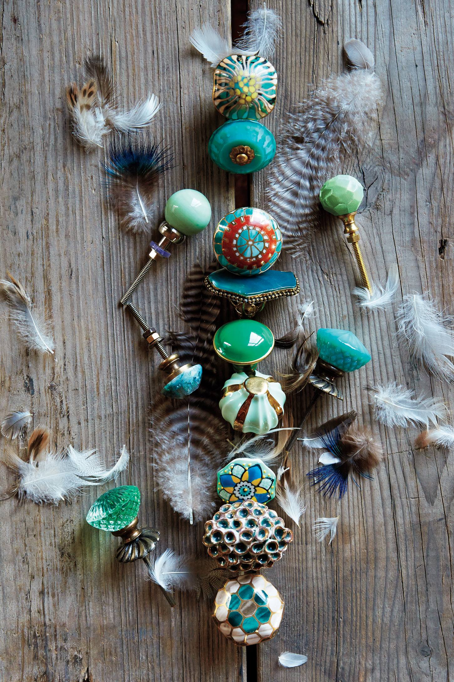
Changing drawer and cabinet pulls to personalize your rental decor. Photo courtesy of Anthropologie.

Changing drawer and cabinet pulls to personalize your rental decor. Photo courtesy of Anthropologie.

Maybe you have sold a home and have temporarily moved into a rental space until you decide what to do with the rest of your home-owning life.  Perhaps you are a boomer and plan to free yourself of the responsibility, throw caution to the wind and travel for the rest of your life and keep a rental apartment as a place to come home to. As a Southwest Florida interior decorator,  I've had clients in both rental situations. And many more.

Eventually, we all seem to end up in a rental home for the long or short term.  And the fine line between making it your own and crossing over to where the landlord decides not to give you the deposit back when you leave...well the lines can be a bit blurry.

Before you paint that red accent wall in the entry, you may want to consider a few rental-friendly tips that will have you saying "home sweet home" in no time. And even if you never plan to rent, these tips will serve you well if you are in a temporary situation or just don't have the budget to do everything right now.

It's only paint

It an accent wall or a bathroom with color on the walls will make you happy, do it. Just be prepared to paint it back in a neutral tone when you leave. This alone, can make all the difference in how you feel about your rental space.

Accents

Drawer and cabinet pulls will change your kitchen and bathrooms. Replace them with something that you like and take them with you when you leave. And while you are at it, dump the old switch plates and replace them with new ones. Favorite: the colorful Nannette pull from Anthropologie. 

Change the flooring (some of it).

Peel and stick floor tiles have been around for a while but today, you can find a selection that is colorful and fun. And easy to apply. Sources: Mirth Studio and Home Depot. Try this in an entry, bathroom or kitchen to completely change the look.

Pottery Barn's Lucianna Medallion pole pocket drape  is a great "fix" to add your own look to windows or sliders. Photo courtesy of Pottery Barn.

Window treatments

These are often the worst part of what a landlord leaves for tenants. At best, you may have not so attractive blinds. But this is where you can put some fabric and color into your decor. Invest in some drapes. Or at least drapery panels to give your rooms a little love. One of my favorite, inexpensive go to sources:  the Moorish tiles drapes at Pier One. Or the Lucianna medallion-pole-pocket-drape from Pottery Barn. They come in a variety of colors and great for a temporary fix.

Kitchen backsplash

For a tile look, Tic Tac adhesive tiles. Photo courtesy of Tic Tac Tiles.

This is one of my favorite fixes. Since I always spec a neutral backsplash for my clients when redoing their kitchen, I love the fact that you can do the same thing with Tic Tac adhesive tiles or the Smart Tiles from Home Depot. Completely change the look of your kitchen and remove them when you leave.

You won't believe it's removable wallpaper

ReUsable wallpaper tiles by Hygge and West are removable so you can take them when you leave your rental or enjoy them for a long time. Photo courtesy of Hygge  and West.

You would be surprised to know how many of my clients use this in part-time homes or if they just aren't sure about using wallpaper. And the result: spectacular. You can find these in Target, Bed, Bath and Beyond and other big box home stores. They vary in quantity and in price depending upon how much you want to invest.  My favorite is Hygge and West.  These removable wallpaper tiles can go with you and are reusable. And you will want to reuse them. Beautiful colors and designs that are ideal for renters and temporary installations. A game- changer for a rental property.

Lighting

Overhead lighting may not be the best in your rental home. So invest in a few floor lamps that warm up your rooms. And they will go with you to your next home. If the builder's grade lighting in the bathroom is not working for you, try a lamp on the counter to tone down the glare. Or invest in inexpensive lighting over your mirror.


Wrenda Goodwyn is a Southwest Florida interior decorator, A.S.I.D. associate and certified gold member of the Interior Redecorators Network. Home Inspirations appears the first Saturday of each month. Visit her website at spectacularspaces.com. Call her at 949-1808 or e-mail wrenda@spectacularspaces.com. For more decorating tips and photos, visit spectacularspaces.com/blog
 

Easy changes to refresh and renew your home and spirit for spring

Wrenda Goodwyn • special to the Fort Myers News-Press• May 9, 2015

Bring springs colors into your home with marbleized bud vases. Photo: Pottery Barn.

Even though in Southwest Florida, we typically go from winter (such as it is) straight into summer, with a few cool and breezy days in between, it is still human nature to mark the change of seasons.

And spring is a time to take a mid-year evaluation of how we want to transition into summer with subtle ways of renewing and refreshing our homes. And our spirit.

So, do a little inventory of you home and decide what makes you happy this spring. And make a list of a few easy changes you do to honor the season and refresh your home. Some of my favorite rituals to acknowledge this subtle shift may help!

Declutter. Spring is the perfect time as you refresh and renew your home. Eliminate anything that bothers you. A mini downsize of your "stuff" is healthy and don't be afraid to open up some space!

Open the windows. Yes, some fresh air. Let all of the bad chemicals and cooking fumes out and some fresh air in.  My green expert friend and designer, Peggy Oberlin of Oberlin Interiors in Naples, uses the plastic bag analogy when explaining what our homes are like. We live in air conditioning without fresh air and everything builds up inside to one big unhealthy trapped batch of air.  Open the windows and let it out!  

Pottery Barn's pretty spring table with turquoise dishes and glass based coral stands.

Bring a little "green" inside. We know that plants are healthy for our environment but I notice in most of my client's homes, there are very few plants used as decor. This does make some sense since we are surrounded by beautiful outdoor landscapes and our lanais are all filled with trees and potted plants. But pick up a few for the inside. No green thumb? Try succulents.  They live despite the fact that you don't have a green thumb.

Replace a few things. Like those yucky switch plates that have been around forever. Like the front door welcome mat. And definitely add or replace a few pots of annuals around your front door. They just shout out "welcome" spring.

Set a pretty spring table with turquoise dishes and glass based coral stands. Photo: Pottery Barn.

Paint baseboards and window sills. One of my favorite spring rituals. This gets rid of scuff marks and gives your home a little sparkly clean feeling.

Now, let's add some bursts of color.

Paint the front door. This is my favorite low-cost change that will make a big impact and it will also make you happy when you walk in the door. But here is the big change: paint the inside of the door as well so you can see it from your entry. Trust me. This is a great one! My favorite front door color (both sides) of the moment is Benjamin Moore's Boca Raton Blue.  But try a color that you love. The choices are endless.

Add spring with outdoor Astrid trellis embroidered pillows. Photo: Pottery Barn.

Paint a ceiling blue. Yes. Blue. There's just something about a blue ceiling.  My favorite locations: bedrooms, bathrooms and lanais. It's a very tropical, cool, calmingthing that is also brings big impact for very little money. Try it. You will thank me.

Paint a piece of furniture. Add some color with an old table that you feel is brown and dull. A nightstand in the bedroom or a even fireplace mantel. Give it a new life. It will brighten up a room instantly and give it a little personality.  

Add wallpaper. Okay. You don't have to go crazy with this one if you are afraid. But a powder room (my favorites) or your closet are great rooms to play with. These are rooms that you are not living in all day but will love some spring pizzazz! Be brave! And while at it, add a chandelier.  Spring glam!

Rotate your artwork. As a Fort Myers interior,  I do this for many of my clients. We all have artwork in the back of our closets because there is not enough space. Bring it all out and pick a few pieces to rotate for a season or two. It's like shopping in your own closet because you have probably forgotten about it!

To celebrate spring, there are a few purchases that will go a long way to welcoming a new season.

Pillows. If you don't add anything else, change the pillows on your sofa for a totally new look for spring.  I like doing this frequently and it is perfect for a seasonal transition.

Set a pretty table. Think about an inexpensive, colorful set of dishes. Napkins, table cloth and centerpiece. There is not any better (and fun) way to bring spring into your home than a new table setting.  You know you are bored with the same old tired looking stuff. Time to refresh it!

Create a spa in your bathroom. This would be a great time to give your bathroom a mini makeover. Transition it into spring with a spa look. White walls, blue ceiling, white fluffy towels, white rugs. Frame the mirror.  Voila! A new bathroom.

Add fresh flowers to every room. This is my favorite. Because it will not only add color to a room but it just makes you feel food. Invest in a few new vases and be creative about what you purchase. My favorites:  turquoise and green bottles. I like to buy large bouquets and break them into bunches of solid colors and arrange them throughout the house. And don't wait until house guests arrive. Do it for yourself.

Whatever changes you make to welcome spring, enjoy your home in this new season. There are only 32 weeks until Christmas!

Wrenda Goodwyn is a Southwest Florida interior decorator. Home Inspirations appears the first Saturday of each month. Visit her website at spectacularspaces.com. Call her at 949-1808 or e-mail wrenda@spectacularspaces.com. For more decorating tips and photos, visit spectacularspaces.com/blog

When paint color is just not enough: wall coverings make bold design statement

Wrenda Goodwyn • special to the Fort Myers News-Press• April 27, 2013

Photo: Cole and Son and Lee Jofa.

Photo: Cole and Son and Lee Jofa.

If you are like most homeowners, when you hear the term "wallpaper,"  you immediately think about scraping sheets of flowery pastels of the wall and then repairing the wall. Or you remember your grandmother's kitchen.  In other words, a thing of the past.

They began centuries ago as a way to protect walls and only the aristocracy could afford them. Wall papers meant that you had made it. Then for the past few years the allure faded.

Today the term is "wall coverings" and many are not paper at all.  They have come a long way, have been totally reinventedand done correctly, wall coverings can be a powerful design element in a home.  Murals that take you away, metals, crystals, grass cloths, hand painted papers, silver threads and anything you can imagine. There are even companies that allow you to design your own paper.

We now see them in design magazines and in model homes. Wall coverings are no longer backdrops. They are focal points and should be treated as such.  Pair the right combination of color and wall covering design and turn a blah room into a spectacular space.

Photo: Pixercise.

Photo: Pixercise.

With Pixers City Never Sleeps collection of mural (pixersize.com/wallmurals/city-never-sleeps) we see atribute to the great metropolises that for ages have inspired not only artists, but also most importantly, ordinary people. Pixers says: "The cities that are a continuous dazzle of lights and cacophony of noises, but still attract like a magnet."

You can have a view of Paris from your living room or have your office in a cafe. A jazz band in your TV room or wake up in Paris.   And best of all, you canspecify the size of the mural to fit your space.

You may want to give wall coverings another look if bold paint colors just aren't enough. If you want to do something that reflects your decorating style and personality in a big way.

Wall covering tips:

                           Photo: Cole and Son and Lee Jofa•

                           Photo: Cole and Son and Lee Jofa•

• Make an entrance.  Select a bold color for the front foyer and add a paper that accentuates the color.

• Powder room.  Designers love wall coverings in powder rooms. We/you can do something totally outrageous in this room.  Bling it up and make a statement.

•  Laundry room.  Use your imagination and try a whimsical pattern.

• For the kiddies. Forget pastels. Select a wall covering that will grow with the child. Neutral backgrounds with playful patterns.

• Complement your furnishings. A modern print works well in a space with a natural and casual style. With neutralssofas and wood accent pieces, try a graphic pattern in a combination of colors.

• Maximum impact.  Select a wall with no windows and doors for wallpaper and paint the rest of the room background color of the paper.

• Nursery. Cover one wall with a modern animal print and paint the remaining walls in a gender neutral shade.

• Love the look but concerned about budget? Select the room's focal point to highlight with an eye-catching print. Then paint the walls in the background color of the paper. The best of both decorating elements!

• Afraid of wall covering commitment?  Pick a design that speaks to you and cover an accent wall.  Minimal investment until you decide how much you love it!                                                                                          

According to Shauna Dennison, creative director of Cole & Son, (available to the trade  through the Kravet showroom in Estero)  popular designs continue to include traditional and classic patterns.  However she is seeing a move towards "larger scale, bolder wallpapers."

"This rise in murals and panel designs has in part been driven by huge advances in digital printing technology.

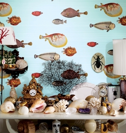
"We are seeing the rise of creativity in wall coverings... wallpaper has become a feature to build interior schemes around, rather than a background element. Large scale, whimsical designs are the conversational piece within a design scheme. The new Fornasetti II collection leads this trend with a series of striking theatrical designs that have been produced on wide widths giving the pattern repeats far greater space, creating a mural like quality."

At Ralph Lauren Home, the Textures Collection is filled with embroidery, damask and woven designs, natural seagrass, cork and scroll. These blend well against the blue-green shades that are the backdrop for southwest Florida homes. For details, visit the showroom in Miromar Design Center. 

Wrenda Goodwyn is a Southwest Florida interior decorator. Visit her website at spectacularspaces.com. Call her at 949-1808 or e-mail wrenda@spectacularspaces.com. For more decorating tips and photos, visit spectacularspaces.com/blog