Simply white: How to get it right in your home

Wrenda Goodwyn • special to the Fort Myers News-Press • November 14, 2015

When Benjamin Moore recently announced its 2016 Color of the Year – Simply White OC-117, there was a lot of surprise among designers and homeowners. Many wondered why Benjamin Moore had selected a color that was lacking in color. Others love it for its versatile, crisp, cleanliness.

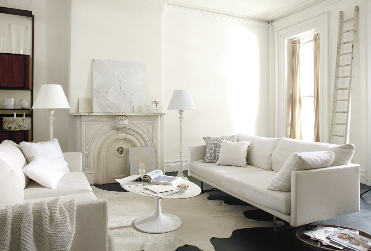
 All white family room walls are done in Simply White )C-117, matte finish. Trim is Simply White semi gloss. Photo: Benjamin Moore.

 All white family room walls are done in Simply White )C-117, matte finish. Trim is Simply White semi gloss. Photo: Benjamin Moore.

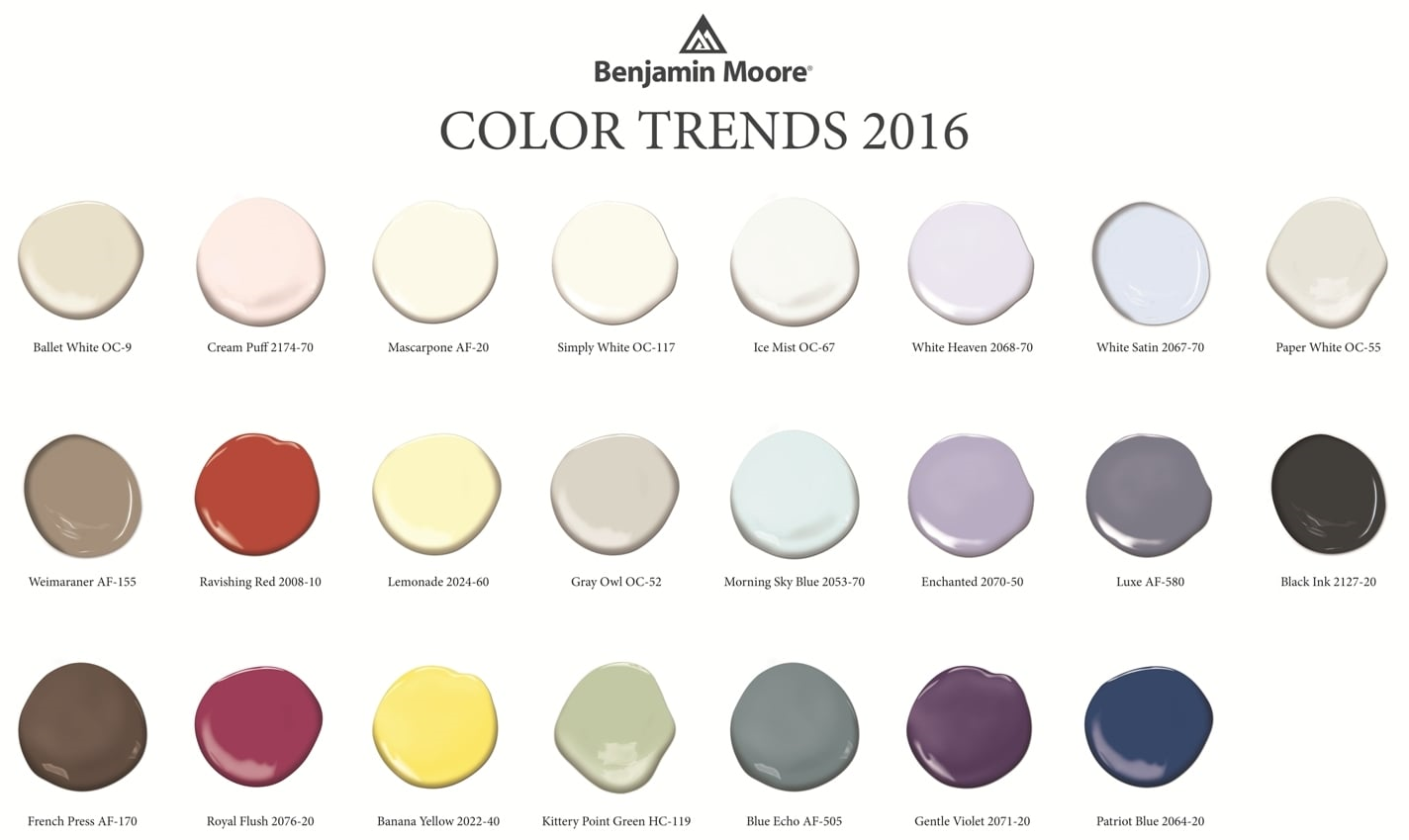
At the same time, the company also unveiled Color Trends 2016, a corresponding palette of 23 colors to illustrate how white works within the color spectrum. The selections include a variety of yummy hues like Lemonade, Patriot Blue, French Press, Creme Puff, Ravishing Redand Gentle Violet. And this is where white really shines.

Where do these trends come from?

The Benjamin Moore Color Studio forecasts color trends after a year of research attending major industry shows around the world, while also taking cues from standouts in architecture, fashion, textiles, home furnishings and the arts. White transcends style, and is seen in traditional, transitional and modern interiors.

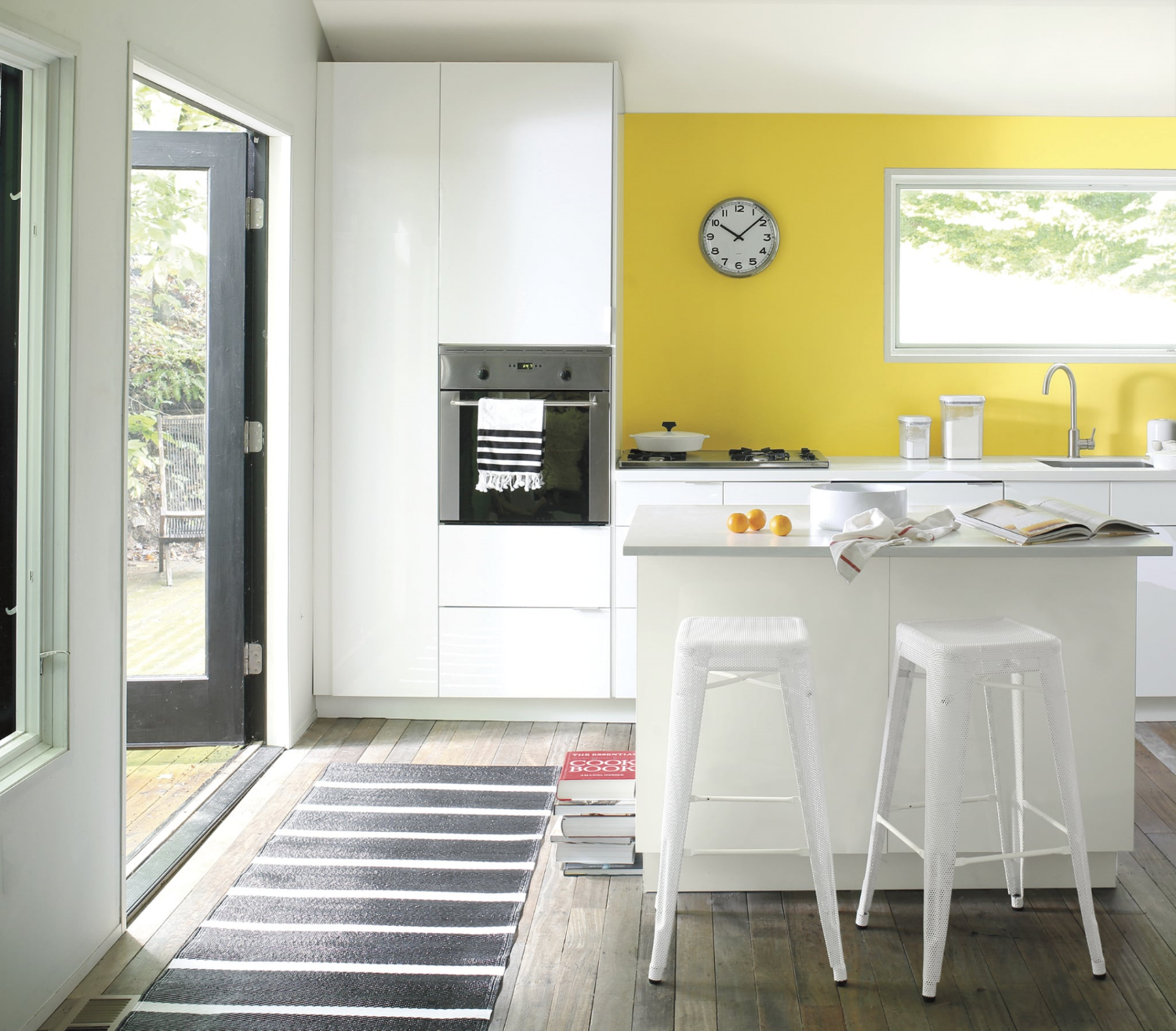
White with a pop of cheerful yellow. Accent wall in Banana Yellow 2022-40, eggshell finish.  Wall and ceiling in Paper White OC-55, eggshell finish. Ceiling in Waterborne Ceiling Paint, ultra-flat finish. Photo: Benjamin Moore.

White with a pop of cheerful yellow. Accent wall in Banana Yellow 2022-40, eggshell finish.  Wall and ceiling in Paper White OC-55, eggshell finish. Ceiling in Waterborne Ceiling Paint, ultra-flat finish. Photo: Benjamin Moore.

As a Fort Myers interior decorator who spends every waking moment thinking about color and creating color palettes for my clients, I can tell you two things about white:

·       It's not boring. That would be beige but not white. It's like an artist's canvas. Start with white and you can go anywhere without a commitment that will come back to haunt you. And there is no color that doesn't work with white. The right white.

Normal
0


false
false
false

EN-US
X-NONE
X-NONE


MicrosoftInternetExplorer4


 <w:LatentStyles DefLockedState="false" DefUnhideWhenUsed="true"
DefSemiHidden="true" DefQFormat="false" DefPriority="…

Create a beautiful color palette for your home using white and Benjamin Moore's Color Trends for 2016. Photo: Benjamin Moore.

·       Depending upon the room, the light, the furnishings, the artwork, white can be bit tricky to pull off.  Done well, it's spectacular. Done poorly, it leaves a lot to be desired. I like to start with white as a backdrop and build the room from there with lots of texture, accents and accessories.

My favorite white rooms

·       Master bathrooms. No color gives a master bath a cleaner, more spa-like feel that white. Combine it with white tile, towels, rugs, accessories and beautiful white sconces and you have a total makeover.

·       Kitchens. Dark flooring, white cabinets and countertops, stainless pendant lighting, white or stainless appliances. Perhaps a yellow or blue accent wall. Beautiful.

Try either of these options and you will have friends asking for the name of your interior decorator.

Add drama to a white room with a wall done in Mascarpone AF-20, eggshell finish. Entry is in Royal Flush 2076-20 in eggshell finish. Trim (semi gloss) and door (satin finish) in Ballet White OC-9. Photo: Benjamin Moore.

Add drama to a white room with a wall done in Mascarpone AF-20, eggshell finish. Entry is in Royal Flush 2076-20 in eggshell finish. Trim (semi gloss) and door (satin finish) in Ballet White OC-9. Photo: Benjamin Moore.

If you are thinking about a white room in your home

·       White can be very dramatic by itself or with accent walls or just the right furnishings.

·       White gives you a chance to start with a clean palette. To experiment with other colors, accent walls. All without the commitment of an expensive wallpaper.

·       Yes, white is a color.  There are 200 whites at Benjamin Moore. Five of the top ten selling paints in their collection are whites.

·       Beware of undertones. Yes, those pesky shades of green, pink, blue, gray...depending upon the color and the lighting. Get around making a mistake by painting a portion of a wall as a test and check it out as the light changes during the day. This is something that I tell my clients to do with any color but with white it's especially important.

·       White is forgiving. It can make flaws in your walls fade away where a bright color calls attention to every detail.

·       If white frightens you, start with white sofas, chairs. Then see if you want to go further. White can be in your accessories and furnishings. It does not have to be on your walls.

·       A white room requires lots of textures and accessories. My favorite: white walls, dark flooring, area rugs,  white comfy sofas, lots of colorful pillows, green plants, colorful art on walls,  white shutters. This is a room that if pulled together correctly, screams "come in and make yourself at home."

And that's what it's all about.

Wrenda Goodwyn is a Southwest Florida interior decorator. Her column, Home Inspirations appears the first Saturday of each month. Visit her website at spectacularspaces.com. Call her at 949-1808 or e-mail wrenda@spectacularspaces.com. For more decorating tips and photos, visit spectacularspaces.com/blog

Trends from High Point Market: Bold, fearless and flirty with a touch of Bohemian

Wrenda Goodwyn • special to the Fort Myers News-Press • November 14, 2015

Once again I was at High Point Furniture Market in North Carolina. That glorious Disneyland for interior designers.

Trying to cover 11.5 million square feet of show space and tens of thousands of new product introductions. I was there along with 75,000 other designers and buyers in 180 buildings that provide dazzling displays of thousands of everything beautiful for your home.

If you can't find it here, it likely doesn't exist. Despite the miles that I put on my new, sensible walking shoes, I couldn't possibly cover all of the showrooms filled with gorgeous, pretty things. But I tried.

 
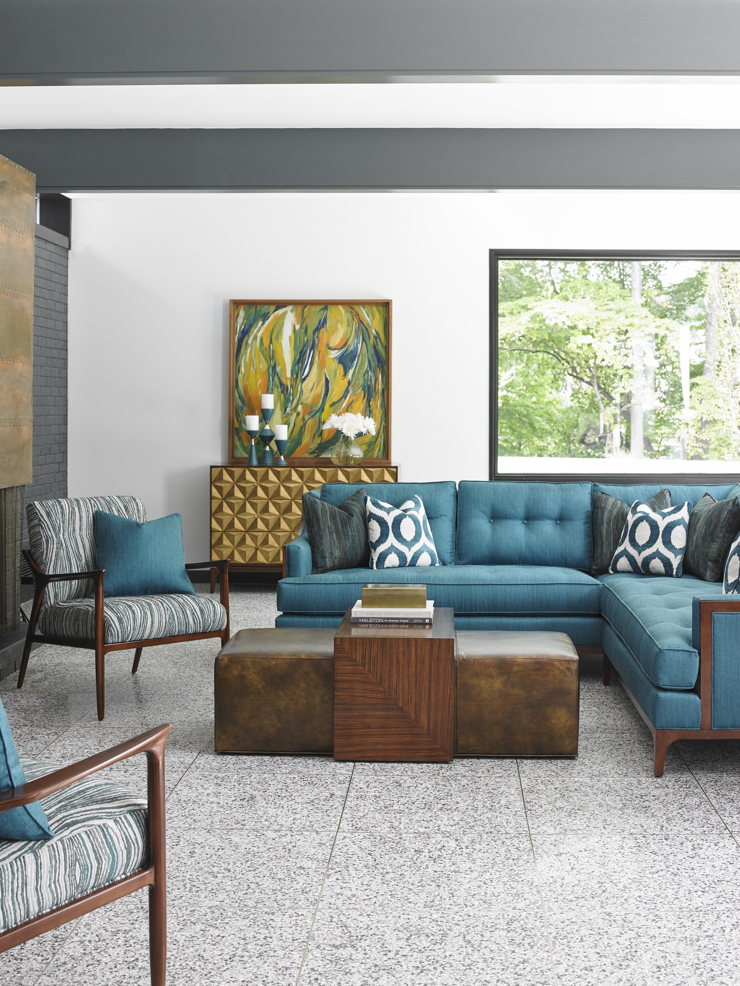
Upholstered seating with clean lines, bright color tones and bold patterns feature geometric and abstract designs. Sleek and comfortable sectional seating is iconic to mid-century styling and is functional for entertaining. From Lexington Home Brand…

Upholstered seating with clean lines, bright color tones and bold patterns feature geometric and abstract designs. Sleek and comfortable sectional seating is iconic to mid-century styling and is functional for entertaining. From Lexington Home Brand's Take Five Collection. Photo: Courtesy of Lexington Home Brands.


Market, as it is called, takes place for one week each fall and spring. There are opportunities to take courses from experts and chances to meet favorite designers and television personalities. As a Fort Myers interior decorator, this is where I go for design inspiration. To look for new ways of creating beautiful rooms and to shop for my clients who are looking for something new and fresh. Whether it is an eclectic piece to be used as a focal point in a room or for to shop for furnishings and accessories for an entire home.

So take a trip with me as I offer a peek at a few of the amazing, edgy, stunning new trends that I saw at Market. You will soon be seeing these in your favorite retail spots and magazines.

The day before Market, I had a chance to visit Furnitureland South and had a little sneak preview of what the coming trends would be. Ron Bristow, Lexington Home Brands showroom manager, summed it up: "a touch of mid-century modern, clean lines and scale, animal prints, geometrics."


A chic ottoman with a brass-plated stainless steel base and polished acrylic legs, upholstered in Australian sheepskin. From Lexington Home Brand's Take Five Collection.  Photo: Courtesy of Lexington Home Brands.


And this set the tone for what was to come.

My Favorite Trends:

  • Singing the blues: from the most muted shades to the most vibrant sapphires and indigo tones.
  • Less is more: a minimalist approach to upholstered chairs with open backs and arms. Sexy!
  • Fashion forward: Home interiors are following fashion more than ever. If it's on the runway, plan on seeing it in your favorite shop or showroom very soon.
  • Gold rush: It's back and there's lots of it. Furniture, lighting and accessories.
  • Color, color, color: fearless color.
  • Mirror, mirror on the wall: and mirrored furniture.
  • Go natural: quartz, agate, natural materials in lighting and furnishings.
  • Practical, streamlined and sexy: Comfort with a flirty flair. Redefined mid-century modern.
  • In the pink: Variations in tones with hues from the 1980's.
  • Go wild: Animal prints and faux fur on everything!
  • Organic: Textures and patterns that reflect the outdoors and landscape. Tranquil colors that make us feel calm.
  • Decadence: Lots of luxury and vintage glamour with nods to European tradition.
 

A nod to decadent luxury and vintage glamour with a deep sense of nostalgia. ReflectingEuropean tradition, the trend is feminine and indulgent. Photo courtesy of Surya.

 
  • Art walls: for photos or a collection.
  • Forget plain and boring: Patterned lampshades for indoors and outdoors.
 

Inspired by the colors and artisanal designs of African tribal textures, this Kuba collection from Surya is expressive and free spirited with a sense of cultural heritage passed down through generations. Photo courtesy of Surya.


You don't want to change your entire home because of trends. But a few touches here and there will give it a fresh look. And who doesn't want that?

Wrenda Goodwyn is a Southwest Florida interior decorator. Her column, Home Inspirations appears the first Saturday of each month. Visit her website at spectacularspaces.com. Call her at 949-1808 or e-mail wrenda@spectacularspaces.com. For more decorating tips and photos, visit spectacularspaces.com/blog


Want to come home to a spectacular space? Call me!
Sort through the confusion of when to splurge on your home and when to save.
Read my tips for a calm home in a not-so-calm-world in the Fort Myers News-Press.

Styled to sell: Tips that make your home appealing to buyers

Wrenda Goodwyn • special to the Fort Myers News-Press • October 3, 2015

We all know the feeling.

You’ve decided to put your home on the market. You’ve lived in it for a while. Decorated it. Renovated it. Upgraded it. Made lots of improvements. It looks great.

And it really does look great. It reflects your lifestyle. YOUR lifestyle. And that’s just the problem when it comes to selling a home.

Sorry, but it’s not about your style. It’s all about the potential buyer for your home. They need to be able to visualize their life (and belongings) in your home. If they can, they get excited and put your home on their favorites list.

And the process of styling your home for resale is a little tricky and most homeowners have difficulties handling it. Why? Because selling a home and moving under the best of circumstances is stressful, emotional and exhausting. The need to take a critical look at how your home appears to an outsider is tough for most homeowners.

Declutter and remove personal items and add fresh flowers for a look that says "welcome to your new home." This Clara space-saving apartment sofa and ottoman are by Pottery Barn. Photo: Pottery Barn.

Declutter and remove personal items and add fresh flowers for a look that says "welcome to your new home." This Clara space-saving apartment sofa and ottoman are by Pottery Barn. Photo: Pottery Barn.

As a Southwest Florida interior designer, my Resale-Ready service helps homeowners cut through the clutter (literally) and determine what’s important to potential buyers. It helps to make the difficult decisions and allows the homeowner to make a sale and get on with their lives. My role is to showcase the home’s best features so it will sell quickly for the highest possible price.

And while we can’t magically add more square footage or an extra bedroom or bathroom, what we can do is this:  Make your home look fresh and new to potential buyers.  We can make them visualize their furnishings and accessories in your home. We can make it look larger and more spacious.  Like a model. We can tempt buyers to put your home at the top of their list.

Let’s face it.  You look at your home every day.  A professional, fresh set of eyes and a plan can change everything.  For a potential buyer and for you to enjoy while your home is on the market.

My top tips for homeowners preparing their home to sell:

First impressions are everything.

Start with the exterior. Replace your mailbox and your house numbers.  Something pretty and fresh. Head to Lowes or Home Depot and pick up colorful annuals.  They go a long way to saying "welcome to your new home." Pressure spray the driveway and sidewalk.  Clean out all of the grunge.  If you have pavers, give them a shiny coat of sealer. Purchase new light fixtures at the front door and garage.  These are very inexpensive and make the house look clean and cared for by the owner (you). Touch up exterior paint where needed.  If the house is in desperately in need of paint, go ahead and invest in a complete redo.

tips-to-sell-home.jpg

Remember:  you are competing with lots of other homes on the market. Have the windows professionally washed. Hire a lawn service to fertilize and edge.  Have them come back periodically until the home sells. Buy a new welcome mat. Purchase two large ceramic pots and fill them with flowers at the front door.

Now your home says "Come inside!"

Invest in a professional opinion.

You are too close to your house. Have an evaluation done with designer or staging company that will prepare a list of changes that you can follow and complete yourself or hire the professional to get everything in perfect order. This is a small investment to sell your home.

It’s not about you anymore.

If buyers cannot visualize their life in your home, it’s simple. They walk. You have to show them how they will love living in your home. How? Remove all personal items. Replace with fresh flowers or books. Store excess furniture so you can open up your home. Pack up everything you can live without. Clear countertops.  Repaint accent walls in a neutral shade.

Declutter.

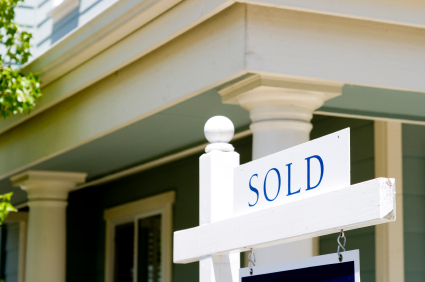
home-sold-sign.jpg

You are going to pack up to move eventually so declutter now. Go minimalist. It may not be the way you live but it is the best way to show your house. Clean out every drawer and closet and pantry because buyers look in every single corner of your home. If your linen closet spills out into the hallway when you open it, a buyer assumes that you don’t have enough storage space. And they go on to the next house.

Create space.

Envision the way the space should be used. Is your furniture smashed up along the walls? Is there a corner in your living room that would be a great placed to read? Group the furniture in ways that would make sense for the intended use. Make sure to have flow and walking areas through the room. Buyers must be able to envision themselves living in your home and the best way to do that is to show them a comfortable seating area.

Freshen it up.

Have your home professionally cleaned from top to bottom until it shines. Paint window sills and baseboards. Give your bathrooms a spa look with fresh paint and new towels and rugs. Replace any mirrors and lighting that are dated. It’s a good time to switch out your switch plates for a clean look. Opt for light colors on the walls that will reflect the light.

Take a step back.

When you are finished, take a long look at your home. Does the exterior say “welcome home?” Does it look like a model home with space and a comfortable seating arrangement?  Does it have a fresh, clean, decluttered look?  If the answer is yes, it’s time for the sale sign.


Wrenda Goodwyn is a Southwest Florida interior decorator. Home Inspirations appears the first Saturday of each month. Call her at 949-1808 or e-mail wrenda@spectacularspaces.com. For more decorating tips and photos, visit spectacularspaces.com/blog
Tips for creating a calm space in a not-so-calm world

Wrenda Goodwyn • special to the Fort Myers News-Press • August 29, 2015

It's all about how you feel when you walk in the door.

Does your home make you happy? Is it a calm retreat from the chaos and over stimulation of the outside world? Do you constantly feel overwhelmed by projects that you just can't quite complete? Are you tired and drained and not sure why?

We all want a nurturing home that offers a refuge. Not one that leaves you frustrated and exhausted.

Relaxing and pretty. Suzanne Kasler curated softly colored abstract art that pairs with her signature fabrics and finishes for Ballard Designs. Photo: Ballard Designs.

Relaxing and pretty. Suzanne Kasler curated softly colored abstract art that pairs with her signature fabrics and finishes for Ballard Designs. Photo: Ballard Designs.

As a Southwest Florida interior decorator, I have my clients fill out a brief questionnaire before I meet with them.  The first question: "How do you want your home to feel when you walk in the door?"

Tell me how you want your home to feel and I will make everything else fall into place.

Each answer is the same. Everyone wants a "calm" home. Of course we do.

It's not about "stuff."  You may have everything that you could dream of in your home and it still doesn't feel right. Check out these tips that I use for my clients and see how it changes your space.

Declutter.

We talk about this a lot in design and decorating but if you don’t do anything else, do this one. It costs nothing. And it has the most impact. Do it today!

Delete some of the visual stimulation. Pare down your accessories. Eliminate or rearrange some furniture and establish a comfortable conversation area that is relaxing.

And your closet. Most of us wear 10% of what is in our closets. So why not just have the 10% in your closet? Instead of the piles of clothes that you never wear any more. It’s all visual clutter and it’s exhausting to look at and to think about.

But sometimes the thought of decluttering itself is overwhelming. Just the physical aspect of getting rid of things and deciding what to do with them is difficult and stops homeowners in their tracks. Because it requires sorting it into what gets donated, given away and tossed. The solution: leave that part for another day. Remove it all from your house. Stash it in the garage until you have time to make the decisions.  Meanwhile, you will love your decluttered home so much that you won’t mind saying goodbye to the clutter when the day comes.

Don't over decorate.

The eyes need a place to rest. Don't cover every surface and every wall.  Don't be afraid of space. It is what most of our homes are lacking and it's the very thingthat creates a calm home.

Splurge in the bedroom.

Create a space to end your day with comfortable linens and fresh colors. Photo: Pottery Barn.

Create a space to end your day with comfortable linens and fresh colors. Photo: Pottery Barn.

Comfortable pillows. Nice sheets and comforter. A window treatment that blocks out the light. Pretty, restful artwork and accessories that make you feel good. We all spend a lot of time in this room and it's not the place to cut corners.

Transform with soothing colors.

Rethink your color palette and drop it down a notch. Soothing colors and more muted fabrics equal a calmer home. Save the bold colors for your family room and outdoor spaces. Of course this does not mean that a well-place splash of color against the most toned down backdrop is not gorgeous!

Design a spa bathroom for relaxation.

This is a service that I have done for my clients since I have been decorating homes. And it’s really easy. You can do it today. Think about what you love at a luxurious hotel or spa. Lots of white. Clean and crisp. Fluffy towels. Thick rugs. Plants.  Candles. Soaps and aromatherapy.  And don’t forget a spa robe. White is the key here and it must be done in a spotlessly clean bathroom. This should be your calming retreat at the end of the day.

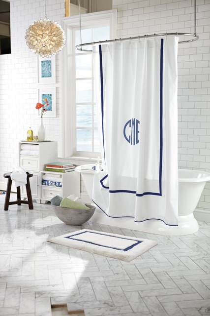
For a spa look, try this Morgan shower curtain of soft cotton with a band of color, along with organic cotton towels. Photo: Pottery Barn.

For a spa look, try this Morgan shower curtain of soft cotton with a band of color, along with organic cotton towels. Photo: Pottery Barn.

Lighting.

Forget the harsh, overhead lighting and install dimmers on all lighting.

Remove the bad vibes.

We all have them. Something that you carry around from home to home. You don’t like it but you don’t feel like you can get rid of it. Give yourself permission. Keep what makes you happy and anything with a negative or tiring association, send it out into the world where someone else will find it useful. It may be art, a photo or a piece of furniture that no longer serves you. Remember: it’s your home and you are not obligated to keep anything.

Create a space for solitude.

Give yourself permission to have a nook or part of a room where you can relax. Just you. Maybe it’s space for a yoga mat or a lounge chair where you can read. Create a corner in your home where there are no electronics or noises. A place where you can think and start to wind down from the day.


Wrenda Goodwyn is a Southwest Florida interior decorator. Home Inspirations appears the first Saturday of each month. Visit her website at spectacularspaces.com. Call her at 949-1808 or e-mail wrenda@spectacularspaces.com. For more decorating tips and photos, visit spectacularspaces.com/blog
 

Make an entrance: doors that say "welcome home"

Wrenda Goodwyn • special to the Fort Myers News-Press• August 1, 2015

If you are looking for a summer pick-me-up for your home, you've come to the right place! The front door of your home.

This will change everything. It's one of my favorite decorating tricks that gives you a big change for little investment.  It will make you happy every time you walk in front door. It sets the tone for your home. It doesn't cost much. And you can do it today!

Benjamin Moore's Crete Countryside is a beautiful green tone for a front door. Photo: Benjamin Moore

It's simple. Pick out a gorgeous color and paint your front door.

Some doors just speak to you. A bright bold color in a high gloss finish. Perhaps with shutters. A wreath on the door. It just screams "welcome everyone."

Think about it.  It's the first thing people see and the last one on many homeowners' to do list. The  color of the front door offers a teasing glimpse into your home. It gives you a chance to do something bold, fun and playful. As a Fort Myers interior decorator who spends a lot of time helping clients with color palettes, I always encourage homeowners to start at the front door.

Take a step back and think about  the style of the door, along with the trim and siding that frame it.  But don't over think it! This is the one place where you really can't make a mistake and it should be fun.

It's a chance to use a color that you may be a little tentative about putting on your walls or in fabric for your sofa. But you love the color so try it on the  door. Front doors should be an accent color. A dramatic, bold shade.  And it can be a color that is not repeated anywhere else in your home although this is not a rule!

So now is good time to think about your favorite front door colors. And make a statement.

Pick a bold, fun color for your front door. One that you love but might not use inside your home.

You may love a deep dark purple but it's just too much for your living room. But not for your front door. My front door is currently a bright, bold turquoise that would be too much for my interior walls. But as a front door color, it is pure happiness and makes me smile when I pull into the driveway.

Benjamin Moore's wildberry in high gloss. Photo: Benjamin Moore.

Benjamin Moore's wildberry in high gloss. Photo: Benjamin Moore.

Some of my favorite front door colors: red, indigo, orange, black, green, yellow, dark gray, blue. Done in high gloss so it pops!

A front door color makes an immediate impact, complementing the style of the home and improving curb appeal. Your home is a good guide for what works and what doesn't when it comes to choosing front door colors. Take into account the materials, colors inherent in those materials, style, and surrounding landscape.

And to really make it fun: carry the color around to the interior side of the door! Be brave!

The color you choose for your door says a lot about you. All for the investment of a can of paint. And the best news of all: if you don't love it, you can easily change it tomorrow!


Wrenda Goodwyn is a Southwest Florida interior decorator. Home Inspirations appears the first Saturday of each month. Visit her website at spectacularspaces.com. Call her at 949-1808 or e-mail wrenda@spectacularspaces.com. For more decorating tips and photos, visit spectacularspaces.com/blog. And to see a selection of her favorite color palettes, go to www.pinterest.com/ wrendagoodwyn

Making porches part of your living space

Wrenda Goodwyn • special to the Fort Myers News-Press • July 4, 2015

We're in those lazy, hot, humid days of summer but if you are at home on this Fourth of July weekend, chances are that you will end up on a porch someplace either relaxing, celebrating with friends over a meal or watching fireworks.

prett-white-with-american-flag-and-pink-flowers-ready-for-fourth-of-july

Maybe it's because I was born and raised in the south. But I love porches. When I was growing up, the "porch" was where the family headed after dinner.  I can hear my mother saying, "Help me finish the dishes and let's go out on the porch." It was where all important discussions and decisions took place. Even though the "porch" was only a small cement stoop with a couple of aluminum chairs. It was still the place where we retreated at the end of the day. And so did all of the neighbors.

As a Southwest Florida interior decorator,  I have had many "porches" since those days. Small apartment balconies barely large enough for two chairs,  front porches with comfortable wicker furniture, large lanais' with summer kitchens surrounding a pool and filled with friends.  But to me, they are all "porches."  A place to unwind, relax and think.

So, if in these hot, hot,  hot, days of July, you find your porch in need of a little makeover, I have some tips to give your space, no matter what the size, a little refreshing.  For years, I have helping my clients makeover their porches as an extension of the home's living space. No matter what the size or budget.

My favorite

Add a porch swing. What could be better than dozing in a porch swing at the end of the day? Find them at flea markets if you are looking for vintage, hardware stores or check out the Ballard Designs Sunday Porch Swing shown on this page. A porch swing just cries out, "Stop what you are doing and come and relax for a while." And if you find a vintage swing that just will not hold up to much weight, hang it any way and fill it with plants.

Dozing in a porch swing on a lazy afternoon. From Ballard Designs, this Sunday Porch Swing is hand crafted of 100% FSC eucalyptus to be naturally moisture and insect resistant, and finished in a warm whitewash. Photo: Ballard Designs.

Dozing in a porch swing on a lazy afternoon. From Ballard Designs, this Sunday Porch Swing is hand crafted of 100% FSC eucalyptus to be naturally moisture and insect resistant, and finished in a warm whitewash. Photo: Ballard Designs.

Anchor your seating area with an outdoor rug

Even on a tiny balcony this works and adds color to the space. It also makes it an extension of your home.

Lighting

If there is space, add an outdoor lamp.

Add a bar cart

Yes, it's great for a party but you can also use it for storage...liquid refreshments,  cups, stirrers, coasters, books, magazines, speakers, and anything else necessary for a relaxing afternoon.

Perfect for a porch: Pottery Barn's all-weather wicker bar console. Photo: Pottery Barn.

Perfect for a porch: Pottery Barn's all-weather wicker bar console. Photo: Pottery Barn.


Hang twinkle Lights

Arrange some strands of patio twinkle lights to transform your porch or patio into something special when evening comes. They make everything (and everyone) look pretty. And are very inexpensive.

Something blue

Paint the ceiling blue. Why? It's pretty and adds another dimension to your porch. Giving your own outdoor space a hint of blue is the perfect way to play into history, and it just might keep wasps and evil spirits away, too. According to the legend! Years ago, in the deep South, many people painted their porch ceilings a specific shade of Haint Blue, a soft blue-green, to ward off evil spirits called "haints." It's especially common in the historic homes around Savannah, Georgia, and Charleston, South Carolina. And I can say that my own blue porch ceiling has kept the wasps away!

Paint the porch ceiling a shade of blue. It's pretty and legend says that it keeps wasps away! Photo: Wrenda Goodwyn

Paint the porch ceiling a shade of blue. It's pretty and legend says that it keeps wasps away! Photo: Wrenda Goodwyn

Invest in plants

Give it your personal touch with lots of greenery. If there is space, add some pots, a small tree and a vase or two of fresh flowers. Use perennials so you will not have to replace them each

Go vertical

Hang a piece of artwork, plants  or a mirror on one wall.

Tiny space? No problem!

Bistro table and chairs may be all that you need. No room for furniture? Fill your tiny balcony with plants and in the winter months in Southwest Florida,  let the outdoors inside. And if you are on a budget, or even if your aren't, you can get creative with furniture by turning crates on the side and using them for benches of plant holders.


Wrenda Goodwyn is a Southwest Florida interior decorator. Home Inspirations appears the first Saturday of each month. Visit her website at spectacularspaces.com. Call her at 949-1808 or e-mail wrenda@spectacularspaces.com. For more decorating tips and photos, visit spectacularspaces.com/blog. And to see a selection of her favorite color palettes, go to www.pinterest.com/wrendagoodwyn