A crocodile, inspiration and coastal vibes at Kips Bay decorator showhouse

Wrenda Goodwyn • special to the Fort Myers News-Press/USA Today Network • March 18, 2023

This year’s Kip’s Bay Decorator Showhouse in West Palm Beach is filled with design inspiration that begins with the woven crocodile that greets you in the foyer to the 21 rooms that are jam-packed with the latest and most beautiful designs and products.

As a Southwest Florida interior decorator, I came away with more tips, trends and ideas for my clients than ever before when visiting a showhouse. From paint colors that blend neutrals with brights to ceiling treatments and outrageously beautiful lighting and unique arrangement of accessories, to creating cozy spaces in large rooms and outdoor spaces.

Amanda Lindroth’s great room features multiple areas done in a comfortable scale despite the large size of the room. The room is also packed with ideas for lighting, furnishings and accessories. Photo: Nickolas Sargent

The 9,000-square-foot, six-bedroom, Mediterranean-style estate is influenced by its location on the Intracoastal Waterway. High-end interior designers and architects (21 of them) from all over the country transformed a blank canvas into a maximalist dream home with a coastal vibe throughout.

A Schumacher crocodile makes its way through the entry at the Kips Bay Decorator Showhouse with a toothy grin  says “walk this way” as it sits on a beautiful hand-loomed black runner with custom saw- toothed edges. Photo: Nickolas Sargent

A Schumacher crocodile makes its way through the entry with a toothy grin and seems to be saying “walk this way” as it sits on a beautiful hand-loomed black runner with custom saw- toothed edges. Photo: Nickolas Sargent

Built in 2007, among its stand-out features: a chef’s kitchen, covered loggia, a led-lit bed frame in marble. There is also the use of lots of texture with neutral tones; ceilings covered in color, wallpaper and trellises; a pretty laundry room with artwork, skirting and honed countertops; eclectic mixing of styles and colors.

A few tips and takeaways:

Coastal is returning in a big way. It never really left but it’s so well done in this home that it can work anywhere, not just on the beach. If you are looking for tips to add just a sprinkling of coastal to your Southwest Florida home, check out my previous article.

Layered rugs. “Walk this way,” says the Schumacher crocodile greeting visitors in the entry. He is layered on top of a black runner with custom scalloped edges. Lots of layering of rugs in this home. I am a bit lukewarm to this idea in general but this crocodile has style!

Curved sofas in narrow rooms. These are pretty in any room but solve a design dilemma if the room is narrow. Rather than smaller pieces, go full-size and curved.

If it’s neutral, add texture! Rooms in showhouses are always filled from top to bottom and this one is no exception. But it works. My favorite room was the Cocoa Lounge by Palm Beach designer Danielle Rollins. The focal point, well there were two, was the gigantic shell mirror over the sofa done by Stephanie Ferguson. The second is the armoire converted into a mirrored “barmoire.”

The comfortable furniture arrangement against a neutral backdrop is enhanced by the form and textures that dominate the room. Rattan, jute, coral, shells (lots of shells), linen and silk come together for a look that works. And it goes along with my thinking that you should always surround yourself with lots of what you love.

Why have a room that serves one function when it can comfortably accommodate two? Designer Lucy Doswell created a functional space in her library. Done in dark green, it is perfect for serious work and transfers into a comfortable setting for evening

Designer Lucy Doswell created a functional space in her library. Done in dark green, it is perfect for serious work and transfers into a comfortable setting for evening relaxation and cocktails when the work day is done.

Home offices that work overtime. Why have a room that serves one function when it can comfortably accommodate two? Designer Lucy Doswell created a functional space in her library. Done in dark green, it is perfect for serious work and transfers into a comfortable setting for evening relaxation and cocktails when the work day is done.

Welcome to the jungle. Designer Mabley Handler curated an exotic guest bedroom with a saturated pattern of mauve and green. Trellis ceiling. Customized mural wall covering with plants and palms in soft melon, gray, sage and cream. A writing desk, vintage rattan chair, gray woven canopy bed and leafy chandelier in vintage brass come together for the bespoke details of the room.

“Welcome to the Jungle,” Mabley Handler’s bedroom uses a Gracie “Tropics” wall mural with the palms and plants colored in a neutral Florida palette of soft grey, sage green, and cream. The trellis and coffered ceiling draw the eye up.

“Welcome to the Jungle,” Mabley Handler’s bedroom uses a Gracie “Tropics” wall mural with the palms and plants colored in a neutral Florida palette of soft grey, sage green, and cream. The trellis and coffered ceiling draw the eye up and emphasize the layering of the room that includes a grey woven canopy bed, vintage rattan armchair and vintage and eclectic accessories curated in a mix that works! Photo: Nickolas Sargent

I will likely never have a marble bedframe with led lighting or a crocodile crawling down my hallway but it’s fun to see it and appreciate the work of these designers. And to discover new ideas for our homes. Well, I did look up the cost of the crocodile because you never know!

“Room with a View” by Designer Honey Collins spans the full width of the rear of the home and overlooks the pool, lush gardens and Intracoastal below. The covered awning creates an outdoor room with a sense of privacy that is loosely inspired by the

“Room with a View” by Designer Honey Collins spans the full width of the rear of the home and overlooks the pool, lush gardens and Intracoastal below. The covered awning creates an outdoor room with a sense of privacy that is loosely inspired by the private loggias and verandas of Palm Beach Island. Photo: Nickolas Sargent

If you would like to see the showhouse, hurry because you have until the end of the day tomorrow. Check details and tickets at www.kipsbaydecoratorshowhouse.org

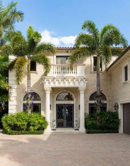
The Mediterranean-style property in Norwood Shores is the 6th Kips Bay Decorator Show House in Palm Beach. The annual event benefits Kips Bay Boys and Girls Clubs and the Boys and Girls Clubs of Palm Beach County. Photo: Nickolas Sargent

The Mediterranean-style property in Norwood Shores is the 6th Kips Bay Decorator Show House in Palm Beach. The annual event benefits Kips Bay Boys and Girls Clubs and the Boys and Girls Clubs of Palm Beach County. Photo: Nickolas Sargent

And if you would like to see more photos of the home, visit my blog.

Wrenda Goodwyn is a Southwest Florida interior decorator, A.S.I.D. associate and gold member of the Interior Redecorators Network. She helps homeowners throughout Southwest Florida with timeless, affordable ways to create beautiful spaces and solve decorating problems. Her articles appear the first Saturday of each month. For more information, visit her website at spectacularspaces.com. Call her at 239-850-5800 or e-mail wrenda@spectacularspaces.com. For more decorating tips, articles and photos, visit spectacularspaces.com/blog

Tips for using color in your home

Wrenda Goodwyn • special to the Fort Myers News-Press/USA Today Network • August 6, 2022

Color. It’s the tricky part of home decorating.

Too much of it and your home can look like the circus is in town. Too little of it and you end up with blah rooms that have no personality. We don’t want to be boring.

The trick is to get it just right.

Fort Myers August 6 at Home cover about color and how to make it work in your home.v

Home office in above photo follows the three color rule: walls in Nimbus Gray, matte; barn doors in Storm, advance interior satin; and trim in Pure White, pearl. Photo: Benjamin Moore

As a Southwest Florida interior decorator, two truths guided me when I began my business 20 years ago and continue to drive my design today. First, you don’t have to be rich to have a beautiful home. And second, no matter what your budget, color is the most important part of your design plan. It sets the tone for everything else.

A few color facts

• Color will change how you feel about your home.

• Color is powerful. A refreshed color plan in your home will take it from blah to WOW.

• Everyone has a color palette. You just need to find one that inspires you.

• The 60-30-10 rule works. This classic decor rule that helps create a color palette for a space, states that 60 percent of the room should be a dominant color, 30 percent should be the secondary color or texture and the last 10 percent should be an accent. But remember: rules are made to be broken.

So many ways to color your home

• You don’t have to put paint color on the walls (necessarily).

White on white shelving in kitchen with white and wicker accessories

White on white with textures and subtle accents, make this a beautiful color choice. Wall in Linen White OC-146, Aura Interior Paint, matte; shelves also in Linen White, advanced interior satin. Photo: Benjamin Moore.

• It’s possible (and very pretty) to have a neutral background and still have a home rich in color. Artwork, rugs, window treatments, upholstery, pillows, trims, lamps/lampshades, chandeliers, countertops, cabinets, books, backsplashes, furniture, the backs of open shelving, wall coverings, furniture, artwork. All opportunities for color.

• Ceilings (especially coffered ceilings) offer places for color with painting an entire room.

• No rule says you must have a brown sofa. Please try a color.

A few ways to use paint color

• One of my goals is to (usually) use no more than three paint colors in the home. This includes a neutral and two additional colors.

• If you have a color palette that you love but are hesitant to use any of the colors on the walls try this: paint a coffered ceiling, molding or trim in the color. With a pretty neutral color and the third color for accessories and the list above, you have a color plan.

Make a splash that radiates summer fun and happiness with Wild Flower 2090-40. Try it in a powder room or accent wall. Photo: Benjamin Moore.

• Note: a paint plan that worked in one home may not work in another. There are many differences to consider. Lighting, size of the home, furnishings, finishes. It’s easy to fall in love with a palette that worked previously but allows for some changes to suit your current home.

Remember these guidelines:

• If you are hesitant about color, remember, less is more.

• Artwork is a great way to create a color palette.

• Pillows, throws, accents, accessories add color that can be changed when you need a refresh.

• In open floor plans, be guided by the architecture to let you know where to start and stop paint color.

• Cohesion is key. We don’t want every room to be a different color. That would be too jarring. But we do want to carry something of our color scheme from room to room. This can be done in large ways or with accents or accessories.

• Link the outdoor spaces to the indoors by using the same color palette.

Create a color plan and take into consideration:

• Where is your home located?

• Do you prefer calm neutrals or dark rich colors?

• How will your plan work with your existing furnishings?

Find your inspiration

As someone who loves color, I keep a fan deck close at hand. I’m constantly saving photos of colors and palettes. And for me, most of those come from nature. Blues, greens, sandy whites and creams. To be honest, there is not a color that I don’t like. Well, maybe beige with lots of yellow undertones. It’s all a matter of finding the right balance.

Wrenda Goodwyn is a Southwest Florida interior decorator, A.S.I.D. associate and gold member of the Interior Redecorators Network. She helps homeowners throughout Southwest Florida with timeless, affordable ways to create beautiful spaces and solve decorating problems. Her articles appear the first Saturday of each month. For more information, visit her website at spectacularspaces.com. Call her at 239-850-5800 or e-mail wrenda@spectacularspaces.com. For more decorating tips, articles and photos, visit spectacularspaces.com/blog



Seeing green: color is optimistic, healing, calming

Wrenda Goodwyn • special to the Fort Myers News-Press/USA Today Network • June 4, 2022

It’s more than a passing trend.

 We’re seeing lots of green. And it’s no wonder. Green is believed to leave us optimistic and refreshed. It’s thought to have calming properties and it can be healing. And it helps to diffuse anxiety. In today’s stressful world, my take on it is that we need everything that green can bring into our homes. Right?

Cover of June 4, 2022 at home section of Fort Myers News-News-Press with article by Wrenda Goodwyn Bonita Springs and Estero-based interior designer.atabilafort

 It’s no coincidence that Benjamin Moore’s Color of the Year for 2022 is October Mist, a silvery green neutral that anchors a space and allows for other colors such as violet, yellows, blues and corals. And Sherwin Williams went for Evergreen Fog, with a bit of grey and blue in its selection for 2022.

Feng Shui teaches that green encourages new beginnings and renewal. Yes, please.

 It’s an easy color with so many choices from cool sage to bright emeralds and it can be used as a neutral or an accent. It’s no wonder it’s a bit of an obsession right now.

 The good news is that you can incorporate a little green into your decorating scheme without doing a major upheaval in your home. As an Estero-based interior designer, I have seen a noticeable increase in requests from my Southwest Florida clients who want to bring more green into their homes. Especially where the main color is a neutral. And why not? It’s perfect for our lifestyle.

 But like everything to do with your home, before you call the painter, you need a plan. Whether you want a lot of green or a hint here and there in your home, I have a few tips for ways of doing a little green refresh and making it look like you hired a designer to help you!

 ·       Feeling a little tired of gray? Some of the cool sage tones are good alternatives as a neutral color. And if you have gray as a neutral in your home, green is a perfect accent in the right shade. For a nice, neutral green, Benjamin Moore’s Soft Fern and Silken Pine are good options. And if you want to go a little deeper, consider Hancock Green and Hollingsworth Green. Check the recommendations in the chart in this article and with any paint color, please test the color before you paint.

Photo of green botanical wallcovering from Schumacherthat is hand-painted for a dose of breezy tropics.es

An array of palm fronds, feathery ferns and other tropical foliage enliven this exuberant green botanical wallpaper. Imagined and hand-painted in Schumacher’s New York design studio, this large-scale three-panel set is 12 feet high, allowing it to spread across and up the walls of a room for a tall dose of breezy tropics. Photo Schumacher. www.fschumacher.com

·       If you want to go bold and are ready for a major change, consider painting the kitchen cabinets. If your cabinets are white and you want to keep them that way, think about a green or blue-green glass backsplash. And a powder room is the perfect place for a beautiful emerald green or a dramatic wallcovering in the same shades.

·       For my tastes, green is best not used in a big way. Like for an entire large room.   Consider a green neutral for a bathroom or office but not necessarily for an entire Florida room.

Beautiful green laundry room in Benjamin Moore cedar grteen. Cabinets and trim in Benjamin Moore super white. Washing machine and dryer with folded towels. Roman shade/. Bucker of flowers.

Give the laundry room an unexpected green refresh with Benjamin Moore’s Cedar Green 2034-40, in eggshell. Cabinets: Super White OC-152, Advance, satin. Trim: Super White OC-152, Advance, semi-gloss. Photo Benjamin Moore. www.benjaminmoore.com

·       The color by no means has to be on the walls. There are ceilings. Especially if you have coffered ceilings. Painting them a bold green and adding a beautiful light fixture is just enough drama for a room.

·       Don’t forget the laundry room. It can be the most boring room in the house but try a gorgeous green on the walls and add a little fun art on the walls and everything changes.  A green sofa (I have one in my Florida room) or console or accent table add a lot of color happiness to a room. 

·       If you have white shutters or blinds, pick out a beautiful fabric with greens, blues and corals and have valances made for the windows. 

Ivy green color shaded bookshelf light from Ballard Designs.

We love the green shade but this ivy bookshelf light from Ballard Designs is also a unique task light made from a piece of solid marble with a swan neck and brass candle arm. A great (and useful) addition to your bookshelf. Photo: Ballard Designs. www.ballarddesigns.com

·       Just want a little touch of green? Paint the wall behind shelves or bookcases. A rug with blue-greens, a mural on an accent wall, framed botanical prints. Paint your front door. Green lamp shades or glass lamps. And there are always plants which keep our homes healthy and bring nature indoors. You can’t have enough of them!

 Wrenda Goodwyn is a Southwest Florida interior decorator, A.S.I.D. associate and gold member of the Interior Redecorators Network. She helps homeowners throughout Southwest Florida with timeless, affordable ways to create beautiful spaces and solve decorating problems. Her articles appear the first Saturday of each month. For more information, visit her website at spectacularspaces.com. Call her at 239-850-5800 or e-mail wrenda@spectacularspaces.com. For more decorating tips, articles and photos, visit spectacularspaces.com/blog
 

Finding comfort at home with color

Benjamin Moore Color of the Year 2021 Aegean Teal 2136-40. A blue-green with grey undertones, is soothing and tranquil with hints of the outdoors and nature. Walls: eggshell. Trim: Atrium White OC-145 in satin. Photo credit: Benjamin Moore

Benjamin Moore Color of the Year 2021 Aegean Teal 2136-40. A blue-green with grey undertones, is soothing and tranquil with hints of the outdoors and nature. Walls: eggshell. Trim: Atrium White OC-145 in satin. Photo credit: Benjamin Moore

Wrenda Goodwyn • special to the Fort Myers News-Press • Oct. 24, 2020

Before we know it, the election will be over. The holidays will be here. And we’ll be heading into a new year with optimism and hope as we say goodbye to a tumultuous 2020. It’s a time to reflect and reset. And there’s no better place to start than in our homes.

Benjamin Moore just announced its Color of the Year, Aegean Teal 2136-40 and the corresponding Color Trends 2021 palette. The colors have a welcoming, lived-in quality that is comforting, uplifting and inspiring. Colors that we can really use in our homes.

Cabinets: Benjamin Moore Color of the Year 2021 Aegean Teal 2136-40 in satin finish; walls: Aegean Teal 2136-40 in eggshell; trim: Gray Cashmere 21385 in satin. Photo credit: Benjamin Moore

Cabinets: Benjamin Moore Color of the Year 2021 Aegean Teal 2136-40 in satin finish; walls: Aegean Teal 2136-40 in eggshell; trim: Gray Cashmere 21385 in satin. Photo credit: Benjamin Moore

“Amid uncertainty, people yearn for stability. The colors we surround ourselves with can have a powerful impact on our emotions and wellbeing,” says Andrea Magno, Benjamin Moore director of color marketing & development.”

As Southwest Florida interior decorator, I’m designing more color palettes for my clients than ever before. Whether during an in-home consultation or virtually, everyone seems to be looking for a color refresh. As someone who lives, sleeps and breathes color, I’ve always believed that popular color trends somewhat reflect what is happening in the world and what we need.

Love this color and want to start out with an accent? Try the inside of a cabinet. Inside cabinet: Aegean Teal 2136-40in semi-gloss; cabinet exterior: Chestertown Bluff HC-9 in semi-gloss. Photo credit: Benjamin Moore

Love this color and want to start out with an accent? Try the inside of a cabinet. Inside cabinet: Aegean Teal 2136-40 in semi-gloss; cabinet exterior: Chestertown Bluff HC-9 in semi-gloss. Photo credit: Benjamin Moore

And it’s no surprise since our homes have never had to work so hard serving as an office, workout space, restaurant, classroom, library and more.

Thoughts about Aegean Teal

My clients know that I advise against following a color trend just for the sake of the trend. But they can be fun and bring a little energy to a room that needs refreshing.

Full disclosure, I love this color. The blue-green with grey undertones, is perfect for our Florida location near the Gulf of Mexico. It’s soothing and tranquil. Inviting. Hints of the outdoors and nature. There’s a harmony and a calm to it.

The entry, dining and living room coffered ceilings in my own home were painted with Aegean Teal 2136-40 and the walls seen here are Silver Satin 856.

I love this color so much I used it in the coffered ceilings of my own home and had a living room sofa upholstered to match, two years ago. It still gives me happiness.

I have this color in my own home. Two years ago, I had the coffered ceilings in my entry, dining and living room painted in this color. The walls are Benjamin Moore’s Silver Satin 856. I wanted just enough of this beautiful color to provide an accent. I like it so much that I had a sofa upholstered in the same color in my living room.

And here we are two years later and I still love it. Why? It gives me joy. It’s pure happiness every day. That’s what I want from a color: happiness. And it’s what I want for your home.

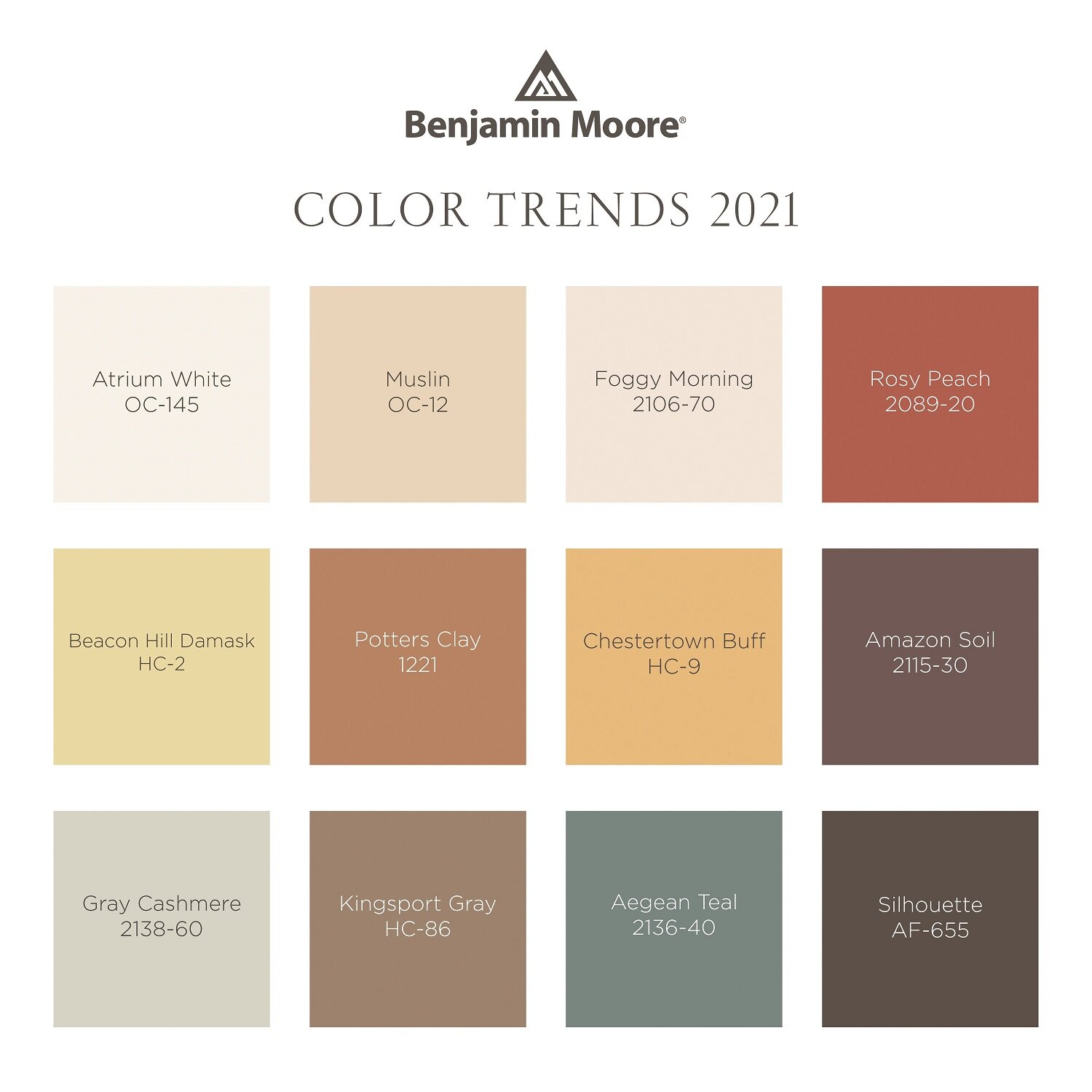
Benjamin Moore Color Trends 2021 palette including Muslin OC-12, Rossy Peach 2089-20, Beacon Hill Damask HC-2, Amazon Soil 2115-30 and Kingsport Gray HC-86, among others.

And if Aegean Teal does not work, check out the other 11 colors in the Color Trends 2021 palette. Described as having sunbaked qualities, they include Atrium White OC-145, Muslin OC-12, Foggy Morning 2106-70, Rosy Peach 2089-20, Beacon Hill Damask HC-2, Potters Clay 1221, Chestertown Buff HC-9, Amazon Soil 2115-30, Gray Cashmere 2138-60, Kingsport Gray HC-86, and Silhouette AF-655.

How to use Aegean Teal in your home

Just because you like a color does not mean that it has to (or necessarily should) go on the walls. There are many ways to incorporate color into your space. For Aegean Green, a few suggestions: front door, powder room, kitchen or bathroom cabinets, kitchen island, shelves or a bookcase in a high gloss, the back wall of a bookcase, wallcoverings, side table, ceilings, trim and baseboards, accessories, fabric, rug.

Daybed painted in Aegean Teal 2136-40 with fresh linen duvet and pillow shams in soft neutral tones and gray throw blanket by Muslin OC-12 flat wall.

Use Aegean Teal 2136-40 in satin for a window seat or piece of furniture. Walls shown are Muslin OC-12 flat. Photo credit: Benjamin Moore

It’s a fact that making a color change in your home is the biggest change you can make for your decorating budget. Note these tips when creating a new color palette:

Color don’ts

• Rush to make a decision

• Pick color from a tiny swatch

• Paint without testing the color on the wall

• Pick a paint color before you have anything else in the room

• Think only about the room that you are painting. Color needs to flow in order to work.

• Paint every room a different color.

Color do’s

• Create a color palette and work from there. Consider your window treatments, upholstery, pillows, artwork and accessories.

• Buy the best quality paint you can afford. It makes a difference. And go with the lowest VOC or no VOC.

• Color challenged? Magazines, Pinterest and vision boards all help.

• When all else fails, call a professional. Our job is to keep you from making mistakes.

We still have a couple of months before we say goodbye to 2020. This is a good time to begin planning your strategy for reenergizing your home.

Aegean Teal - Copy.png

Wrenda Goodwyn is a Southwest Florida interior decorator, A.S.I.D. associate and gold member of the Interior Redecorators Network. She helps homeowners throughout Southwest Florida with timeless, affordable ways to create beautiful spaces and solves decorating problems. Her articles appear the first Saturday of each month. For more information visit her website at spectacularspaces.com. Call her at 949-1808 or e-mail wrenda@spectacularspaces.com. For more decorating tips, articles and photos, visit spectacularspaces.com/blog

Thinking about pink: 2020 Color of the Year

Wrenda Goodwyn • special to the Fort Myers News-Press • October 26, 2019

It’s a good day to think about pink.

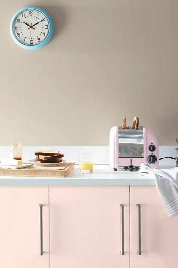
If you’ve been craving something pink in your palette, but have been afraid to make a commitment, this could be it. Living room accent wall with Benjamin Moore First Light 2102-70 on walls; White Heron OC-57 ceiling. Photo: Benjamin Moore

If you’ve been craving something pink in your palette, but have been afraid to make a commitment, this could be it. Living room accent wall with Benjamin Moore First Light 2102-70 on walls; White Heron OC-57 ceiling. Photo: Benjamin Moore

Actually, think about that pretty dusty glow first thing in the morning when the sun is coming up. Before the hot, Florida sun has brightened everything up. That’s First Light 2102, Benjamin Moore’s Color of the Year 2020.

Let’s face it: pink has been a popular, trending color for several years. In fashion (I give you Lilly Pulitzer), accessories and paint. We see lots of pink in Southwest Florida. Especially at the beaches. Every time I go to the beach I pass a beautiful pink home on the beach with the blue gulf behind it. I’m certain that I was meant to live in that home.

Photo: Benjamin Moore

Photo: Benjamin Moore

These color of the year announcements from paint companies are fun and playful. Not to be taken too seriously. It doesn’t mean that you are meant to redo your home every time a new color is highlighted. It’s just something to consider that you may not have when refreshing your home.

As a Southwest Florida interior designer, my job is to help my clients select what they like. Not what is trending. I present choices that are best for their home within the guidelines of what they like. We make it all flow together when creating a color palette. Get the color right and you will have a happy home. Miss the mark and something will always seem off.

My take on First Light 2102

It’s a happy color. Not sugary sweet.

A fun neutral between cool and warm. It’s should not be taken too seriously. This is not an in-your-face color.

To me, it presents an alternative to white or beige that is modern and refreshing.

It plays well with other colors. Some examples:

Colors that work well with First light. Photo: Benjamin Moore

Colors that work well with First light. Photo: Benjamin Moore

If you have been craving something pink in your palette, but have been afraid to make a commitment, this could be it.

How to use it

I love this color for ceilings and trim. Pair it with Decorator’s White or Simply White on the walls in a bedroom or dining room and you have a gorgeous room.

When selecting color, I always go with colors that are found in nature. This one certainly is, so don’t be afraid of it. A bathroom, living room or office that need a change would be perfect.

Bedding, pillows, accessories, window treatments in a white room.

Photo: Benjamin Moore

Photo: Benjamin Moore

Give it a test run as an accent color. Or a throw for your bed or sofa.

A new decade

“We selected First Light 2102-70 as our Color of the Year 2020 to represent a new dawn of idealism, design and living,” said Andrea Magno, Benjamin Moore Director of Color Marketing and Development. "First Light 2102-70 reflects a new definition of the home – a shift in mindset from the material to satisfying the core needs in life: community, comfort, security, self-expression, authenticity and ultimately, optimism.”

I think we could all use a strong dose of comfort and optimism. If First Light can give us that, I am all for it!


Wrenda Goodwyn is a Southwest Florida interior decorator, A.S.I.D. associate and gold member of the Interior Redecorators Network. She helps homeowners throughout Southwest Florida with timeless, affordable ways to create beautiful spaces and solves decorating problems. Her article appears the first Saturday of each month. For more information visit her website at spectacularspaces.com. Call her at 949-1808 or e-mail wrenda@spectacularspaces.com. For more decorating tips, articles and photos, visit spectacularspaces.com/blog

Color Matters

Wrenda Goodwyn • special to the Fort Myers News-Press • August 3, 2019

Color. It makes us feel happy. It changes everything including how we feel about our space. Get it right and you will love your home. Mess it up and you will always wonder why it’s not feeling quite right. Photo: Thibaut Design

Color. It makes us feel happy. It changes everything including how we feel about our space. Get it right and you will love your home. Mess it up and you will always wonder why it’s not feeling quite right. Photo: Thibaut Design

There I was at the gym the other morning. Slogging away on the treadmill.

I love working out and couldn’t figure out why it was such a struggle. Too much effort. Painful.

Then it hit me. This was a new fitness center and I had only been there a few times. The colors were fairly horrid. Brown walls in a shade I have never seen, brown flooring (to hide dirt…need I say more), grey equipment (of course) and it looked out over a grey parking lot with no vegetation or color of any kind. And it was an overcast day. On a sunny day this might be tolerable. Maybe.

Contrast this with my yoga studio which is done in creams, soft blues and greens. A glass wall looks out over a beautiful garden with lots of greenery and a fountain. I can’t wait to get there in the early morning and I am never anxious to leave.

Color matters

From the time we get that first box of crayons, we are fascinated by color. It has the power to change everything.

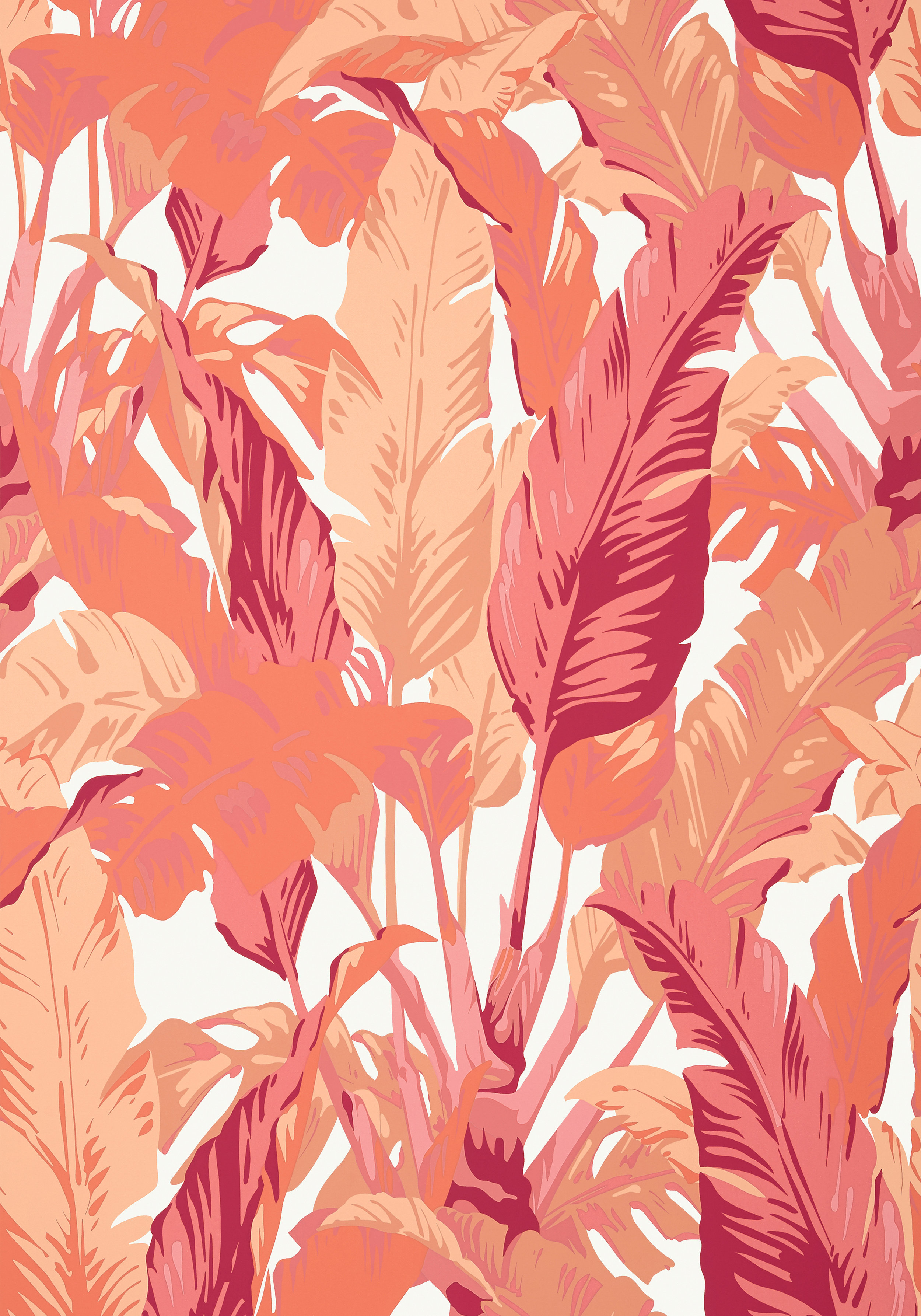
You can’t go wrong with blue and white as the foundation for a color palette. Shown here: Thibaut Design’s Travelers palm printed fabric. Other colors available. Photo: Thibaut Design

You can’t go wrong with blue and white as the foundation for a color palette. Shown here: Thibaut Design’s Travelers palm printed fabric. Other colors available. Photo: Thibaut Design

As an interior decorator working in Southwest Florida, my most requested service is selecting color and creating personalized color palettes for the home. It’s the most difficult part of decorating for most people and there are good reasons.

It’s a fact

We are fortunate to live in a tropical paradise where beautiful color palettes surround us.

The right color scheme can make a room look larger, prettier, lighter, darker, cleaner or happier. Color can give your home a beach vibe, modern coastal look, add a little boho chic, a cottage feeling or farmhouse style.

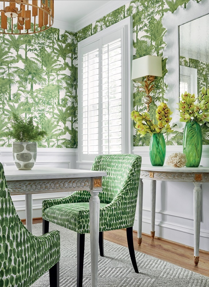
Palm Botanical wallpaper in Emerald Green from Thibaut Design’s Tropics Collection. Morgan Dining Chairs in Rain Water printed fabric in Green. Photo: Thibaut Design

Palm Botanical wallpaper in Emerald Green from Thibaut Design’s Tropics Collection. Morgan Dining Chairs in Rain Water printed fabric in Green. Photo: Thibaut Design

Limited budget? Pick color

Seriously. If you are on a limited budget and are able to only do one thing, select a new color palette. It will change everything and you’ll love your home again.

It makes us feel happy. It changes how we feel about our space (like that gym). Get it right and you will love your home. Mess it up and you will always wonder why it’s not feeling quite right.

It’s far from easy. It’s complicated. It’s why home interior professionals study it for years and most are like me and don’t leave the house without a fan deck in their hand. We are passionate about color. And we know all of the tricks.

Color don’ts

· Rush to make a decision.

· Go with the latest trends.

· Pick color from a tiny swatch.

· Paint without testing the color on the wall.

· Pick a paint color before you have anything else in the room.

· Think only about the room that you are painting. Color needs to flow in order to work.

· Paint every room a different color.

Color do’s

· Pick colors that are found in nature. You can’t go wrong.

· Create a color palette and work from there. Consider your window treatments, upholstery, pillows, artwork and accessories. Color is not just the paint that you put on the walls. Think about the big picture.

· With paint, buy the best quality paint you can afford. It makes a difference. And go with the lowest VOC or no VOC.

· Color challenged? Lots of homeowners are…magazines, Pinterest and vision boards all help.

· And when all else fails, call a professional. Our job is to keep you from making mistakes.

· Consider the ceiling. I often tint the paint for the ceiling so that it’s not such a stark white. Just a little splash links the ceiling to the walls. And if you have coffered ceilings, take advantage of this element with color.

Be fearless when it comes to color. It changes everything. Including how you feel. And who doesn’t want a happy home?

Photo: Thibaut Design

Photo: Thibaut Design


Wrenda Goodwyn is a Southwest Florida interior decorator, A.S.I.D. associate and gold member of the Interior Redecorators Network. She helps homeowners throughout Southwest Florida with timeless, affordable ways to create beautiful spaces and solves decorating problems. Her article appears the first Saturday of each month. For more information visit her website at spectacularspaces.com. Call her at 949-1808 or e-mail wrenda@spectacularspaces.com. For more decorating tips, articles and photos, visit spectacularspaces.com/blog