Tips for using color in your home

Wrenda Goodwyn • special to the Fort Myers News-Press/USA Today Network • August 6, 2022

Color. It’s the tricky part of home decorating.

Too much of it and your home can look like the circus is in town. Too little of it and you end up with blah rooms that have no personality. We don’t want to be boring.

The trick is to get it just right.

Fort Myers August 6 at Home cover about color and how to make it work in your home.v

Home office in above photo follows the three color rule: walls in Nimbus Gray, matte; barn doors in Storm, advance interior satin; and trim in Pure White, pearl. Photo: Benjamin Moore

As a Southwest Florida interior decorator, two truths guided me when I began my business 20 years ago and continue to drive my design today. First, you don’t have to be rich to have a beautiful home. And second, no matter what your budget, color is the most important part of your design plan. It sets the tone for everything else.

A few color facts

• Color will change how you feel about your home.

• Color is powerful. A refreshed color plan in your home will take it from blah to WOW.

• Everyone has a color palette. You just need to find one that inspires you.

• The 60-30-10 rule works. This classic decor rule that helps create a color palette for a space, states that 60 percent of the room should be a dominant color, 30 percent should be the secondary color or texture and the last 10 percent should be an accent. But remember: rules are made to be broken.

So many ways to color your home

• You don’t have to put paint color on the walls (necessarily).

White on white shelving in kitchen with white and wicker accessories

White on white with textures and subtle accents, make this a beautiful color choice. Wall in Linen White OC-146, Aura Interior Paint, matte; shelves also in Linen White, advanced interior satin. Photo: Benjamin Moore.

• It’s possible (and very pretty) to have a neutral background and still have a home rich in color. Artwork, rugs, window treatments, upholstery, pillows, trims, lamps/lampshades, chandeliers, countertops, cabinets, books, backsplashes, furniture, the backs of open shelving, wall coverings, furniture, artwork. All opportunities for color.

• Ceilings (especially coffered ceilings) offer places for color with painting an entire room.

• No rule says you must have a brown sofa. Please try a color.

A few ways to use paint color

• One of my goals is to (usually) use no more than three paint colors in the home. This includes a neutral and two additional colors.

• If you have a color palette that you love but are hesitant to use any of the colors on the walls try this: paint a coffered ceiling, molding or trim in the color. With a pretty neutral color and the third color for accessories and the list above, you have a color plan.

Make a splash that radiates summer fun and happiness with Wild Flower 2090-40. Try it in a powder room or accent wall. Photo: Benjamin Moore.

• Note: a paint plan that worked in one home may not work in another. There are many differences to consider. Lighting, size of the home, furnishings, finishes. It’s easy to fall in love with a palette that worked previously but allows for some changes to suit your current home.

Remember these guidelines:

• If you are hesitant about color, remember, less is more.

• Artwork is a great way to create a color palette.

• Pillows, throws, accents, accessories add color that can be changed when you need a refresh.

• In open floor plans, be guided by the architecture to let you know where to start and stop paint color.

• Cohesion is key. We don’t want every room to be a different color. That would be too jarring. But we do want to carry something of our color scheme from room to room. This can be done in large ways or with accents or accessories.

• Link the outdoor spaces to the indoors by using the same color palette.

Create a color plan and take into consideration:

• Where is your home located?

• Do you prefer calm neutrals or dark rich colors?

• How will your plan work with your existing furnishings?

Find your inspiration

As someone who loves color, I keep a fan deck close at hand. I’m constantly saving photos of colors and palettes. And for me, most of those come from nature. Blues, greens, sandy whites and creams. To be honest, there is not a color that I don’t like. Well, maybe beige with lots of yellow undertones. It’s all a matter of finding the right balance.

Wrenda Goodwyn is a Southwest Florida interior decorator, A.S.I.D. associate and gold member of the Interior Redecorators Network. She helps homeowners throughout Southwest Florida with timeless, affordable ways to create beautiful spaces and solve decorating problems. Her articles appear the first Saturday of each month. For more information, visit her website at spectacularspaces.com. Call her at 239-850-5800 or e-mail wrenda@spectacularspaces.com. For more decorating tips, articles and photos, visit spectacularspaces.com/blog




How to correct home decorating mistakes

Wrenda Goodwyn • special to the Fort Myers News-Press/USA Today Network • April 3, 2021

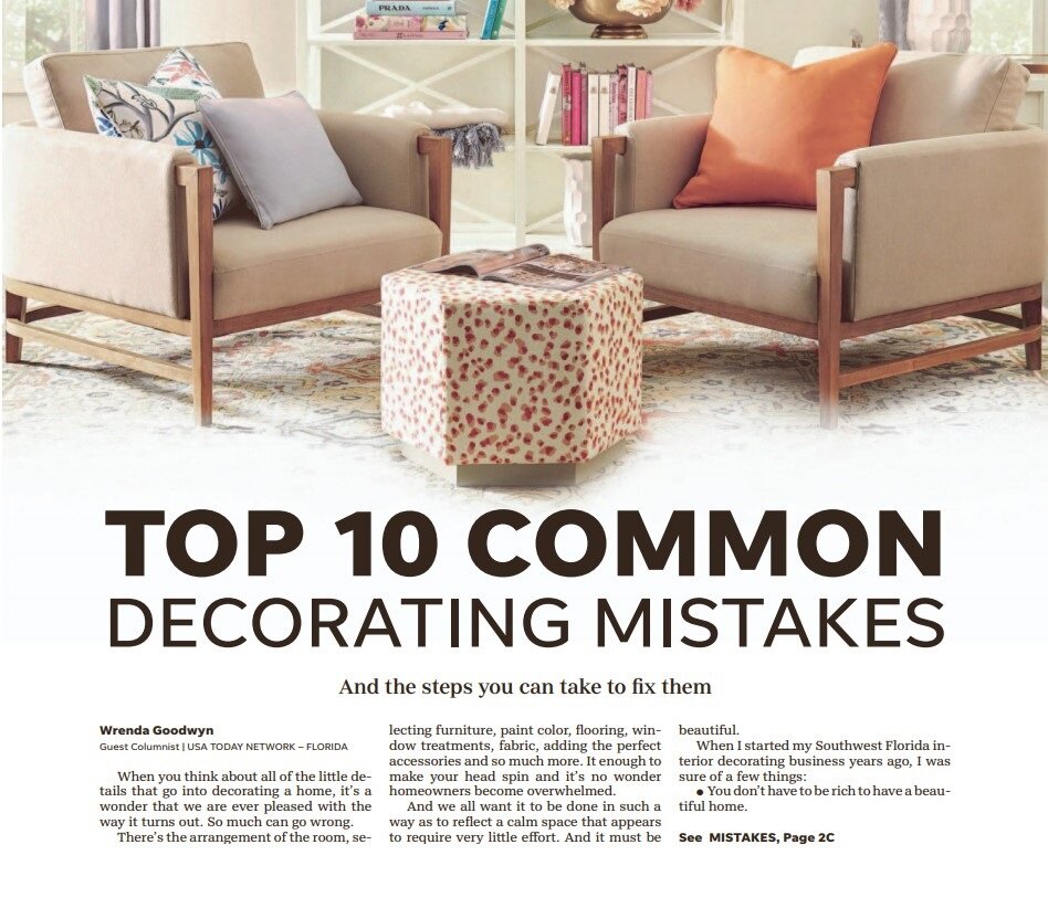
Fort Myers News-Press tearsheet featuring pair of Jaxon chairs, double Bourdonnais bookshelves, and colorful accessories.

When designing a room, keep in mind that our eyes love pairs. In this room above from Ballard Designs, notice the beautiful double Bourdonnais bookshelves, pair of drapery panels, two matching Jaxon chairs, a Riley ottoman in Mira Spice fabric and a Carli hand-tufted rug to anchor the room. Photo: Ballard Designs

When you think about all of the little details that go into decorating a home, it’s a wonder that we are ever pleased with the way it turns out. So much can go wrong.

There’s the arrangement of the room, selecting furniture, paint color, flooring, window treatments, fabric, adding the perfect accessories and so much more. It enough to make your head spin and it’s no wonder homeowners become overwhelmed.

And we all want it to be done in such a way as to reflect a calm space that appears to require very little effort. And it must be beautiful.

When I started my Southwest Florida interior decorating business years ago, I was sure of a few things:

• You don’t have to be rich to have a beautiful home.

• You need a plan before you dive in and make purchases.

• It’s important to correct common decorating mistakes that may be making you unhappy with your space.

If you have worked really hard to create a beautiful space but something is still a little off, check out these 10 common decorating mistakes. We have all made them and chances are, you can make a few changes by the end of this article.

10 common decorating mistakes

• Lack of a focal point. Usually TV, fireplace, view, a fantastic piece of furniture, styled bookcase or art.

• Awkward conversation area. The U shape works best with sofa and two chairs on each side. There are many configurations for this shape but keep the U for the best result.

• Where are the pairs? Our eyes love pairs. They anchor the room. Think: chairs, lamps, stools, bookcases.

• Incorrect use of lighting. Most rooms do not have enough light. We all need ambient, accent and task lighting. We also need dimmer switches and extra outlets.

• Color confusion. The 60-30-10 rule: It states that 60% of the room should be a dominant color, 30% should be the secondary color or texture and the last 10% should be an accent.

• Lack of a plan and budget. Enough said.

• Room is off balance. If possible, pull the furniture away from the walls (this is not always possible). Always avoid too much furniture on one side of the room.

• Bad traffic pattern. You need space to walk and move. This is usually the result of too much furniture or incorrectly arranged.

• Using too many accessories. In a small space? Eliminate tchotchkes. Otherwise, group collections together and avoid spreading them all over the home.

• Poorly displayed artwork. Most of us hang it too high. A good rule is to hang art so that its midpoint is between 57 and 60 inches from the floor. Lay out your arrangement on brown wrapping paper and get it just right before nailing into the wall. And leave a wall empty so your eyes have a place to rest.

Worth remembering for your home decor:

• Your home should tell a story about you and what you love.

An indoor-outdoor woven resin and teak daybed topped with blue and white throw pillows sits on a rough brick patio in front of lush greenery.

So many details go into designing a space. And we all want it to reflect a calm that appears to require very little effort. And it must be beautiful. Accents make all the difference in an indoor or outdoor space. They also give our home its personality. This Cypress Daybed from Ballard Designs works in either and is just the piece to add character into a home. Photo: Ballard Designs.

• Do it once and do it well.

• Vintage pieces breathe soul into a room.

• A home with character takes time. Don’t rush it.

• Redoing a room? Select fabric (drapes, rugs, upholstery) first. Then select paint.

• Rules are made to be broken!

A few things to avoid in your home:

• Pull out beds. Sorry.

• Go easy on themes.

• Don’t design a room like you see it in a magazine.

• Patterned sofas. We aren’t living in the sixties.

• Constantly rearranging clutter. Ditch it.

• Backless barstools.

Wrenda Goodwyn is a Southwest Florida interior decorator, A.S.I.D. associate and gold member of the Interior Redecorators Network. She helps homeowners throughout Southwest Florida with timeless, affordable ways to create beautiful spaces and solves decorating problems. Her articles appear the first Saturday of each month. For more information visit her website at spectacularspaces.com. Call her at 239-850-5800 or e-mail wrenda@spectacularspaces.com. For more decorating tips, articles and photos, visit spectacularspaces.com/blog

Open floor plans: How to make them work

Wrenda Goodwyn • special to the Fort Myers News-Press • March 3, 2018

On a recent Saturday morning, I had a call from someone who began the conversation with these words: "I need help. Now."

The desperate, soon-to-be-design client had just taken delivery of her furniture from her home in Michigan. It was piled up in her brand new “open concept home” and she did not know what to do.  Her comment was “I’ve never had a house without walls and I don’t know what to do.” 

As a Fort Myers interior decorator, I can tell you that my biggest request, after coming up with a color palette, is help with arranging furniture in an open space where rooms flow one into the other.

European wide plank hardwood in this open floor plan gives the space a natural organic element and a timeless look. Photo courtesy of Tricia Pallak, the Wood Floor Company, Naples and Bonita Springs.

European wide plank hardwood in this open floor plan gives the space a natural organic element and a timeless look. Photo courtesy of Tricia Pallak, the Wood Floor Company, Naples and Bonita Springs.

The concept is a great one. It can be beautiful if arranged and accessorized well. It can also be a challenge.

The benefits: the open concept will make any space feel larger and it’s great for entertaining.

The challenges: Lack of privacy, less room for art and electrical outlets, the large open space does not hide clutter so you are always cleaning up.

Walk into a model home where the entry, family room, dining room, kitchen all flow into one large space and it looks beautiful. Trying to make it work in your own home with your existing furnishings can stress the savviest homeowner.

But not to worry.  Check a few of these tips and you will have a plan to make the open concept work in your home. And that’s important because it’s here to stay. In other parts of the country builders seems to be reverting back to more walls and rooms. But in Southwest Florida, that likely will not change any time soon. Open and spacious is just our style.

Establish a comfortable conversation area in an open floor plan with a this square arm, slipcovered corner sectional, a rug and large accent light to anchor the space. Photo courtesy of Pottery Barn.

Establish a comfortable conversation area in an open floor plan with a this square arm, slipcovered corner sectional, a rug and large accent light to anchor the space. Photo courtesy of Pottery Barn.

Warm up the floors. If possible, consider hardwood flooring.  At least in the public/living areas of the home. You can establish room boundaries with area rugs. It gives the open spaces a timeless look and a backdrop for furnishings and artwork. 

Coffered ceilings and crown molding. They fill up some of the open space, establish living areas and add a design element. If you are unable to do this, install a large fan in the family/living room.

Keep the color palette neutral for the walls. Bring color into the space with accents on the ceilings and accessories.

Floor to ceiling drapes or fabric panels. Open spaces cry out for fabric. In addition to your sofa, chairs, rugs.

Add a few architectural details. Molding and paneling such as shiplap or wainscoting provide some separation for an entry or dining area or breakfast nook.

Lighten up. Avoid heavy, over-sized furniture in open spaces. They take over the room and defeat the goal of a light, flowing space.

Arrange furniture away from the walls. This enables you to create comfortable conversation areas in the space with a classic look.

Consistency pays off. Maintain a consistent look in furnishings, color palette and accessories. The last thing you want is a hodgepodge of styles in a space that you can see from each room.

When it comes to artwork, think BIG.  Wall space is at a premium in an open floor plan. Incorporate large pieces to give it an art gallery look. Perfect for an open concept plan.

Glam it up and arrange a dining space with plants, rug and a beautiful Adeline crystal chandelier.  Photo courtesy of Pottery Barn.

Glam it up and arrange a dining space with plants, rug and a beautiful Adeline crystal chandelier.  Photo courtesy of Pottery Barn.

Glam it up. Establish specific areas of the space with a rug, lighting, or plants. This is especially effective in a dining area of a larger space.

Consider your other rooms.  With an open floor plan, the master bedroom is usually off the main space. Take this room into consideration when establishing a color palette and other décor elements if it can be seen from the main space.

Limit patterns. You want to keep your space calm and flowing. One room into the other. Neutral with accents and bold colors work best.

Fill the space with what you love. That is the most important tip!


Wrenda Goodwyn is a Southwest Florida interior decorator, A.S.I.D. associate and certified gold member of the Interior Redecorators Network. She has helped homeowners throughout Southwest Florida with timeless, affordable ways to create beautiful spaces and to solve decorating problems. Her article appears the first Saturday of each month. For more information visit her website at spectacularspaces.com. Call her at 949-1808 or e-mail wrenda@spectacularspaces.com. For more decorating tips, articles and photos, visit spectacularspaces.com/blog