Thinking about pink: 2020 Color of the Year

Wrenda Goodwyn • special to the Fort Myers News-Press • October 26, 2019

It’s a good day to think about pink.

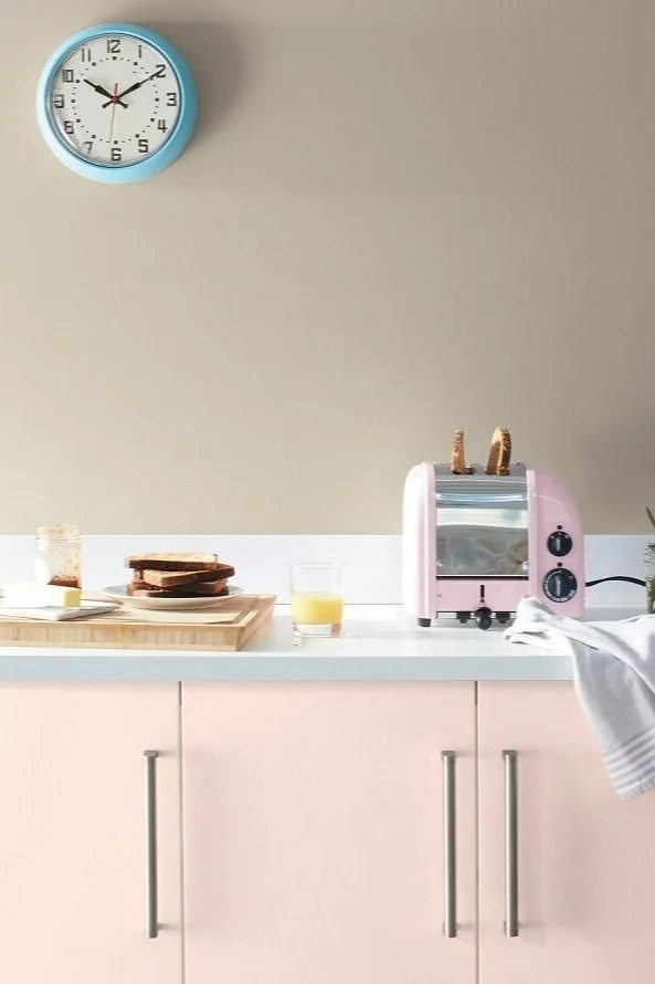
If you’ve been craving something pink in your palette, but have been afraid to make a commitment, this could be it. Living room accent wall with Benjamin Moore First Light 2102-70 on walls; White Heron OC-57 ceiling. Photo: Benjamin Moore

If you’ve been craving something pink in your palette, but have been afraid to make a commitment, this could be it. Living room accent wall with Benjamin Moore First Light 2102-70 on walls; White Heron OC-57 ceiling. Photo: Benjamin Moore

Actually, think about that pretty dusty glow first thing in the morning when the sun is coming up. Before the hot, Florida sun has brightened everything up. That’s First Light 2102, Benjamin Moore’s Color of the Year 2020.

Let’s face it: pink has been a popular, trending color for several years. In fashion (I give you Lilly Pulitzer), accessories and paint. We see lots of pink in Southwest Florida. Especially at the beaches. Every time I go to the beach I pass a beautiful pink home on the beach with the blue gulf behind it. I’m certain that I was meant to live in that home.

Photo: Benjamin Moore

Photo: Benjamin Moore

These color of the year announcements from paint companies are fun and playful. Not to be taken too seriously. It doesn’t mean that you are meant to redo your home every time a new color is highlighted. It’s just something to consider that you may not have when refreshing your home.

As a Southwest Florida interior designer, my job is to help my clients select what they like. Not what is trending. I present choices that are best for their home within the guidelines of what they like. We make it all flow together when creating a color palette. Get the color right and you will have a happy home. Miss the mark and something will always seem off.

My take on First Light 2102

It’s a happy color. Not sugary sweet.

A fun neutral between cool and warm. It’s should not be taken too seriously. This is not an in-your-face color.

To me, it presents an alternative to white or beige that is modern and refreshing.

It plays well with other colors. Some examples:

Colors that work well with First light. Photo: Benjamin Moore

Colors that work well with First light. Photo: Benjamin Moore

If you have been craving something pink in your palette, but have been afraid to make a commitment, this could be it.

How to use it

I love this color for ceilings and trim. Pair it with Decorator’s White or Simply White on the walls in a bedroom or dining room and you have a gorgeous room.

When selecting color, I always go with colors that are found in nature. This one certainly is, so don’t be afraid of it. A bathroom, living room or office that need a change would be perfect.

Bedding, pillows, accessories, window treatments in a white room.

Photo: Benjamin Moore

Photo: Benjamin Moore

Give it a test run as an accent color. Or a throw for your bed or sofa.

A new decade

“We selected First Light 2102-70 as our Color of the Year 2020 to represent a new dawn of idealism, design and living,” said Andrea Magno, Benjamin Moore Director of Color Marketing and Development. "First Light 2102-70 reflects a new definition of the home – a shift in mindset from the material to satisfying the core needs in life: community, comfort, security, self-expression, authenticity and ultimately, optimism.”

I think we could all use a strong dose of comfort and optimism. If First Light can give us that, I am all for it!


Wrenda Goodwyn is a Southwest Florida interior decorator, A.S.I.D. associate and gold member of the Interior Redecorators Network. She helps homeowners throughout Southwest Florida with timeless, affordable ways to create beautiful spaces and solves decorating problems. Her article appears the first Saturday of each month. For more information visit her website at spectacularspaces.com. Call her at 949-1808 or e-mail wrenda@spectacularspaces.com. For more decorating tips, articles and photos, visit spectacularspaces.com/blog

Simply white: How to get it right in your home

Wrenda Goodwyn • special to the Fort Myers News-Press • November 14, 2015

When Benjamin Moore recently announced its 2016 Color of the Year – Simply White OC-117, there was a lot of surprise among designers and homeowners. Many wondered why Benjamin Moore had selected a color that was lacking in color. Others love it for its versatile, crisp, cleanliness.

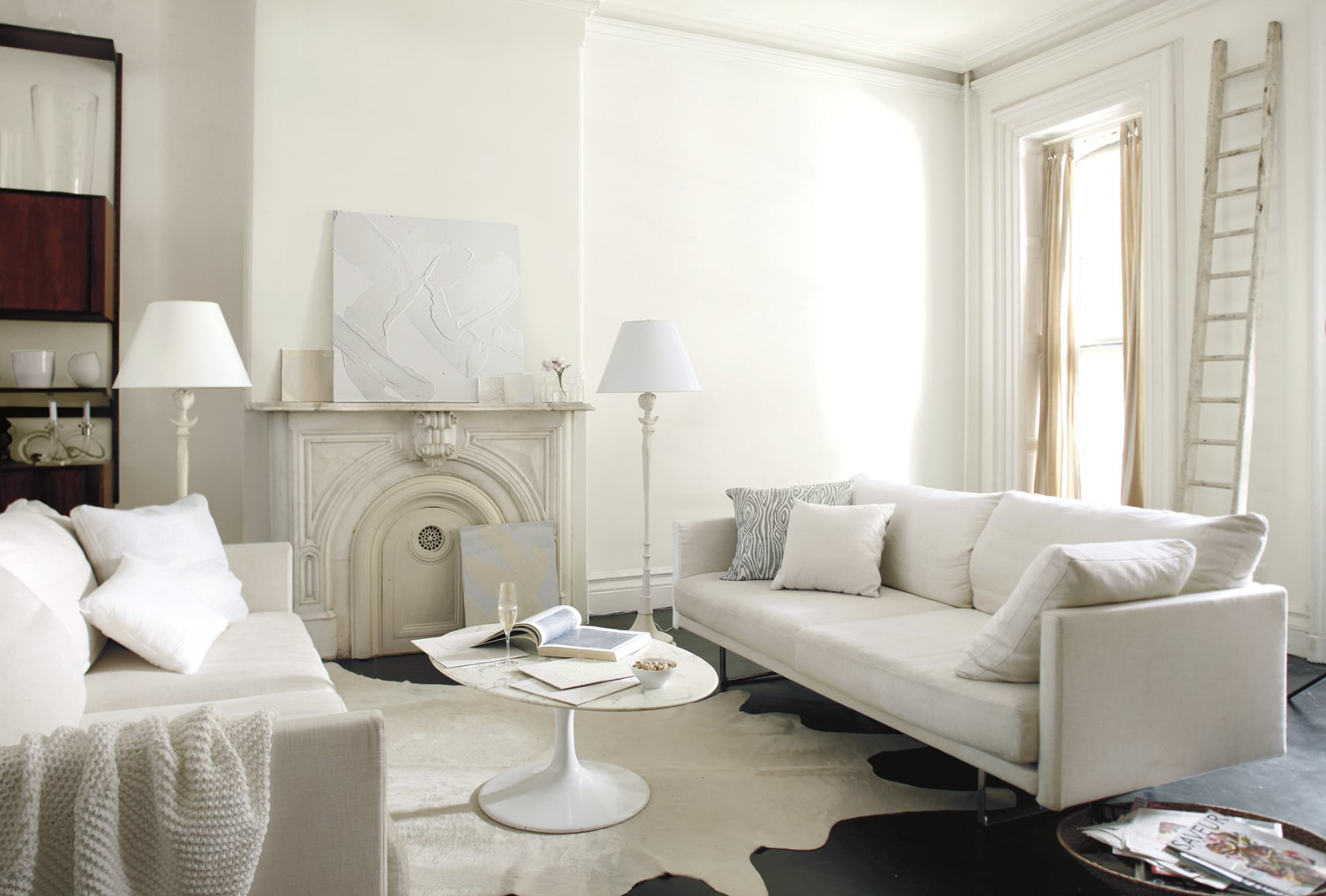
 All white family room walls are done in Simply White )C-117, matte finish. Trim is Simply White semi gloss. Photo: Benjamin Moore.

 All white family room walls are done in Simply White )C-117, matte finish. Trim is Simply White semi gloss. Photo: Benjamin Moore.

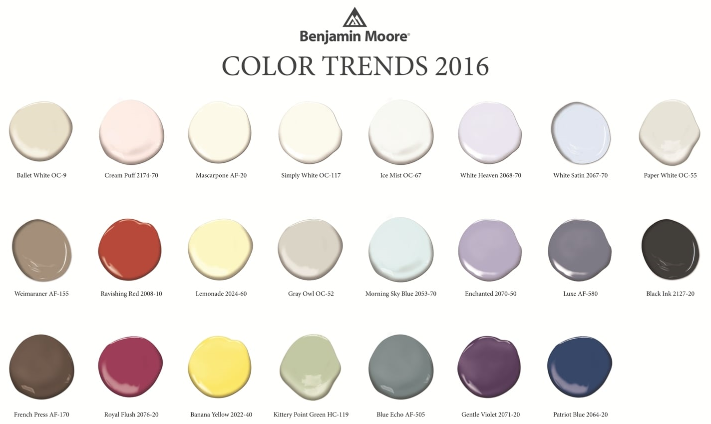
At the same time, the company also unveiled Color Trends 2016, a corresponding palette of 23 colors to illustrate how white works within the color spectrum. The selections include a variety of yummy hues like Lemonade, Patriot Blue, French Press, Creme Puff, Ravishing Redand Gentle Violet. And this is where white really shines.

Where do these trends come from?

The Benjamin Moore Color Studio forecasts color trends after a year of research attending major industry shows around the world, while also taking cues from standouts in architecture, fashion, textiles, home furnishings and the arts. White transcends style, and is seen in traditional, transitional and modern interiors.

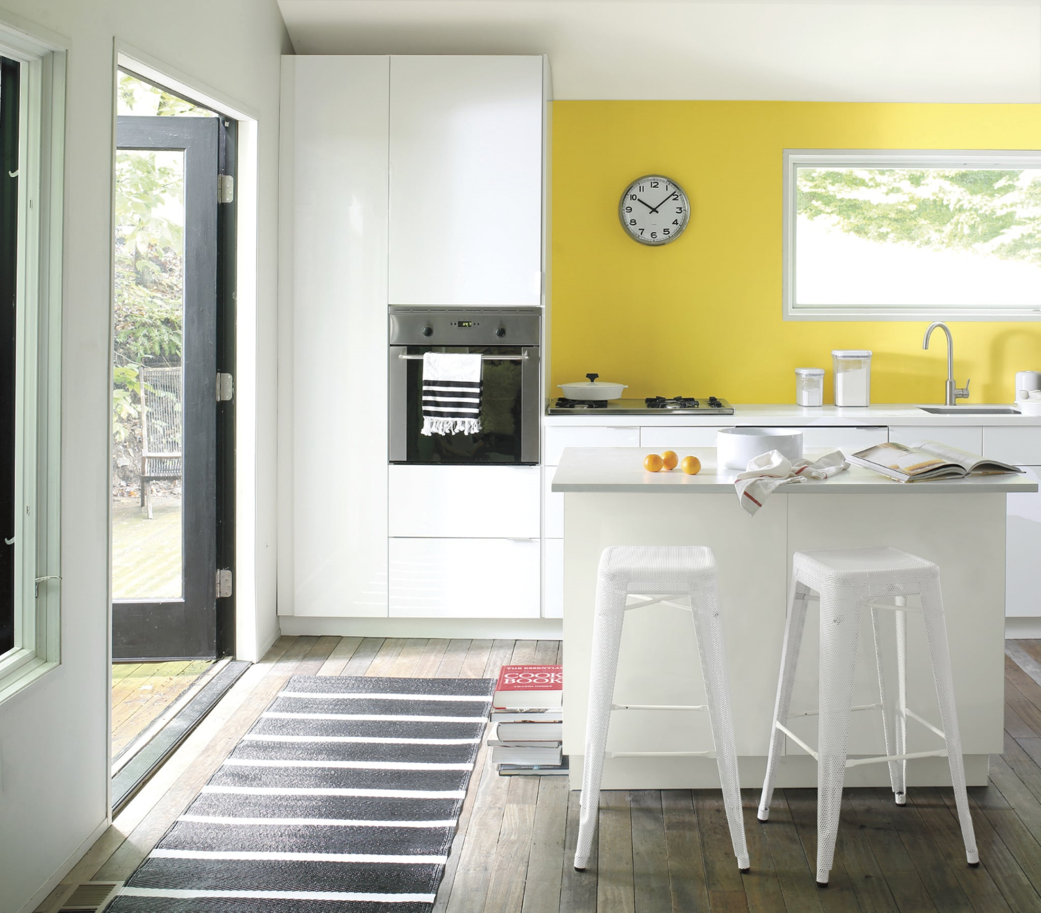
White with a pop of cheerful yellow. Accent wall in Banana Yellow 2022-40, eggshell finish.  Wall and ceiling in Paper White OC-55, eggshell finish. Ceiling in Waterborne Ceiling Paint, ultra-flat finish. Photo: Benjamin Moore.

White with a pop of cheerful yellow. Accent wall in Banana Yellow 2022-40, eggshell finish.  Wall and ceiling in Paper White OC-55, eggshell finish. Ceiling in Waterborne Ceiling Paint, ultra-flat finish. Photo: Benjamin Moore.

As a Fort Myers interior decorator who spends every waking moment thinking about color and creating color palettes for my clients, I can tell you two things about white:

·       It's not boring. That would be beige but not white. It's like an artist's canvas. Start with white and you can go anywhere without a commitment that will come back to haunt you. And there is no color that doesn't work with white. The right white.

Normal
0


false
false
false

EN-US
X-NONE
X-NONE


MicrosoftInternetExplorer4


 <w:LatentStyles DefLockedState="false" DefUnhideWhenUsed="true"
DefSemiHidden="true" DefQFormat="false" DefPriority="…

Create a beautiful color palette for your home using white and Benjamin Moore's Color Trends for 2016. Photo: Benjamin Moore.

·       Depending upon the room, the light, the furnishings, the artwork, white can be bit tricky to pull off.  Done well, it's spectacular. Done poorly, it leaves a lot to be desired. I like to start with white as a backdrop and build the room from there with lots of texture, accents and accessories.

My favorite white rooms

·       Master bathrooms. No color gives a master bath a cleaner, more spa-like feel that white. Combine it with white tile, towels, rugs, accessories and beautiful white sconces and you have a total makeover.

·       Kitchens. Dark flooring, white cabinets and countertops, stainless pendant lighting, white or stainless appliances. Perhaps a yellow or blue accent wall. Beautiful.

Try either of these options and you will have friends asking for the name of your interior decorator.

Add drama to a white room with a wall done in Mascarpone AF-20, eggshell finish. Entry is in Royal Flush 2076-20 in eggshell finish. Trim (semi gloss) and door (satin finish) in Ballet White OC-9. Photo: Benjamin Moore.

Add drama to a white room with a wall done in Mascarpone AF-20, eggshell finish. Entry is in Royal Flush 2076-20 in eggshell finish. Trim (semi gloss) and door (satin finish) in Ballet White OC-9. Photo: Benjamin Moore.

If you are thinking about a white room in your home

·       White can be very dramatic by itself or with accent walls or just the right furnishings.

·       White gives you a chance to start with a clean palette. To experiment with other colors, accent walls. All without the commitment of an expensive wallpaper.

·       Yes, white is a color.  There are 200 whites at Benjamin Moore. Five of the top ten selling paints in their collection are whites.

·       Beware of undertones. Yes, those pesky shades of green, pink, blue, gray...depending upon the color and the lighting. Get around making a mistake by painting a portion of a wall as a test and check it out as the light changes during the day. This is something that I tell my clients to do with any color but with white it's especially important.

·       White is forgiving. It can make flaws in your walls fade away where a bright color calls attention to every detail.

·       If white frightens you, start with white sofas, chairs. Then see if you want to go further. White can be in your accessories and furnishings. It does not have to be on your walls.

·       A white room requires lots of textures and accessories. My favorite: white walls, dark flooring, area rugs,  white comfy sofas, lots of colorful pillows, green plants, colorful art on walls,  white shutters. This is a room that if pulled together correctly, screams "come in and make yourself at home."

And that's what it's all about.

Wrenda Goodwyn is a Southwest Florida interior decorator. Her column, Home Inspirations appears the first Saturday of each month. Visit her website at spectacularspaces.com. Call her at 949-1808 or e-mail wrenda@spectacularspaces.com. For more decorating tips and photos, visit spectacularspaces.com/blog

Tips for creating a calm space in a not-so-calm world

Wrenda Goodwyn • special to the Fort Myers News-Press • August 29, 2015

It's all about how you feel when you walk in the door.

Does your home make you happy? Is it a calm retreat from the chaos and over stimulation of the outside world? Do you constantly feel overwhelmed by projects that you just can't quite complete? Are you tired and drained and not sure why?

We all want a nurturing home that offers a refuge. Not one that leaves you frustrated and exhausted.

Relaxing and pretty. Suzanne Kasler curated softly colored abstract art that pairs with her signature fabrics and finishes for Ballard Designs. Photo: Ballard Designs.

Relaxing and pretty. Suzanne Kasler curated softly colored abstract art that pairs with her signature fabrics and finishes for Ballard Designs. Photo: Ballard Designs.

As a Southwest Florida interior decorator, I have my clients fill out a brief questionnaire before I meet with them.  The first question: "How do you want your home to feel when you walk in the door?"

Tell me how you want your home to feel and I will make everything else fall into place.

Each answer is the same. Everyone wants a "calm" home. Of course we do.

It's not about "stuff."  You may have everything that you could dream of in your home and it still doesn't feel right. Check out these tips that I use for my clients and see how it changes your space.

Declutter.

We talk about this a lot in design and decorating but if you don’t do anything else, do this one. It costs nothing. And it has the most impact. Do it today!

Delete some of the visual stimulation. Pare down your accessories. Eliminate or rearrange some furniture and establish a comfortable conversation area that is relaxing.

And your closet. Most of us wear 10% of what is in our closets. So why not just have the 10% in your closet? Instead of the piles of clothes that you never wear any more. It’s all visual clutter and it’s exhausting to look at and to think about.

But sometimes the thought of decluttering itself is overwhelming. Just the physical aspect of getting rid of things and deciding what to do with them is difficult and stops homeowners in their tracks. Because it requires sorting it into what gets donated, given away and tossed. The solution: leave that part for another day. Remove it all from your house. Stash it in the garage until you have time to make the decisions.  Meanwhile, you will love your decluttered home so much that you won’t mind saying goodbye to the clutter when the day comes.

Don't over decorate.

The eyes need a place to rest. Don't cover every surface and every wall.  Don't be afraid of space. It is what most of our homes are lacking and it's the very thingthat creates a calm home.

Splurge in the bedroom.

Create a space to end your day with comfortable linens and fresh colors. Photo: Pottery Barn.

Create a space to end your day with comfortable linens and fresh colors. Photo: Pottery Barn.

Comfortable pillows. Nice sheets and comforter. A window treatment that blocks out the light. Pretty, restful artwork and accessories that make you feel good. We all spend a lot of time in this room and it's not the place to cut corners.

Transform with soothing colors.

Rethink your color palette and drop it down a notch. Soothing colors and more muted fabrics equal a calmer home. Save the bold colors for your family room and outdoor spaces. Of course this does not mean that a well-place splash of color against the most toned down backdrop is not gorgeous!

Design a spa bathroom for relaxation.

This is a service that I have done for my clients since I have been decorating homes. And it’s really easy. You can do it today. Think about what you love at a luxurious hotel or spa. Lots of white. Clean and crisp. Fluffy towels. Thick rugs. Plants.  Candles. Soaps and aromatherapy.  And don’t forget a spa robe. White is the key here and it must be done in a spotlessly clean bathroom. This should be your calming retreat at the end of the day.

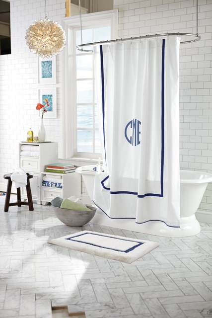
For a spa look, try this Morgan shower curtain of soft cotton with a band of color, along with organic cotton towels. Photo: Pottery Barn.

For a spa look, try this Morgan shower curtain of soft cotton with a band of color, along with organic cotton towels. Photo: Pottery Barn.

Lighting.

Forget the harsh, overhead lighting and install dimmers on all lighting.

Remove the bad vibes.

We all have them. Something that you carry around from home to home. You don’t like it but you don’t feel like you can get rid of it. Give yourself permission. Keep what makes you happy and anything with a negative or tiring association, send it out into the world where someone else will find it useful. It may be art, a photo or a piece of furniture that no longer serves you. Remember: it’s your home and you are not obligated to keep anything.

Create a space for solitude.

Give yourself permission to have a nook or part of a room where you can relax. Just you. Maybe it’s space for a yoga mat or a lounge chair where you can read. Create a corner in your home where there are no electronics or noises. A place where you can think and start to wind down from the day.


Wrenda Goodwyn is a Southwest Florida interior decorator. Home Inspirations appears the first Saturday of each month. Visit her website at spectacularspaces.com. Call her at 949-1808 or e-mail wrenda@spectacularspaces.com. For more decorating tips and photos, visit spectacularspaces.com/blog


Color your home with happiness

Wrenda Goodwyn • special to the Fort Myers News-Press• June 6, 2015

Color is the first thing we notice about a home. Does your color make you happy every time you walk in the door? Photo: Benjamin Moore.

Color is pretty much my life.

I live with a fan deck in my hand and I constantly pull it out wherever I go to match colors, to plan a color palette or just because I see a color or a fabric that I want for a client.

As a Fort Myers interior decorator, I do more color consultations than any other design service.  And there is one big reason for that: Color is the most difficult challenge for most homeowners. Get it right and the results are pure joy. Get it wrong and you will always feel like something is off in your home. And it is. Really off. If the color is not right, nothing else matters. Trust me on this.

Color is the first thing we notice about a home. Does your color make you happy every time you walk in the door?

Having the right color palette in your home is the difference between a happy home and one that says "hope you can live with me."

So many colors! How do you select the right ones? Photo: Benjamin Moore.

And it's not easy. It can be daunting. Color just plain stumps most people. So, if you are one of those people, and most of you are, I have a few tips to consider when selecting color.  Follow these tips and you will be ready to take the plunge. Or not. You may also be ready to call in a professional who can help you sort it all out and remove the stress.  After all, color creates a happy home and process should be fun.

Here we go with my favorite "don'ts."

  • Don’t ask a painter or a paint store to help you select color. They sell paint. Not color. They are not decorators or designers. They are painters who put paint on the wall  or paint sellers. Simply put, they know how to paint a house and can tell you the best kind of paint to use but they just don't know how to select color.
  • Don’t select a color from one of those itsy bitsy fan deck samples or tiny swatches. You must (and this is non-negotiable) test the color by painting a large area or a foam core board.
  • Don't just throw the paint on the wall and make a decision. I insist  that my clients "live" with the test color for a few days. Light changes throughout the day and is different in each room and that must be taken into consideration.

Now for some do's.

&nbsp;Color palette from the Benjamin Moore Williamsburg Collection.

 Color palette from the Benjamin Moore Williamsburg Collection.

  • Make a plan for the room (or house) before you look at color. You have to start somewhere when designing an empty room and that should not be with the paint color. Select furnishings,  fabric, counter tops and other finishesand even a few accessories and THEN look at color. I have clients who call and ask me to have an entire new home painted by next week before they select furniture. You may love that pretty coral paint but what happens when you fall in love with a sofa that doesn't relate to the color? Answer: you have to repaint. We want to avoid that costly mistake!  If you want coral, accessories may be the best way to go.
  • Forget this rule. It's just not true. I don't know who started it but painting small spaces a dark color does NOT make the room look smaller. My favorite: powder rooms done in dark hues.
  • It's fun to break decorating rules but this is one I never stray from: when selecting a color palette,  follow nature as your guide. Mother Nature has perfected the color palette soimitate her. This is a rule I always follow. If it's not a color found in nature, forget it.
  • Stick with two or three (at the most colors for your home. The result: Beautiful and restful. You can add more color with accessories.  Don't try to put all of your color on the walls. Tip: the right pillows will change any room!
  • Connect your rooms.  Don't make each room a completely different color. You want to have a plan so the house makes sense. An idea my clients seem to like: paint all of the main rooms (living room, entry, kitchen) a neutral shade. Use color in the bathrooms, bedrooms and den. I also like to paint the master bedroom and bath in coordinated shades to give it a hotel/master suite feeling.
  • One current trend that I love and encourage my clients to try: No more white ceilings! Check out the decorating magazines.  We are now using color on the ceilings or a cream shade. No more super white.
  • My latest color crush: Boca Raton Blue by Benjamin Moore. I can't think of a room that shouldn't have a little of this color. At least paint a front door (on both sides) or an entry ceiling.
  • Consider undertones. All color is not created equal. Look at the number of whites that you can select from on a fan deck. The reason a color works or does not work: undertones.
  • When in doubt, go neutral. This never fails. Neutral walls with stronger hues in fabric and accessories.  And if you really have doubts and don't know where to start, call a professional. They will help you nail it.

Wrenda Goodwyn is a Southwest Florida interior decorator. Home Inspirations appears the first Saturday of each month. Visit her website at spectacularspaces.com. Call her at 949-1808 or e-mail wrenda@spectacularspaces.com. For more decorating tips and photos, visit spectacularspaces.com/blog. And to see a selection of her favorite color palettes, go to www.pinterest.com/wrendagoodwyn

Home Inspirations: Chipping away at paint color

It's the first Saturday in March and daylight savings time is kicking in tonight. Spring is right around the corner. This means that most of us are thinking about a little interior change to mark a new season. And one of the best (and easiest) ways to enhance your space is with color. Check out my article this morning with tips on how to avoid color confusion. And happy spring! 

Wrenda Goodwyn • special to the Fort Myers News-Press• March 8, 2014

Make a statement in an entry with a bold accent wall in Sherwin-Williams “Naval” for Pottery Barn.&nbsp;

Make a statement in an entry with a bold accent wall in Sherwin-Williams “Naval” for Pottery Barn. 

Make a statement in an entry with a bold accent wall in Sherwin-Williams “Naval” for Pottery Barn. Photo: potterybarn.comThere you are standing in a paint store surrounded by thousands of paint chips...all colors, shades, textures and palettes. Even if you decide to paint the entire house white, there hundreds of choices of white. What's a home decorator to do?

Selecting paint colors is overwhelming for most homeowners. Books have been written about this subject and it is impossible to condense it all into one article. As a Fort Myers interior decorator, it is my most requested service. The phone call often goes like this: "I have no idea what colors to paint. Can you just come over and chose for me?"

Photo: Benjamin Moore

Photo: Benjamin Moore

This is not a joke. And neither is selecting paint for your walls. It is the most important part of your decorating.  It makes the most dramatic change in your space and most important: if you can only implement one change in your design plan, select color. It is the most value for your money.

The wall is not your enemy! Done well, paint color choices will change the space. And it will make you love it when you walk into the room. And loving your home is the goal.

We know a lot about what color means. For example: Blue gives us a sense of peace. Green can be a healing color. Yellow and orange are happy colors. Red is energizing (Trouble sleeping? Don't use it in a bedroom!). And the list goes on and on.

Andyou have to consider lighting throughout the day, undertones and lots of other factors. And you cannot possibly pick a paint color from a one inch swatch. And you absolutely have to test the paint before committing to an entire wall.

To give you a few tricks of the design trade that may help in your paint color selection, consider these tips. And don't forget, if you just cannot make a decision, call a professional who is trained in color planning.  We thrive on these challenges and do this every day.

• Rule number 1: It's all about you! Coco Chanel said that "The best color in the whole world, is the one that looks good on you." Why would you paint a room that does not flatter you?

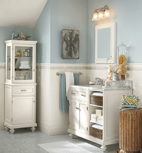
For a bath select colors that are tranquil and reminiscent of the sea. This Pottery Barn-inspired bath with Sherwin-Williams “Krypton” with a calm, clean white.

For a bath select colors that are tranquil and reminiscent of the sea. This Pottery Barn-inspired bath with Sherwin-Williams “Krypton” with a calm, clean white.

• It's fun to break decorating rules but this is one I never stray from: When selecting new colors, follow nature as your guide. Mother Nature has perfected the color palette so imitate her. This is a rule I always follow.

•  Stick with two or three (at the most) paint colors for your home. The result: Beautiful and restful. You can add more color with accessories. Don't try to put all of your color on the walls.

Color Consultation.jpg

• Connect your rooms. Don't make each room a completely different color. You want to have a plan so the house makes sense. An idea my clients seem to like: paint all of the main rooms (living room, entry, kitchen) a neutral shade. Use color in the bathrooms, bedrooms and den. I also like to paint the master bedroom and bath in coordinated shades to give it a hotel/master suite feeling.

• One trend to consider: No more white ceilings! Check out the decorating magazines.  We are now using color on the ceilings or a cream shade. No more super white.

• Neutrals: You can't go wrong with these. Pure and simple. If your natural light is great, neutrals in the main rooms are so easy to live with and make it easy to add color in accessories, wall treatments and more.

• Finishes: often a trouble spot for homeowners. The rule: Pick paints with a bit of shine, such as satin and eggshell, in high-traffic areas, kitchens and bathrooms. Use semi gloss and glossy paints and enamels to emphasize moldings, wainscots and banisters. Flat finishes are best for ceilings and imperfect surfaces because they hide flaws. Glossy sheens emphasize problem areas.

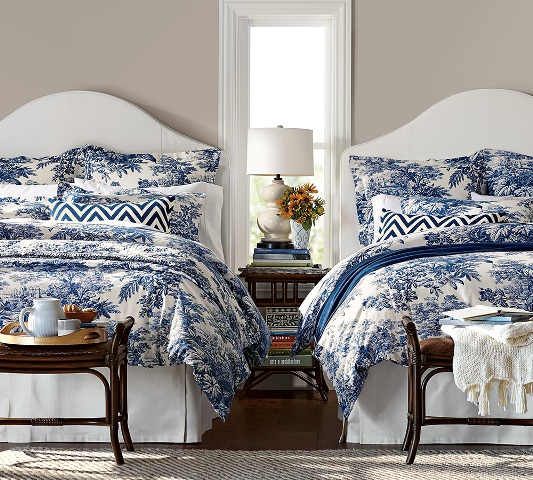
Pottery Barn’s twilight blue Matine tolie bedding is a perfect accent color for Sherwin-Williams “Functional Gray” walls. Photo: potterybarn.com

Pottery Barn’s twilight blue Matine tolie bedding is a perfect accent color for Sherwin-Williams “Functional Gray” walls. Photo: potterybarn.com

• You get what you pay for. It's true.  I give my clients the same advice as when they are purchasing a sofa: buy the best paint you can afford. It does matter. It looks prettier, has more pigment and will last longer. Premium paint also spreads easier, needs fewer coats and will hold up against repeated cleaning.

• A word about gray. This is definitely the new beige. And it is gorgeous with some version of it working in almost every home from a beach cottage to an estate home. It also works with almost any color palette or pop of color. It can be classic, sexy, shimmery, sexy, calming.

• Make an entrance. Don't forget the front door. And you can be very brave here. Go with something strong and bold that makes a statement. It is the easiest color change of all.

Need help visualizing color for your rooms?

Pottery Barn and West Elm have partnered with Sherwin Williams to create seasonal palettes to coordinate with their furnishings. Details: sherwin-williams.com/architects-specifiers-designers/color/find-and-explore-colors/color-collections/west-elm-collection/.

In addition, Ballard Designs has teamed up with Benjamin Moore to offer advice on paint colors to compliment their designs at howtodecorate.com/category/decorating/paint-colors/.

Wrenda Goodwyn is a Southwest Florida interior decorator. Home Inspirations appears the first Saturday of each month. Visit her website at spectacularspaces.com. Call her at 949-1808 or email wrenda@spectacularspaces.com. For more decorating tips and photos, visit spectacularspaces.com/blog

Design forecast: Fearless, bright, bold and brassy

Wrenda Goodwyn • special to the Fort Myers News-Press• November 8, 2014

 
Mid-century modern dining by Stanley Furniture. Photo: Wrenda Goodwyn

Mid-century modern dining by Stanley Furniture. Photo: Wrenda Goodwyn


At High Point Market in North Carolina, along with 75,000 other buyers and designers from all over the world, I did my best to cover 11.5 million square feet of space that provide dazzling displays of thousands of new products.

This home decor mecca is Disneyland for designers. It takes place for one week each fall and spring. With so much to see that it's easy to find yourself on visual overload. In addition, there are opportunities to meet famous designers, take courses from experts and there are lots of opportunities to meet your favorite television personalities (my design crush: Tom Filicia). There is even a seminar that teaches you how to navigate Market, as it is called, and to make the most out of your time.

 
Lots of creative uses of books. Photo: Wrenda Goodwyn.

Lots of creative uses of books. Photo: Wrenda Goodwyn.


But who has time for that course with all of the spectacular showrooms waiting with beautiful, pretty things. The temptation is to just take the plunge with your to do list. And so I did.

As a Fort Myers interior decorator, this is where I go for design inspiration, to look for new ways of creating beautiful rooms and to shop for my clients who are looking for something new and fresh. Whether it is an eclectic piece to be used as a focal point in a room or for to shop for furnishings and accessories for an entire home.

 
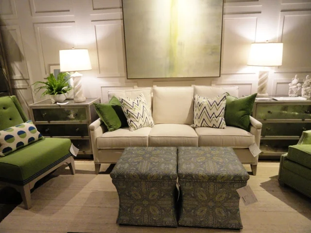
Pretty and popular apple green accents with neutral tones. Photo: Wrenda Goodwyn.

Pretty and popular apple green accents with neutral tones. Photo: Wrenda Goodwyn.


If you can't find it here, it doesn't exist. Not that every showroom can be covered. Despite the miles that I put on my new, sensible walking shoes. So take a trip with me as I offer a peek at a few of the amazing, edgy, stunning new trends that I saw at Market. You will soon be seeing these in your favorite retail spots and magazines.

Trends

The market spotters were predicting "bright, bold and brassy," and that sums it up perfectly. Home design has taken a turn that is not for the faint of heart. Fearless decorating with bright tones and accessories that don't take themselves too seriously.

Brass and gold continue to be very important in home décor----not shiny brass or gold but wonderful antiqued and textured gold as well as brass with a natural patina.

 
Bold and sassy! Photo: Curry &amp; Company.

Bold and sassy! Photo: Curry & Company.


Lighting

The jewelry of interior decorating, lighting is the hottest accessory and it takes center stage in every room. Never has lighting been prettier with more sparkle and bling! The choices are stunning. Think gold.

In the Currey and Company showroom, a showstopper in itself, each piece hanging from the ceiling looked like a sparkling gold bracelet twisted into arty shapes.

 
Orli Chandelier of Wrought Iron finished in Contemporary Gold Leaf. Photo: Currey &amp; Company.

Orli Chandelier of Wrought Iron finished in Contemporary Gold Leaf. Photo: Currey & Company.


Wrought Iron with contemporary gold leaf and brass are popular finishes. And the dazzling La Mer Wall Sconce of wrought iron, shell and glass is a perfect accessory for a sophisticated coastal look that blends beach-inspired design with a traditional or contemporary look.

 
La Mer Wall Sconce. Photo: Currey &amp; Company.

La Mer Wall Sconce. Photo: Currey & Company.


Color

As we said, bold and fearless! Lots of blues including navy, indigo, robins egg.  Red is also trending in sofas and accessories along with corals and pinks. Orange, jade, teals and that beautiful apple green are everywhere.

Furniture

Lots of soft curves that soften the silhouette of a chair or sofa and add visual interest. Canopy beds are trending with a breathtaking, modern new look. Blending antiques with almost any style as an accent piece. Reclaimed/distressed pieces. Driftwood. Lot of gold and brass tables. Table bases and coffee tables have emerged as artwork with sculptured designs. Bar carts are the rage with lots of gold and glass. Ottomans in bold patterns and jewel tones.

 
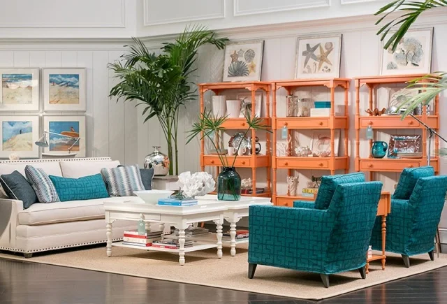
Coastal living retreat. Photo: Stanley Furniture.

Coastal living retreat. Photo: Stanley Furniture.


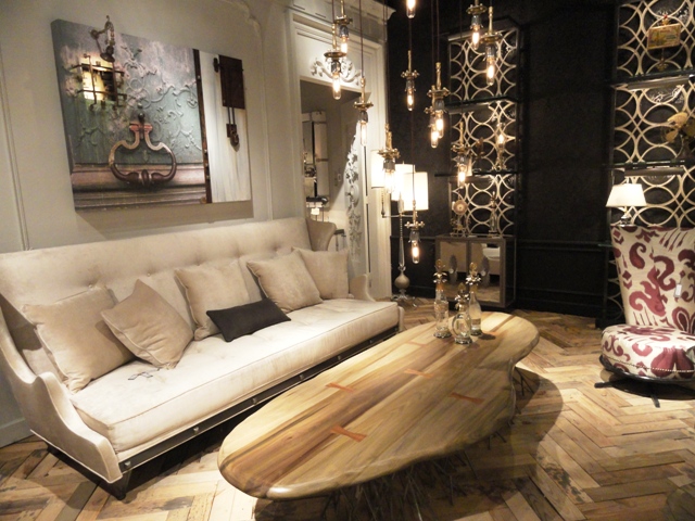
Carved wooden coffee table. Photo: Wrenda Goodwyn.

Carved wooden coffee table. Photo: Wrenda Goodwyn.


And with furniture, it's all about customization. Changing the shape of a leg, an arm or a cushion, even changing the dimensions of a piece to fit a unique space, offers choices like never before to the consumer.

According to Kravet, premiering its new furniture showroom at Market, a lot of designers today are embracing an updated traditional look, which could mean a tufted sofa with a slim track arm, or a comfortable arm chair with sleek details.

 
Kravet Denham Chair. Photo: Kravet.

Kravet Denham Chair. Photo: Kravet.


There is a resurgence of the chaise lounge, and they are popular in today’s interior design schemes. With regard to pattern and color, Kravet embraces a bright bold fabric statement on furniture, however many designers are choosing upholstery that is durable and neutral, which is a great investment for the life of your furniture, and your room.

Brass and bronze occasional tableswere everywhere with some of the most popular at Vanguard Furniture to complement the extensive furniture collection that is popular with southwest Florida homeowners because of its personalization options. And furniture is painted every color imaginable!

Art and accessories

So many fresh, new choices here. Artifact decor is hugely popular as an accent. Buddha's in every color are a huge accent piece with all styles of decor. Books have taken on a huge role in artwork and accessories serving as a focal point and covered in papers and fabric. Glass is seen in bold colors and shapes.

 
Popular Buddha is incorporated into all styles of design. Photo: Wrenda Goodwyn.

Popular Buddha is incorporated into all styles of design. Photo: Wrenda Goodwyn.


Rugs

Bold and exotic. Intricate patterns. Lots of metallics. Washes and patinas create a soft look.  Viscose yarn is used with pearlescent shimmer to add dimension to neutral tones. Easy care with custom sizing, beautiful indoor/outdoor selections.

 
Blue Bye You. Photo: Company C.

Blue Bye You. Photo: Company C.


Summary:

Have fun with the latest trends and don't take your decorating too seriously!

DSC05219.JPG

For more details on trends and other fun sightings at High Point Market, visit www.spectacularspaces.com/blogor call Wrenda Goodwyn at 239-949-1808 or wrenda@spectacularspaces.com