Love your home again: decorating ideas from the heart

Wrenda Goodwyn • special to the Fort Myers News-Press/USA Today Network Feb. 4, 2024

There’s a pretty townhome in Notting Hill with a bright pink door and a window just above that says “Love.” I read about it in a travel article and on my last trip to London, tracked it down because I will do just about anything to see a home so loved that its owners would install this window. And there it was. Just a simple window with a huge message to anyone walking by.

In a time when we need more love more than ever, we find ourselves welcoming February, a month that’s all about hearts, love and showing a little extra kindness to others, ourselves and to our homes. With the holidays well behind us, it’s the perfect time to make a few changes to make you love your home again. And to do that by refreshing some spaces in your home.

Our homes are our sanctuary. A place that we return to shake off the day and find peace and comfort. It’s also a good time to think about what your home means to you. Is it a place to pass through and sleep with a busy schedule that keeps you on the run? Is it your happy place surrounded by things that you love? A place of love, warmth and happy memories?

As a Southwest Florida interior decorator, I help my clients decide what is most important and how to best create a space that makes them love their home the minute they open the door. No two homes are the same and the relationship with our homes can be complicated. With some thought and a solid plan, you can soon be on your way to creating a home that you love and one that’s in step with your lifestyle.

Pottery Barn faux fur heart-shaped pillow on a curved swivels

Throw a teddy faux fur heart-shaped pillow on Pottery Barn’s curved silhouette swivel to round out any space. Photo: Pottery Barn

Love really is the operative word when you refresh. Love what you surround yourself with. Love it or don’t buy it. If you don’t love it, donate it.

Four rules to keep in mind to love your home again

Find your inspiration. Is it a new color, light, mirror, piece of furniture? If you need a change but don’t know where to begin, it may be time to call a professional to help.

Classics never go out of style. Trends some and go and can be fun to sprinkle here and there but you can’t go wrong with the classics.

Stop scrolling. I call this one “facebook envy.” We are bombarded daily with the latest and greatest, most gorgeous ideas for our homes. Before you go off the deep end making a pile of changes, take a deep breath and think about what really matters. To you. No one else.

Purchase mindfully. Before you buy, think carefully about what would make you love your space. Do your research, go on a few shopping trips to look. Take your time. And take photos.

Refresh old pendants with something fresh and new. Shown: Scallop rattan suspended from an antique bracelet chain. Photo: Serena and Lily

A few ways to give your home a loving refresh!

• Make home repairs that you have been putting off.

• Set a pretty table.

• Give your entry a new look with a dramatic color.

• Paint your front door.

• Wallpaper a powder room. Something outrageously beautiful.

• Add some sparkle: a chandelier in the living room or bedroom (you really don’t need a ceiling fan in every room in the house). Or hang one in the master closet. It will make you happy every time you walk in.

• Soften the harsh, recessed lighting in the kitchen with a lamp on the counter or island. You won’t believe the change.

dollops of Benjamin moore pink colors for valentine's day article by Wrenda goodwyn, Bonita Springs interior designer

February, a month that’s all about hearts, love and showing a little extra kindness to others, ourselves and to our homes. Shown: Benjamin Moore’s Valentine color favorites. Photo: Benjamin Moore

• Hang something colorful in your laundry room.

• Change your drapes or drapery panels over the sliders. Make sure you hang them high: just below the ceiling or molding.

• Delete what is no longer working in your home. I do this seasonally as things do tend to accumulate no matter how hard we try.

• Add a little glam to each room: a tufted sofa or a chaise lounge. Pick a color that you love. Or a new mirror or a few glass accessories for some sparkle.

• Want color but afraid to commit to an entire room? Fine. Paint the ceiling that color that you have always wanted to try. Yes, the ceiling!

• Create a gallery-style wall with your favorite art.

Wrenda Goodwyn is a Southwest Florida interior decorator, A.S.I.D. associate and gold member of the Interior Redecorators Network. She helps homeowners throughout Southwest Florida with timeless, affordable ways to create beautiful spaces, color palettes and solve decorating problems. Her articles appear the first Saturday of each month. For more information, visit her website at spectacularspaces.com. Call her at 239-850-5800 or e-mail wrenda@spectacularspaces.com. For more decorating tips, articles and photos, visit spectacularspaces.com/blog


Finding design inspiration in a decorator show house

Wrenda Goodwyn • special to the Fort Myers News-Press • February 22, 2020

Decorator show houses always leave me with new inspiration. They show us tricks for creatively providing solutions to problems that we all face in our homes. And they are just plain fun!

That’s why I made the trip to Palm Beach this past week to preview what I knew would be a worthwhile experience at the Kips Bay Decorator Show House. The proceeds go to the Boys and Girls Club of Palm Beach and the same organization in New York. It’s a win-win for everyone.

When you take a group of 19 top designers and give them each a room in a fabulous home, the result is bound to be spectacular. It can be a room, entry, hallway, closet or outdoor space. Or cottage in the backyard. So to speak. They are hardly cottages and this is no ordinary backyard.

Kips Bay Decorator Show House. Photo: Sargent Architectural Photography.

Kips Bay Decorator Show House. Photo: Sargent Architectural Photography.

What you can expect

• A home that does not flow. Each room is done by a different designer so they bring their own creativity to the space. Enjoy each individual space.

• The latest colors, fabric, furnishings, window treatments, wall coverings, paint colors, patterns, textures, accessories and trends.

• Ideas and solutions for your own space. As a Southwest Florida interior decorator, I always look for tips to pass on to my clients and this home did not disappoint. Tips are below.

• These rooms each had their set of “challenges” and it’s interesting to see how designers overcame them. Much as we do when we work with clients on a daily basis. No home or room is perfect.

The show house

The 8,751-square-foot home inspired by South African and Dutch architecture is located at 260 Palmetto Lane in West Palm Beach. It features four bedrooms, five bathrooms, a great room with vaulted ceilings and French doors that open up to an expansive loggia, and a spacious kitchen with an adjacent outdoor dining terrace. The home includes two guest houses, a pool house, and an expansive private garden with lush tropical flora.

Design challenges

The home is lacking in architectural features for most rooms and in some spaces, the walls do not go all the way to the high ceilings.

Tips you can use

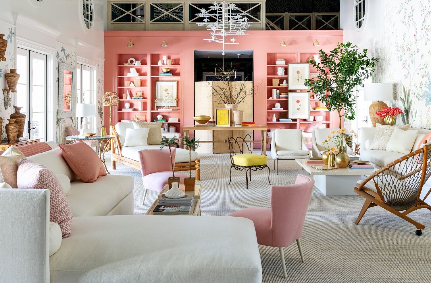
Use paint in a voluminous room with no focal point. In Southwest Florida, we know something about this challenge! With our open concept and lack of walls, we understand the dilemma. But one of my favorite designers, Suzanne Kasler cleverly dealt with this in the huge living room with high, high ceilings and no architectural details to speak of. And she also had to overcome walls that did not reach the ceiling.

Huge pink and white great room designed by ​Suzanne Kasler at Kips Bay Decorator Show House boasts rattan and linen features and lots of light.

Great Room “Edited Style” ​was designed by ​Suzanne Kasler. Built on a quintessential Palm Beach color palette of pink and white and featuring rattan, linen, and natural materials, the Great Room boasts stunning views of the outdoor garden and swimming pool. High-gloss, built-in bookcases in ​Benjamin Moore’s​ Custis Salmon stretch across an entire wall, housing a number of books and white sculptural pieces, while a stunning wall covering sets the scene for the room. Photo: Sargent Architectural Photography.

Solution: Paint. She made you forget the shortcomings with built-in bookshelves in Benjamin Moore’s Curtis Salmon and trim and walls in Benjamin Moore’s White Dove, both in high gloss. For the main walls, she designed a beautiful floral wall covering framed in white millwork. This all helps draw the eye away from the irregular ceilings. She also uses moldings to bring the volume down to eye level.

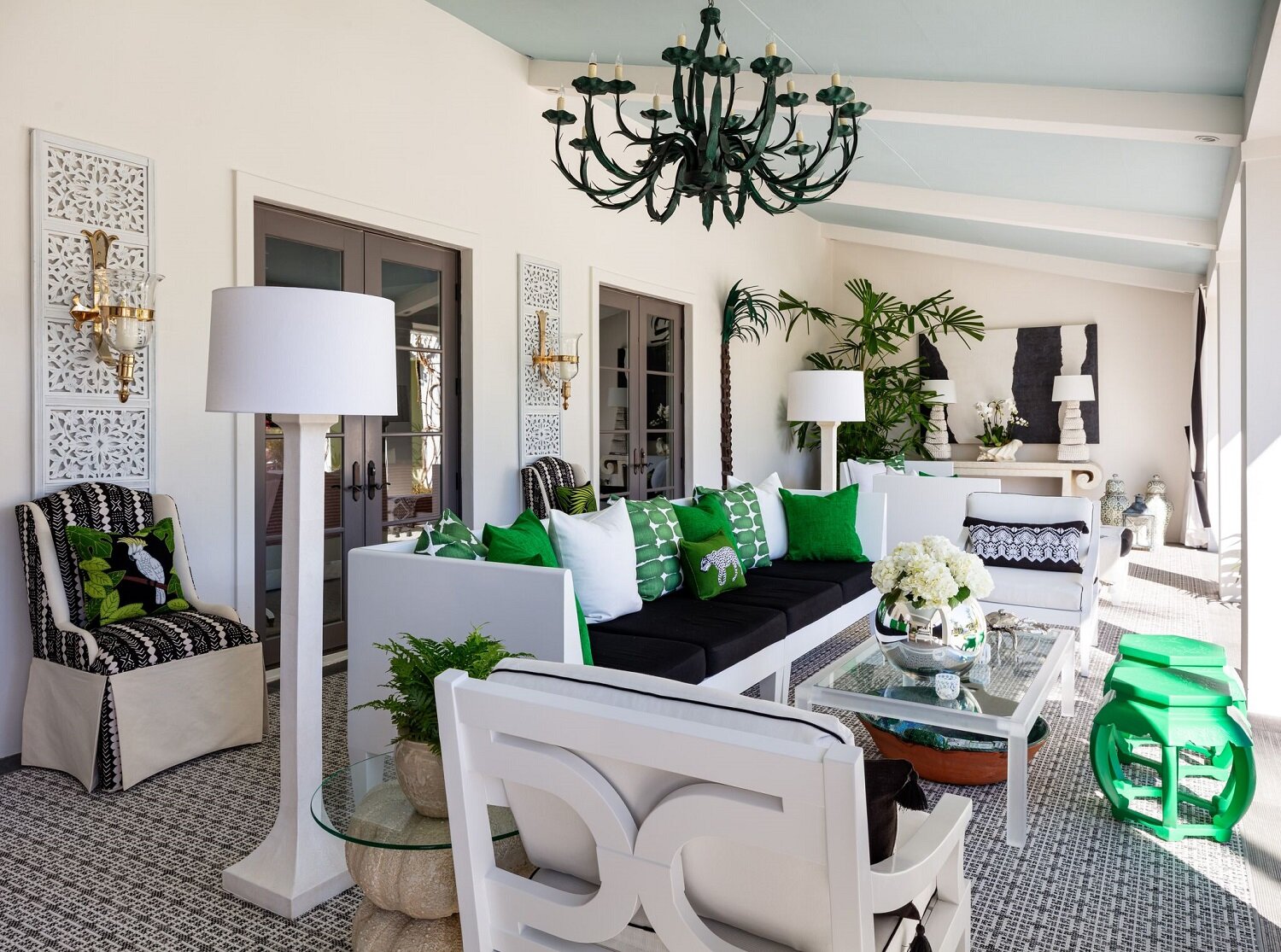
Paint the outdoor ceiling. This has been a trend for a while, although I find many homeowners are a little reticent to make the commitment. Another of my favorite designers, Sherrill Canet created a fabulous palette of black, white, and jewel tones on the shaded terrace. She uses Benjamin Moore‘s Fantasy Blue to create the effect of an open air space on a covered porch. It’s a great trick that can be used on any outdoor space. As for furnishings, embracing its role as the heart of the plantation-style home, the Loggia blends modern touches with antique pieces for a tailored look for comfortable outdoor living. Gorgeous.

Sherrill Canet created a fabulous palette of black, white, and jewel tones on the shaded terrace. She uses Benjamin Moore‘s Fantasy Blue to create the effect of an open air space on a covered porch. It’s a great trick that can be used on any outdoor…

Sherrill Canet created a fabulous palette of black, white, and jewel tones on the shaded terrace. She uses Benjamin Moore‘s Fantasy Blue to create the effect of an open air space on a covered porch. It’s a great trick that can be used on any outdoor space. Photo: Sargent Architectural Photography.

Fake it with a beautiful wall covering. At first glance, the master bedroom by designer Alessandra Branca, is like waking up in a tiled bedroom in a villa in Portugal. In reality, the hand-painted wallpaper that Branca designed for DeGournay, gives the look of traditional Portuguese ceramic tiles. The furniture is a mix of Dutch and French pieces with 18th-century painted chairs mixed with modern pieces. On the terrace, floor-to-ceiling custom window treatments by The Shade Store lead to sweeping views of the garden and pool. It’s a room you never want to leave.

Blue and white hand-painted wallpaper in master bedroom that Alessandra Branca designed for DeGournay. Dutch and French pieces with 18th-century painted chairs mixed with modern pieces.

The master bedroom by designer Alessandra Branca, is like waking up in a tiled bedroom in a villa in Portugal. In reality, the hand-painted wallpaper that Branca designed for DeGournay, gives the look of traditional Portuguese ceramic tiles. The furniture is a mix of Dutch and French pieces with 18th-century painted chairs mixed with modern pieces. Photo: Sargent Architectural Photography.

Colorful kitchen with an antique. There is no dining room in the home so the spacious kitchen could easily handle that function. Designer Sarah Blank created a timeless space that offers a relaxing and refreshing gathering place. Benjamin Moore's brilliant Swiss Blue adds dimension, while artwork depicting birds and coral pays homage to the home’s South Florida location. The island, an antique tailor’s table anchors the room and is the focal point.

Huge kitchen designed by Sarah Blank features Benjamin Moore’s Swiss Blue and antique tailor’s table over rich wood floors in Kips Bay Decorator Show House.

Benjamin Moore’s Swiss Blue and an antique tailor’s table are the stars of this kitchen by Sarah Blank. Photo: Sargent Architectural Photography.

If you go

Dates: the show runs through March 1.

Admission: $35 per person. Proceeds go to the Boys and Girls Clubs of Palm Beach and New York.

Details: www.kipsbaydecoratorshowhouse.org/palmbeach

Home and location: Home of interior designer Lars Bolander, it’s known as Bambo Hill and is located at 260 Palmetto Lane, Palm Beach.


Wrenda Goodwyn is a Southwest Florida interior decorator, A.S.I.D. associate and gold member of the Interior Redecorators Network. She helps homeowners throughout Southwest Florida with timeless, affordable ways to create beautiful spaces and solves decorating problems. Her articles appear the first Saturday of each month. For more information visit her website at spectacularspaces.com. Call her at 949-1808 or e-mail wrenda@spectacularspaces.com. For more decorating tips, articles and photos, visit spectacularspaces.com/blog

What's in, what's out and resolutions for a new year

Wrenda Goodwyn • special to the Fort Myers News-Press • January 6, 2018

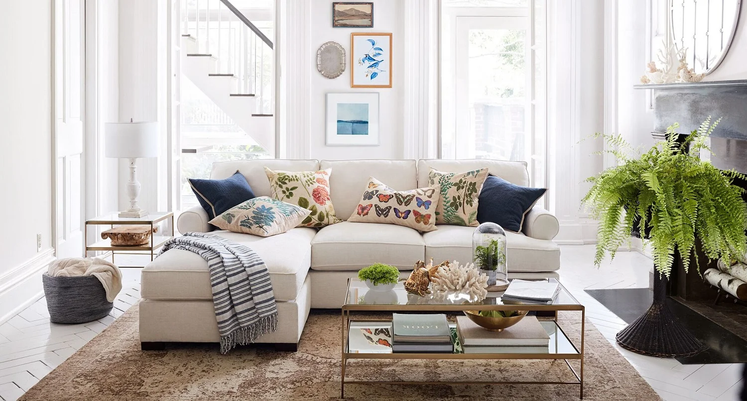
Keep it simple in the New Year. Pillow covers inspired by nature nautical accessories, plants, Leona metallic tables, Jackson chippy base lamps work with this Townsend sofa as a focal point of the room. Photo courtesy of Pottery Barn.

Keep it simple in the New Year. Pillow covers inspired by nature nautical accessories, plants, Leona metallic tables, Jackson chippy base lamps work with this Townsend sofa as a focal point of the room. Photo courtesy of Pottery Barn.

The lights and decorations have come down and if you’re like me, it seems that things seem a bit gloomy. You may be looking around your home thinking that it needs a little sparkle as we settle in for a new year.

There are lots of interesting trends in the home interiors forecast for 2018. Some are fabulous and worth a try. As I always tell my Southwest Florida interior design clients, pick your changes according to what you love and not the latest trend. And there are the fun lists of what’s in and what’s out. It’s all great fun and I have offered a sampling as well as a few resolutions for your home in 2018. I promise you can keep them!

Happy decorating and best wishes for the New Year!

 Resolutions to do NOW!

 ·       Show gratitude for your home. We always have a wish list and it all never seems to get done. But keep in mind that many in our area are still dealing with severe hurricane damage and would love to be thinking about decorating. Be thankful for what you have and don’t stress out about the small things.

·       Be intentional about your home décor this year. Make a plan before making purchases. We all crave simplicity so don’t go overboard.

Give a little love in 2018 with Pottery Barn’s Love Gallery art pieces, pillows, Bella crystal round chandelier, Madison upholstered settee and metallic tables. Check out details at www.potterybarn.com. Photo courtesy of Pottery Barn.

Give a little love in 2018 with Pottery Barn’s Love Gallery art pieces, pillows, Bella crystal round chandelier, Madison upholstered settee and metallic tables. Check out details at www.potterybarn.com. Photo courtesy of Pottery Barn.

·       Give yourself a little self-care. The early days of a new year are perfect for thinking about what is important for the upcoming months. And these cool days are perfect for relaxing with a cup of tea and a good book, some soft music. In other words: give yourself a break.

Treat yourself to a break with this love is love tray and accessories. Photo courtesy of Pottery Barn.

Treat yourself to a break with this love is love tray and accessories. Photo courtesy of Pottery Barn.

·       Manage clutter. Eliminate your junk drawer (who needs junk?).

·       Say “no” to what you don’t love in your home. 

·       Discard duplicates. Donate clothes that you don’t wear. Take excess books to the library.

·       Buy plants or fresh flowers and put them in every room in your house.

·       Try something new! Suggestions below!

What’s in (trends)

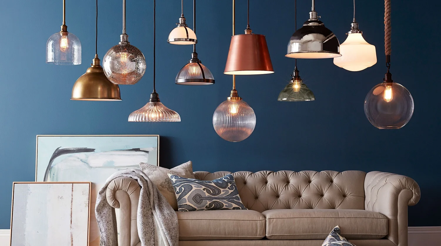
Metallics are the hot accessory for the new year. Pendants in nickel, brass, copper, bronze, white, vintage glass.  Photo courtesy of Pottery Barn.

Metallics are the hot accessory for the new year. Pendants in nickel, brass, copper, bronze, white, vintage glass.  Photo courtesy of Pottery Barn.

·       Keep it simple! And calm.

·       Fish scale tiles for the perfect backsplash.

·       Space for a coffee bar.

·       Velvet. Couches, rugs, pillows.

·       Metallics: rose gold, brass, copper. And it’s okay to mix them.

·       Rattan furniture. If you see it at a flea market, grab it.

·       Fringe.

·       Typography (signs with your favorite sayings).

·       Art gallery walls.

A serene spa-like powder room with classic white console, marble top, metal fixtures is set against a dramatic wall covering for a customized look. Photo courtesy of Pottery Barn. 

A serene spa-like powder room with classic white console, marble top, metal fixtures is set against a dramatic wall covering for a customized look. Photo courtesy of Pottery Barn.


·       Chandeliers.

·       Wall coverings inspired by nature.

·       Floral patterns.

·       Nautical laccessories.

·       Daybeds.

·       Terrazzo flooring and counters. Even walls.

·       Spa bathrooms.

·       Statement ceilings with paint, wallpaper or textures.

·       Herringbone flooring, walls, backsplashes.

·       Three dimensional wall décor.

·       The color green. And plants everywhere. Real, if possible!

·       Repurposing anything.

·       Dark wood. Chocolate brown floor and furniture.

·       Colorful doors. The front door of course. But also interior doors.

·       Subway tiles. They are still a classic and are affordable. The best kitchen backsplash option.

·       Natural light. Large windows. Light shades and drapes.

·       Mirrors to reflect natural light.

·       Mixing antiques with modern pieces.

·       Marble everything. Flooring, walls, backsplashes, counters.

·       Jewel tones. Colors from nature. Bye-bye beige.

·       Large wall art to take up large spaces in open floor plans.

·       Black and white patterns, prints, flooring.

·       Woven textures and artisan accessories.

What’s out

·       Brushed metals.

·       Too many throw pillows.

·       Decorative painting. Enough said.

·       Huge oversized furniture. It’s ugly and space is a premium.

·       Bare walls.

·       Artwork at the wrong height: 57-58 inches. That’s the general rule.

·       Chevron. Thank goodness.

·       Furniture smashed against the walls.

·       Huge hoods in kitchen.

·       Tuscan. Thank goodness.

·       Overuse of the farmhouse look. Thank goodness.

·       Too much white on white on white.

·       Designing your space without a plan. The result: costly mistakes.

·       Keep it simple. Be intentional with what you bring into your home. Follow what you love. Not trends!


Wrenda Goodwyn is a Southwest Florida interior decorator, A.S.I.D. associate and certified gold member of the Interior Redecorators Network. She helps homeowners throughout Southwest Florida with timeless, affordable ways to create beautiful spaces and to solve decorating problems. Her article appears the first Saturday of each month. For more information visit her website at spectacularspaces.com. Call her at 949-1808 or e-mail wrenda@spectacularspaces.com. For more decorating tips, articles and photos, visit spectacularspaces.com/blog


Your home in 2017: Is it time to call a design professional?

Your home in 2017: Is it time to call a design professional?


It’s a new year and if you are like most of us, you’re getting your home back in shape after the holiday decorations come down and the guests leave.  Maybe you’ve done a little reorganizing. Some decluttering. Deep cleaning. And now you are thinking about some refreshing your décor for the winter season.

Read More

Design directions: what designers want to change in your home

It happens a lot. I am often asked what I most want to change in client’s homes. And there have been a lot of articles recently about “what designers dislike most.”

As a Southwest Florida interior decorator who goes into lots of homes, I can tell you a little secret: there are things that make us cringe and they may not be what you would expect. The good news: most of them are easily corrected and some can be done before the end of this article.

Read More

Bring home design tips from favorite boutique hotels

Have you ever stayed in a hotel that you loved so much that you wanted to just live there?  Like the capricious, six-year old Eloise who lived on the top floor of the New York Plaza Hotel?

Even though we can't all be Eloise, (although you can now book the Betsey Johnson-decorated Eloise Suite for a night or two at www.theplazany.com/eloise) you can bring a little of that special lux  hotel vibe back home with you.

Read More