Finding design inspiration in a decorator show house
/Wrenda Goodwyn • special to the Fort Myers News-Press • February 22, 2020
Decorator show houses always leave me with new inspiration. They show us tricks for creatively providing solutions to problems that we all face in our homes. And they are just plain fun!
That’s why I made the trip to Palm Beach this past week to preview what I knew would be a worthwhile experience at the Kips Bay Decorator Show House. The proceeds go to the Boys and Girls Club of Palm Beach and the same organization in New York. It’s a win-win for everyone.
When you take a group of 19 top designers and give them each a room in a fabulous home, the result is bound to be spectacular. It can be a room, entry, hallway, closet or outdoor space. Or cottage in the backyard. So to speak. They are hardly cottages and this is no ordinary backyard.
Kips Bay Decorator Show House. Photo: Sargent Architectural Photography.
What you can expect
• A home that does not flow. Each room is done by a different designer so they bring their own creativity to the space. Enjoy each individual space.
• The latest colors, fabric, furnishings, window treatments, wall coverings, paint colors, patterns, textures, accessories and trends.
• Ideas and solutions for your own space. As a Southwest Florida interior decorator, I always look for tips to pass on to my clients and this home did not disappoint. Tips are below.
• These rooms each had their set of “challenges” and it’s interesting to see how designers overcame them. Much as we do when we work with clients on a daily basis. No home or room is perfect.
The show house
The 8,751-square-foot home inspired by South African and Dutch architecture is located at 260 Palmetto Lane in West Palm Beach. It features four bedrooms, five bathrooms, a great room with vaulted ceilings and French doors that open up to an expansive loggia, and a spacious kitchen with an adjacent outdoor dining terrace. The home includes two guest houses, a pool house, and an expansive private garden with lush tropical flora.
Design challenges
The home is lacking in architectural features for most rooms and in some spaces, the walls do not go all the way to the high ceilings.
Tips you can use
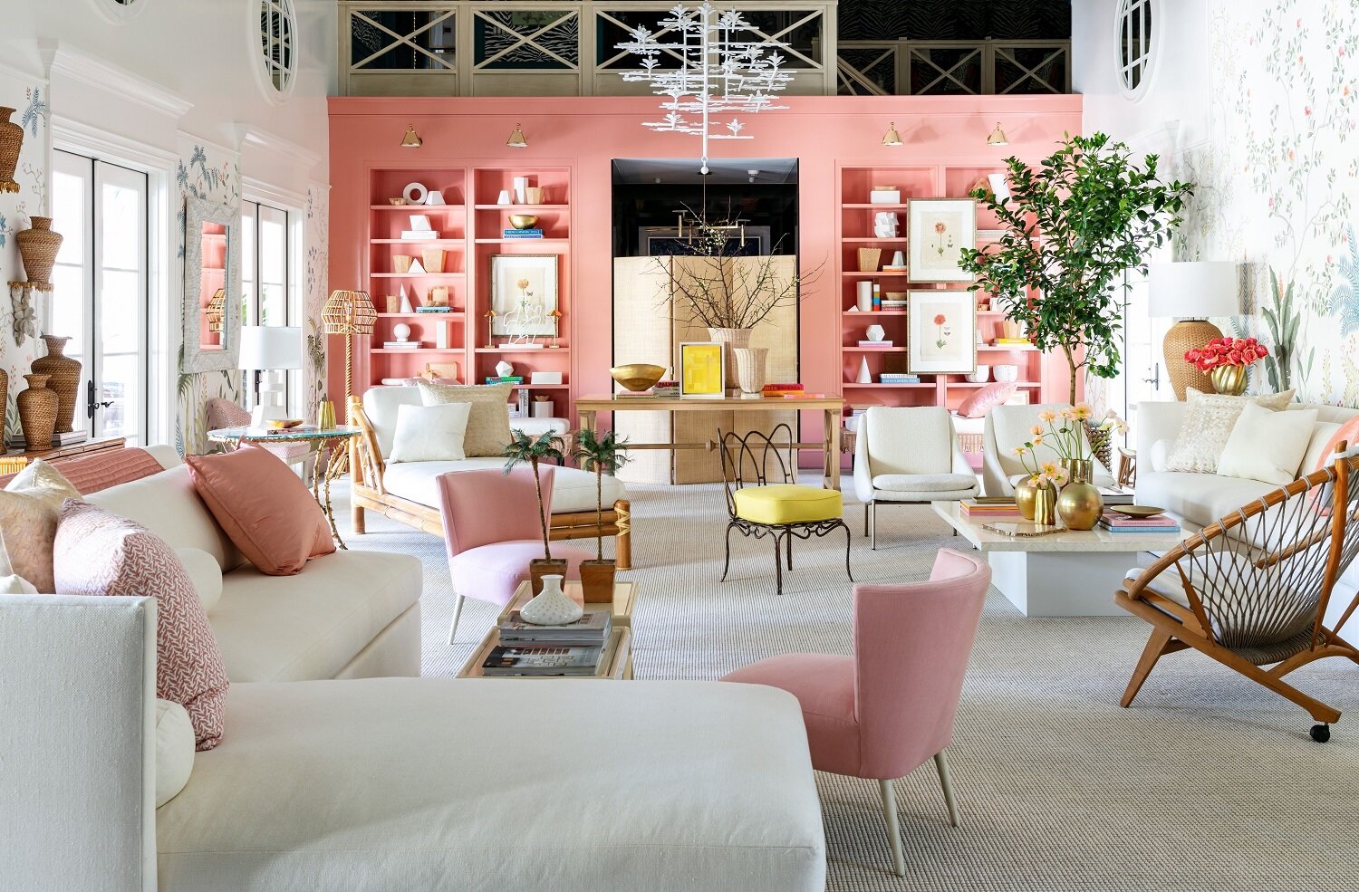
Use paint in a voluminous room with no focal point. In Southwest Florida, we know something about this challenge! With our open concept and lack of walls, we understand the dilemma. But one of my favorite designers, Suzanne Kasler cleverly dealt with this in the huge living room with high, high ceilings and no architectural details to speak of. And she also had to overcome walls that did not reach the ceiling.
Great Room “Edited Style” was designed by Suzanne Kasler. Built on a quintessential Palm Beach color palette of pink and white and featuring rattan, linen, and natural materials, the Great Room boasts stunning views of the outdoor garden and swimming pool. High-gloss, built-in bookcases in Benjamin Moore’s Custis Salmon stretch across an entire wall, housing a number of books and white sculptural pieces, while a stunning wall covering sets the scene for the room. Photo: Sargent Architectural Photography.
Solution: Paint. She made you forget the shortcomings with built-in bookshelves in Benjamin Moore’s Curtis Salmon and trim and walls in Benjamin Moore’s White Dove, both in high gloss. For the main walls, she designed a beautiful floral wall covering framed in white millwork. This all helps draw the eye away from the irregular ceilings. She also uses moldings to bring the volume down to eye level.
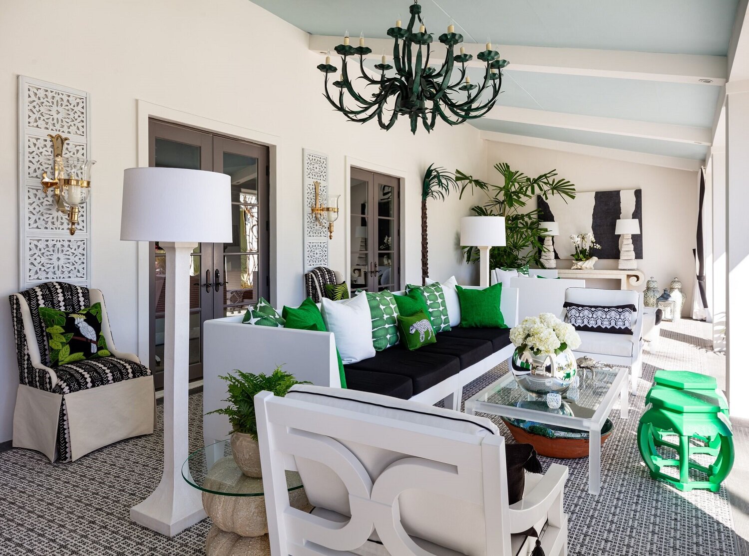
Paint the outdoor ceiling. This has been a trend for a while, although I find many homeowners are a little reticent to make the commitment. Another of my favorite designers, Sherrill Canet created a fabulous palette of black, white, and jewel tones on the shaded terrace. She uses Benjamin Moore‘s Fantasy Blue to create the effect of an open air space on a covered porch. It’s a great trick that can be used on any outdoor space. As for furnishings, embracing its role as the heart of the plantation-style home, the Loggia blends modern touches with antique pieces for a tailored look for comfortable outdoor living. Gorgeous.
Sherrill Canet created a fabulous palette of black, white, and jewel tones on the shaded terrace. She uses Benjamin Moore‘s Fantasy Blue to create the effect of an open air space on a covered porch. It’s a great trick that can be used on any outdoor space. Photo: Sargent Architectural Photography.
Fake it with a beautiful wall covering. At first glance, the master bedroom by designer Alessandra Branca, is like waking up in a tiled bedroom in a villa in Portugal. In reality, the hand-painted wallpaper that Branca designed for DeGournay, gives the look of traditional Portuguese ceramic tiles. The furniture is a mix of Dutch and French pieces with 18th-century painted chairs mixed with modern pieces. On the terrace, floor-to-ceiling custom window treatments by The Shade Store lead to sweeping views of the garden and pool. It’s a room you never want to leave.
The master bedroom by designer Alessandra Branca, is like waking up in a tiled bedroom in a villa in Portugal. In reality, the hand-painted wallpaper that Branca designed for DeGournay, gives the look of traditional Portuguese ceramic tiles. The furniture is a mix of Dutch and French pieces with 18th-century painted chairs mixed with modern pieces. Photo: Sargent Architectural Photography.
Colorful kitchen with an antique. There is no dining room in the home so the spacious kitchen could easily handle that function. Designer Sarah Blank created a timeless space that offers a relaxing and refreshing gathering place. Benjamin Moore's brilliant Swiss Blue adds dimension, while artwork depicting birds and coral pays homage to the home’s South Florida location. The island, an antique tailor’s table anchors the room and is the focal point.
Benjamin Moore’s Swiss Blue and an antique tailor’s table are the stars of this kitchen by Sarah Blank. Photo: Sargent Architectural Photography.
If you go
Dates: the show runs through March 1.
Admission: $35 per person. Proceeds go to the Boys and Girls Clubs of Palm Beach and New York.
Details: www.kipsbaydecoratorshowhouse.org/palmbeach
Home and location: Home of interior designer Lars Bolander, it’s known as Bambo Hill and is located at 260 Palmetto Lane, Palm Beach.
Wrenda Goodwyn is a Southwest Florida interior decorator, A.S.I.D. associate and gold member of the Interior Redecorators Network. She helps homeowners throughout Southwest Florida with timeless, affordable ways to create beautiful spaces and solves decorating problems. Her articles appear the first Saturday of each month. For more information visit her website at spectacularspaces.com. Call her at 949-1808 or e-mail wrenda@spectacularspaces.com. For more decorating tips, articles and photos, visit spectacularspaces.com/blog


