Sorting through the trends: Decorating tips for 2014

Wrenda Goodwyn • special to the Fort Myers News-Press• February 1, 2014

Decorating can be confusing. There are so many products on the market. New colors, furnishing, accessories, finishes, textures and styles come out every year. And what to do with that Radiant Orchid pantone color?

How do you keep your home fresh without giving into every trend that comes along and staying within some reasonable budget?

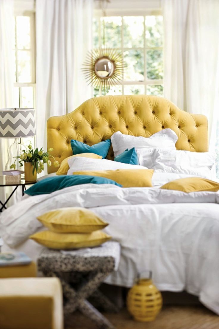
Tufted headboard from Ballard Designs. Photo: Ballard Designs.

Tufted headboard from Ballard Designs. Photo: Ballard Designs.

The advice to my southwest Florida clients making major purchases: ask yourself, will you love it in five years?  Keep major items in your home timeless.  Take a chance with paint color and accessories and have some fun.

The trends for 2014 are, well, spectacular. Simple and low maintenance are the keywords for homeowners.  And while there is no point in going crazy in making dramatic changes just for the sake of a trend, you can tone some of these down and pick and choose what works for your lifestyle.   Here are a few trends along with some of my tips for the year. Have fun!

Changing spaces that you don't use

At one time that large dining room or formal living room made sense. But lifestyle changes can make them a wasted space. That's why many homeowners are converting these spaces into entertainment rooms, libraries and more to make the space more functional.  

before-photo-of-formal-living-room

BEFORE: Owners of this West Bay home wanted to transform this formal living room to a more useful space.

after-photo-of formal-living-room-converted-to-entertainment-roomrtainment room..JPG

AFTER: Space is changed into an entertainment room that is used daily by family and friends.

Color and paint

Indigo! From the bedroom to the living room and for every imaginable accessory, this peaceful, comforting color will bring to mind the deep blue of the sea. Tip: It's great for pops of color in rooms with a neutral/white palette and works with a nautical scheme. 

For paint: black walls are popular, white walls are still the trend. Accent walls are not so popular as painting the entire room is the trend. Grey is still the new beige and is everywhere in many shades.

Farrow & Ball paints are hot, pricey and worth a look. The high levels of pigment, rich resin binders, and the high refractory nature the key ingredients give the paints their signature depth of color. There are 132 colors and they are available to the trade through Kravet at the Miromar Design Center.

Wow those walls

Grass cloth has made a return with rich textures and colors. It can be painted when you are tired of it so it has a longer lifespan.

Mirrors

Everywhere. Rather than doing an entire wall (very 80's and making a comeback), I suggest a large framed mirror or a collection.

Antiqued mirror from Restoration Hardware with a vintage look is handfitted from multiple pieces of beveled, mitered and joined glass. Photo: Restoration Hardware.

Antiqued mirror from Restoration Hardware with a vintage look is handfitted from multiple pieces of beveled, mitered and joined glass. Photo: Restoration Hardware.

Lighting

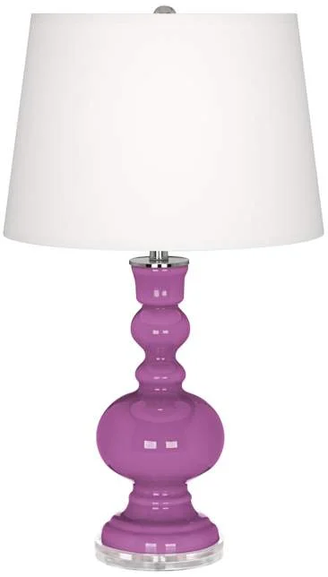
There have never been so many great choices in table lamps. Give your room an instant makeover with a fresh color with two new lamps for your bedroom or living room. This would the perfect place to try that Radiant Orchid with a pair of glass table lamps with an apothecary base from Lamps Plus. 

Photo: Lamps Plus.

Photo: Lamps Plus.

Windows

Gone are the heavy and expensive draperies. The trend is panels, blinds, shutters and anything that will let in more natural light.  Simple panels in linen, thin wool, cotton or muslin with a pared down look.

Flooring

Huge floor tiles, bamboo, laminate flooring in wide plank styles and various colors, vinyl planking, porcelains in many styles including a wood-look porcelain. Tip: flooring is a major purchase and there are so many choices on the market.  Work with a professionalto determine which is best for your home.

Furnishings

Forget cookie cutter designs.  It's all about you and not your neighbor or a trend, for that matter. Unique and no matchy matchy"sets." Hot: shopping on ETSY, eBay, 1st Dibs, Craigs List, estate sales and consignment shops for something different.

Because we have exposure to so many cultures, ethnic prints and patterns are popular in   homes this year. Moroccan, Asian, South American and other influences.

Lacquer trays in bold shades multi-task to serve drinks, organize odds and ends on a dresser or hold a stack of books on a coffee table. Photo: West Elm.

Lacquer trays in bold shades multi-task to serve drinks, organize odds and ends on a dresser or hold a stack of books on a coffee table. Photo: West Elm.

Hot: Felt, suede and leather headboards, tufted sofas and ottomans, Lucite chairs, coffee tables and accessories. Chairs are larger and armless and love seats are becoming extinct. Nailheads in furniture, pillows. Platform beds, no box springs (we said "simple" is the trend!).

For offices, which are becoming smaller as large computers are phasing out, day beds are popular and allow the room to be used for guests.

Furniture with multiple uses: coffee tables that liftup and have storage or transform into a larger table for dining, occasional tables that can be used in multiples throughout the home. Vintage, one-of-a-kind pieces are popular as are reclaimed wood pieces such as coffee tables and shelving.

Fabric

Monograms are everywhere: linens, pillows, chairs. A way to personalize and to be unique.  Palettes: blue and white, soft purple, graphic prints, plaids. Grays. Ikat prints.

Tip: Keep floral prints in the bedroom and solid tones in the family room.

Kitchen

Timeless white/black color scheme. Eco-friendly cabinets with no formaldehyde and non-toxic glues, binders and finishes. White-glass appliances are a change from the stainless (no smudge) which is still popular. 

Quartz countertops. These are engineered but look like granite and are sustainable and more durable, resists stains and chipping.  Touchless, motion-sensing faucets that areeasier to use, cleaner, and cut down on water usage in kitchens and baths.

Bathrooms

High-efficiency showerheads and toilets, barrier free walk-in showers that do not require being stepped over, stand-alone bathtubs as centerpieces, wall mounted sinks.

Wrenda Goodwyn is a Southwest Florida interior decorator. Her practical and affordable interior decorating helps clients transform a house into a beautiful home.  Home Inspirations appears the first Saturday of each month. Visit her website at spectacularspaces.com. Call her at 949-1808 or e-mail wrenda@spectacularspaces.com. For more decorating tips and photos, visit spectacularspaces.com/blog

Want a home that makes you happy?

Call me. I can help!

Time to hire a professional? Read my tips for working with an interior decorator in the Fort Myers News-Press. 

Lighten up home decor with Lucite

Wrenda Goodwyn • special to the Fort Myers News-Press• June 8, 2013

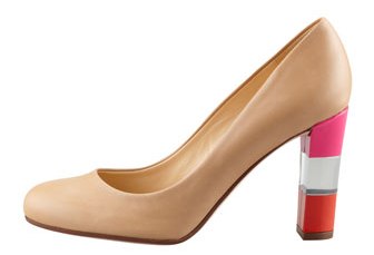
Kate Spade lucite heel.

Kate Spade lucite heel.

It never fails. What you see on the runway is eventually going to make its way into home decor.

And just as Lucite heels and jewelryare the rage in fashion magazines, pieces are again making an appearance in home furnishings and accessories. 

And just as the sparkle of Lucite in a heel has a modern, fresh look, you would not want an entire shoe made of it. The same goes for the home. Less is definitely more.  Use sparingly and you have a look.  Use too much and it can look cheap.

Ozzie Pancaro, owner of the Casa Italia showroom at Miromar Design Center in Estero, says the trend has been "gaining steam for the past two years and that it was seen prominently at the Milan furniture in April."

The Italian, contemporary design, he says, was used sparingly as accents such as "night tables, floating bases, with lighting, sideboards, panels and floating legs."

Most dramatic:  Casa Italia offers a 100% eco- friendly produced bed that is available in 32 colors of matte lacquer or it can be upholstered. It sits on a On Methacrylate base with LED lighting and gives the effect of floating.

Photo: Casa Italia, Miromar Design Center, Estero. 

Photo: Casa Italia, Miromar Design Center, Estero. 

And don't forget the 2002 classic Ghost Chair, designed by Philippe Starck. It now comes in colors, giving it a little less ghost and a little more pizzazz. It has an elegant, timeless look. Using a single piece of translucent injection-molded polycarbonate, Starkcreated the one of the most recognizable chairs of the 21st century. Versatile enough for almost any space, it is often seen at events such as weddingsbecause of its comfort and durability indoors or outdoors. Fabric chair covers can be added for comfort and color.

What is Lucite?

Lucite is the brand name for a clear, acrylic resin material that has been around since the early twentieth century.  It was firstused for commercial purposes but became a popular material for jewelry and interior decoratingin the 1950's.  Today itappears in wall sconces, chairs, benches, tables, lamp bases and other home accessories.

Using Lucite in your home

Not a serious line of furniture, Lucite takes on a modern, almost whimsical feel. In other words, have some fun with it!

It is great for small spaces and does not take up a lot of visual space. For a small room it can be a good solution as it basically disappears and lightens up the space.

Lucite furniture is perfect for spaces where pattern, texture or paint color, are the focal point. The transparency creates a balanced look to the room and does not add unnecessary visual clutter.

Ghost Chair, designed by Philippe Starck. Photo: Casa Italia.

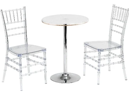
Kohl's lucite bistro set.

Kohl's lucite bistro set.


 Photos: Casa Italia

Like the look but afraid of committing? Try a magazine rack, barstool or tray for a table.  Kohl's, Target and other big box stores feature accent tables, bar stools, bistro sets and a wide range of accessories.

Lucite combined with brass or other materials and designs can serve as a point of interest. And furniture manufacturers are also making Lucite legs as an alternative to wood to make a piece a focal point in a room.

It's eco-friendly!

Perhaps the best reason of all to consider Lucite in your decorating plan: it requires no cutting down of trees, no toxic glues are used and it can be recycled. It is also durable, making it usable indoor and outdoors.

Wrenda Goodwyn is a Southwest Florida interior decorator. Visit her website at spectacularspaces.com. Call her at 949-1808 or e-mail wrenda@spectacularspaces.com. For more decorating tips and photos, visit spectacularspaces.com/blog
Sources:

Casa Italia
Miromar Design Center
10800 Corkscrew Road
Suite 250
Estero, FL 33928
239-390-0643
www.casaitalia.com

Kohl's
www.kohls.com

Accessories: Maximize with minimum

Wrenda Goodwyn • special to the Fort Myers News-Press• Nov. 17, 2012

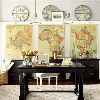
Photo of accessories from Ballard DesignsWorld map printed canvases reproduced from an actual 1937 map. Photo: Ballard Designs.

Accessories for the home are the most important part of interior decorating. They are the icing on the cake. The finishing touch.

Done well, they reflect our tastes, our style, our travels, our dreams, what we love. They are the soul of our home.

Photo of repurposed vintage table with shell and glass collectionsRepurposed vintage table is used for shell and glass collection.Done not so well, they create visual overload and just look like a bunch of stuff that was purchased to fill empty spaces. Meaningless bits that in a year will be thrown out. But a grouping that has been thought out allows you to relax and makes you feel calm.

Coco Chanel knew a lot about accessories.

She said that “simplicity is the keynote of all true elegance.”

She knew that the simplest possessions in our homes, just like in jewelry or fashion, are often the most meaningful. And so it is with accessories. Less is usually more.

Accessories are often the most difficult part of interior decorating. Not because we don’t have enough of them but because they are often not properly displayed.  Just as we do when deciding on paint colors, furniture purchases, window treatments, flooring and fabric, a plan is needed to make accessories work for the home.

Read More

Inspiration: Behind the scenes at Kravet's NYC studio

It was the best of days in New York City.

After a week of meeting top designers, home magazine editors, fellow design bloggers and touring fabulous Manhattan show homes, came the cherry on top of the sundae.

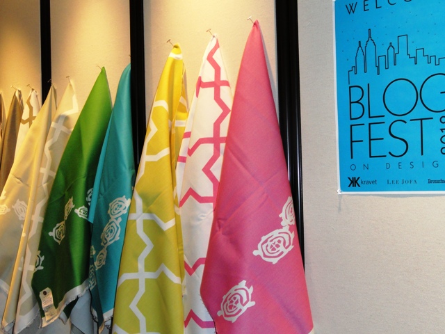
Photo of colorful Kravet fabricAs a southwest Florida interior decorator, I have long considered Kravet the Walt Disney of the fabric and home furnishing world. The level of quality and customer service results in a tremendous comfort level for designers. I often work with Amy Jimenez at the  Kravet showroom in the Miromar Design Center in Estero. Finding just the right pattern, palettes and textures for a room is the most exciting part of my job as an interior decorator. It is a good day for me when I have clients who want fabulous fabric for a new project or want to design a piece of furniture to fit their space. It is always a great collaboration between a decorator or designer and Kravet.

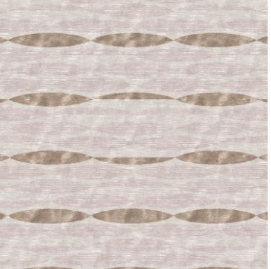
Currently, I am working with Kravet on a gorgeousBarbary Barry carpet collectionBarbara Barry's Indochine Collection for Kravet.  Barbara Barry Indochine rug for a vacation home for one of my Fort Myers decorating clients. Fabric for drapes, pillows and several other projects.

So, on this last day in NYC, I headed to the Flatiron district where Cary Kravet and the Kravet family opened their studio and welcomed 168 designers with open arms for breakfast and a studio tour. They made us feel like family and gave us a peek behind the scenes. Shared a few secrets that are soon to be announced, showed us the latest fabric designs, product development and merchandising for three of the industry's respected brands: Kravet, Lee Jofa and Brunschwig & Fils. In a word: Inspiring.

My heartfelt thanks to Gary, Lisa and Ellen Kravet. To Beth Greene, Ann Felstein and Jennifer Powell. You gave me my best day in NYC.


Read More

Fort Myers News-Press: Designer featured at Miromar Design Center makes everything that's old new again

Wrenda Goodwyn • special to the Fort Myers News-Press• February 25, 2012

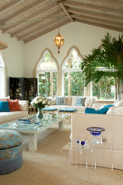
Living room designed by Sherrill CanetThis living room features an antique door that was transformed into a coffee table combined with upholstered pieces and Lucite nesting tables. Photos courtesy of Sherrill Canet.Blending old with new is all the rage in decorating. And even though there are no rules about it, there is some amount of artistic talent required. A trained eye for what looks good together. And what doesn't.

Otherwise it just ends up a pile of "stuff" in a room that does not work. And making it “work” is the challenge.

That is why it is so much fun to meet a designer who has perfected the art of creating traditional interiors that retain elements of youthfulness and surprise. Combining her love of antiques and eclectic pieces with an artist-like eye for the fine details of a room, Sherrill Canet creates stunning rooms that have a gracious comfort and elegance about them.

She takes “old world” things and makes them fresh again. And her designs result in rooms that make you want to come in and stay a while.

And they are timeless. This is every designer's goal. To create rooms that never go out of style.

Canet has designed rooms in homes for high profile clients all over the world. Her designs that mix old with new have been featured in Traditional Home, Better Homes & Gardens and House Beautiful. And this week, she was in Southwest Florida to share the recipe for her creations as part of the Distinguished Speaker Series at the Miromar Design Center in Estero. She also signed her book, A La Carte, The Elements of an Elegant Home.

Read More

Lunch with Alexa Hampton: The Language of Interior Design

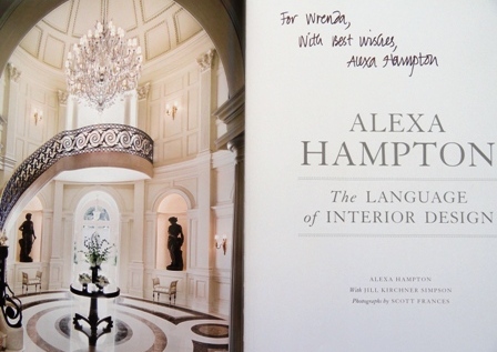
When I had "Lunch with Alexa Hampton" and heard her presentation at the Miromar Design Center in Photo of cover of Alexa Hampton bookEstero this week, I was already a huge fan of her stunning designs. Her ideas about what makes a house not just pretty, but extraordinary, are inspiring.  And they remind me what I love about interior decorating.

Plus, the fact that she once sold her Volkswagon to purchase a damask club chair made by the famous New York upholsterer Guido De Angelis.  Maybe a little extreme but I think we can all relate.

And her secret for removing red wine from furniture (which she jokingly said that she has done a few times): One jigger of Ivory dish wash mixed with one jigger of hydrogen peroxide.  Information you can use.

Photo of Alex Hampton autograph for Wrenda GoodwynWhen I spelled my name for her to sign my book: W-R-E-N-D-A, she said "Sir Christopher Wren!"  I was amazed.  No one ever makes that connection. Wren was my father's middle name and my mother made it up from there. Being from the Williamsburg, Virginia area, it is a big name in historical architecture and I have spent years going to Wren's famous architectural masterpieces in Europe.  Of course she knew Wren.  She laughingly said that she would never forget my name with that connection. 

And I surely could not forget hers.

I already knew that Alexa was the daughter of the late interior design legend Mark Hampton.  And I knew from a previous seminar that she is one of America's most influential designers herself having been listed in Architectural Digest and House Beautiful as one of the country's top designers.  She designs the interiors of landmarks such as the Trowbridge House in Washington, DC, the official guesthouse for former visiting Presidents.  She served as senior design consultant for the 25th anniversary of the PBS series, This Old House.  She decorated a dressing room for Barbara Walters.

Read More