Escape to a world of inspiring designs: Kips Bay Decorator Show House
/Wrenda Goodwyn • special to the Fort Myers News-Press/USA Today Network-Florida
As if we need an excuse to visit beautiful Palm Beach, the 8th annual Kips Bay Decorator Show House is underway. It’s a lot like the Oscars for Interior Designers: colorful, filled with pretty things and in most cases over the top. But in a fun way. Which makes it a fabulous must-see, never-miss event each year for me.
In this stunning primary bedroom, “Worth Every Peony,” David Mitchell Brown went big and bold with a modern approach. Believing the perfect bedroom should be both relaxing and energizing with colors that soothe us in the evening hours and colors to energize us when we emerge from our bed in the morning. In this case, the room was large enough that he was able to have the color palette change from one side to the other as you gaze across the room. Photo: Nicholas Sargent
Photo: Nicholas Sargent
It’s where designers and decorators go for inspiration in the beautiful rooms packed with creative work that reflects the latest trends. It never disappoints. And I always come back to Southwest Florida feeling inspired and with fresh ideas for my clients.
It’s also for a worthy cause. As a fundraiser for the Kips Bay Boys & Girls Club and Boys & Girls Clubs of Palm Beach County, the event supports the organization’s mission to provide life-changing educational and developmental programs for young people.
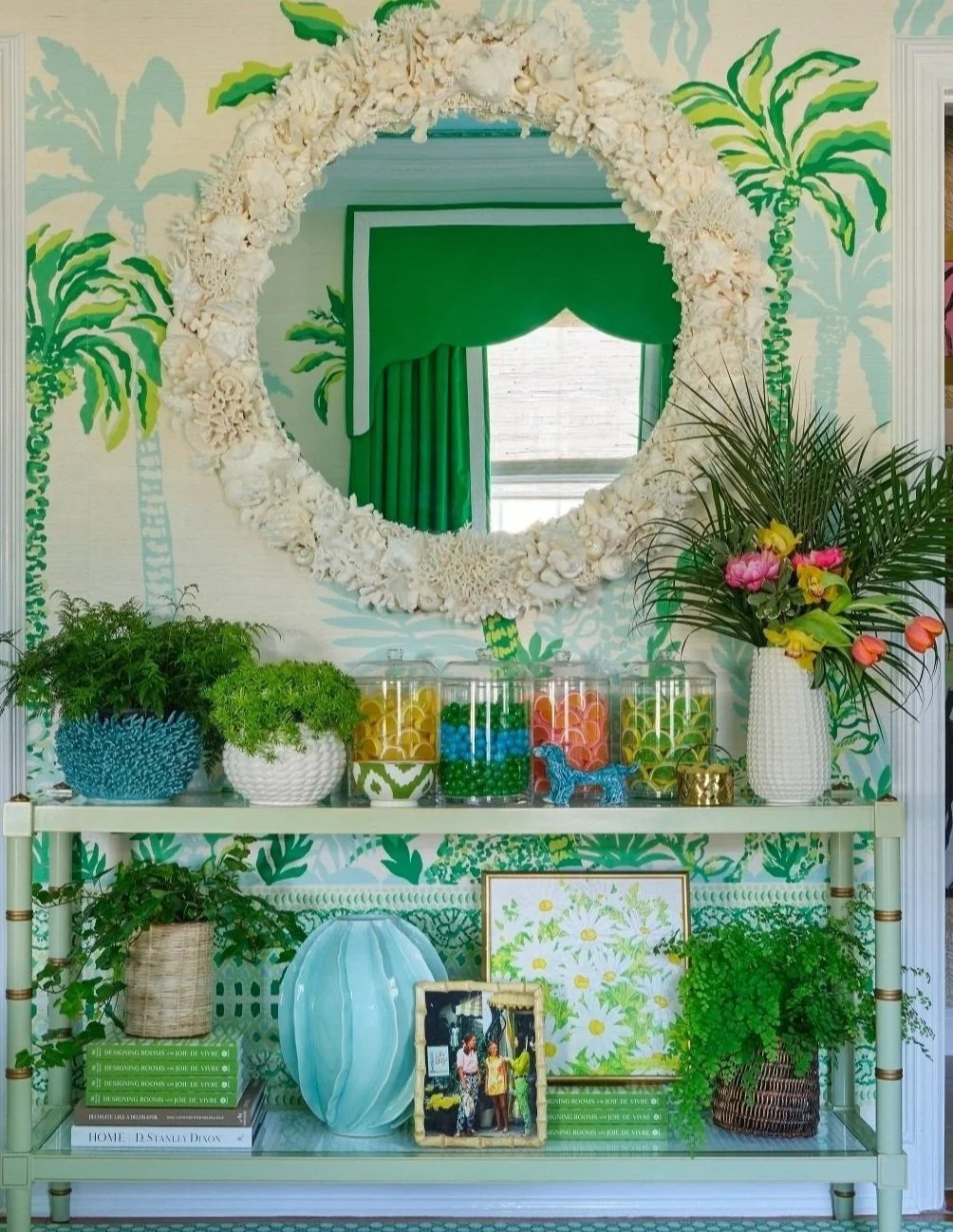
It takes a while to take everything in at Caroline Gidiere’s “Ladies Club of Palm Beach.” The lady’s private retreat in shades of salmon pink, butter yellow and palm green is described by the designer as a “love letter to Palm Beach’s timeless charm—with a contemporary twist that’s hard to leave.” The design masterfully blends nostalgia with a fresh, traditional aesthetic for the ultimate sanctuary. And the oversized shell mirror is a showstopper. Photo: Nicholas Sargent
The house is located at 1125 North Flagler Drive, in the Providencia Park neighborhood of West Palm Beach. It features the work of 23 distinguished designers, decorators and architects. The property has been thoughtfully transformed into a showcase of innovative design where visitors are invited to explore cutting-edge concepts and timeless style through March 16. For tickets and details, go to kipsbaydecoratorshowhouse.org/pb
The home includes 7,706 square feet of living space with five spacious bedrooms, seven bathrooms, and an expansive outdoor area with a pool. Set against the stunning backdrop of the Intracoastal Waterway, the residence has sweeping views of blue water and nearby Palm Beach Island. It’s a beautiful canvas for this year’s designers to work their magic.
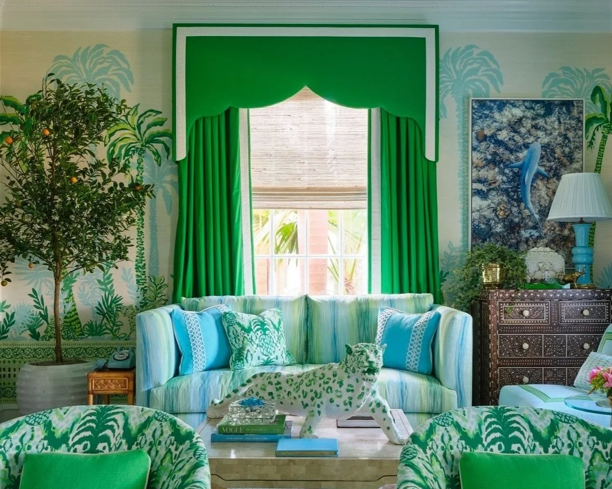
Amanda Reynal’s “Lilly Pad,” captures the vibrant whimsy of the Lilly Pulitzer lifestyle through Lee Jofa’s spring fabric and wallcovering collection for Lilly Pulitzer. Debuted in her “Lilly Pad,” the room boldly features saturated Kelly Green curtains adorned with bold white embroidered Lilly Pulitzer lace trim. Key elements include a sculptural chandelier and brass cocktail table, rattan end tables and a large burl wood coffee table that grounds the space with natural materials and soft neutrals. In the powder room, the Lilly wallpaper is punctuated with a teal sink and toilet inspired by the 1960s’ love of colorful bathroom porcelain and tile. The whimsical valance and Roman shade introduce warmth and privacy, enhancing the overall charm and seamlessly blending classic influences with contemporary flair.Photo: Carmel Brantley
Photo: Carmel Brantley
Photo: Carmel Brantley
What you will not find: minimalism. There is a lot to see in every room. What you will find: room designs that are filled with joy and happiness. And inspiration that will follow you home. You will also find a lot that will take you out of your comfort zone. Enjoy the experience and check out all of the details.
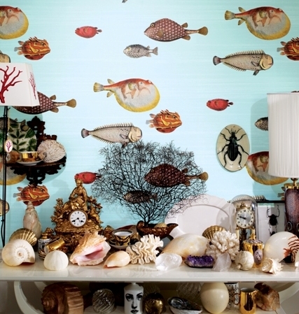
Expect to see big and bold color; no ceiling left untouched with lacquered color, tenting and wallcoverings; color drenching, antiques; a couple of pastel rotary phones (I would like one of those, please); murals, nature themes, curved sofas, oversized mirrors, lounges, retreats, lush landscaping, wellness sanctuaries and fantasy retreats. It’s all very glamorous and an escape to the dreamiest version of Palm Beach that’s imaginable.
Oxford Design’s “Poolside Perch,” reminds us of what a luxury it is to have a lanai. Designed to blur the lines between interior and exterior space, it’s an eclectic mix of upholstery, draping, and antiques. With an elegant bar, comfortable seating areas, artistic focal points, seasonal plantings, the lanai is an escape from reality the moment you walk across the threshold to enjoy the serene comforts of a tranquil retreat. Photo: Nicholas Sargent
It’s a total escape and who doesn’t need that? With rooms like Meet me at the Casbah, The Ladies Club of Palm Beach, The Lilly Pad, Worth Every Peony, Jewel of the Nile, Gentleman of the Jungle, Between Two Realms and more, it’s a beautiful day in Palm Beach!
Wrenda Goodwyn is a Southwest Florida interior decorator, A.S.I.D. associate. As a writer, blogger, stylist and color expert, she has helped homeowners throughout Southwest Florida with timeless, affordable ways to create beautiful spaces and to solve decorating problems. Her articles appear the first Saturday of each month. For more information visit her website at spectacularspaces.com. Call her at 239-850-5800 or e-mail wrenda@spectacularspaces.com. For more decorating tips, articles and photos, visit spectacularspaces.com/blog


