Creating a gallery wall for our treasures

Wrenda Goodwyn • special to the Fort Myers News-Press • February 1, 2020

Let’s face it: we love our stuff.

It’s why parting with things is so difficult. And no matter how often we have a healthy decluttering, there are just some items that are too important to part with. These are the things that tell a story about who we are and how we got here.

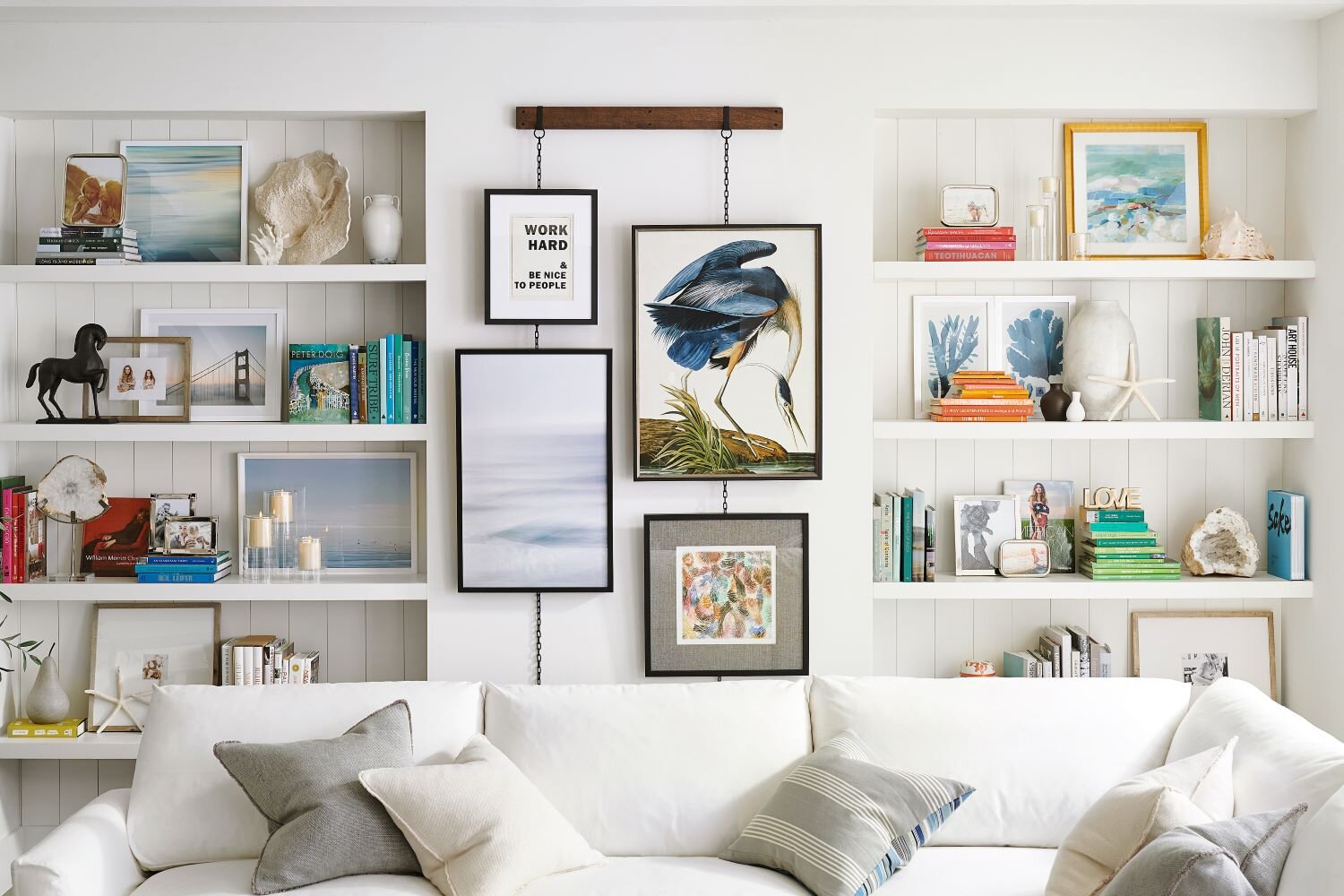
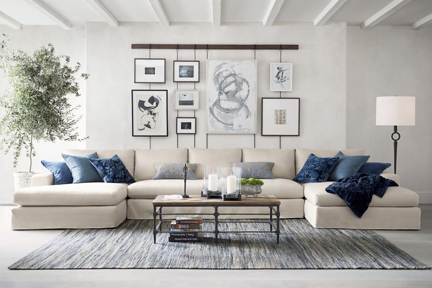
White sofa with statement wall featuring arrangement of art, accessories, books, and personal treasures. Art is displayed on Pottery Barn’s Frame Rail.

Mix art, accessories, books and personal treasures for a fun and playful statement wall. This arrangement combines items with art displayed on Pottery Barn’s Frame Rail with industrial chains that work with artwork or photos. Photo: Pottery Barn.

It’s also what makes a house a home.

But there’s a difference between a pile of things that we can’t say goodbye to and a carefully curated and styled grouping. It could be a collection of art, photography, objects from travels, collections, books. Anything that makes us happy when we look at it.

As a Fort Myers interior decorator, I can tell you that gallery walls are a huge trend right now and it’s no wonder. They look great and give us pleasure when we look at them. It gives us a place to display what we love in a creative way that adds to the look of our home. Arranging art and other objects on walls or shelving also frees up space on surfaces that can add to the cluttered look that none of us want.

Cream sofa with blue pillows and blankets in front of striking gallery wall hung using Pottery Barn's stylish frame rail.

This easy-to-hang and stylish frame rail offers a chance to curate a gallery wall designed to fit the style of the room. Photo: Pottery Barn.

You can create a gallery wall in a large or small space with two or three objects or 20. It just takes a little imagination and a wall.

A few tips to get you started:

Pick a wall. Decide where your gallery space will be located. It can be over a table. A sofa. In a small nook. In a dining room. You can fill a hallway with family photos and artwork.

Pick a theme. Family photos. Nature. Fine art.

What to use. Give the display more dimension by carrying the theme of the pieces to a table or shelving.

Over wooden side and corner desk are hung a grouping of hand-drawn monocromatic sunflowers in black frames. Arrangement includes greenery, candles and stacks of books.

Photo: Pottery Barn.

Decide on framing. If your wall will be a photo gallery, select matching frames if you want a cohesive look (my favorite) and the photos will be the focal point, not the frames. Or mix up the framing for an eclectic look.

Figure out the space. If pieces are of different sizes, begin by placing the largest piece first and filling in with smaller pieces. Do a layout of each item with brown wrapping paper to see how the sizing will work in the space.

Create drama. Take your display from the floor all the way to the ceiling.

From floor to ceiling, combine a bench artwork, family, photos and other items in a floor-to-ceiling gallery wall.. Photo: Pottery Barn.

From floor to ceiling, combine a bench artwork, family, photos and other items in a floor-to-ceiling gallery wall.. Photo: Pottery Barn.

Keep it clean and simple. If your style is clean and modern arrange two rows of photos the same size.

Eye level. If you are hanging pieces of different sizes, the largest piece should be at eye level. And if you are hanging a row of several pieces of different sizes, align the pieces at their center points.

Ledges. If nailing into the wall makes you a little nervous, style frames on a ledge (or two).

Pottery Barn ledges were used for this bold gallery wall in a bright white room with natural light, rustic floors, and tropical plant.

Photo: Pottery Barn

Make it easy. A frame rail from Pottery Barn lets you customize a statement wall with industrial chains that hold art or photos. See photo.

Make it fun. You are creating a collage of objects that means something to you. Use your imagination and see what happens!

Wrenda Goodwyn is a Southwest Florida interior decorator, A.S.I.D. associate and gold member of the Interior Redecorators Network. She helps homeowners throughout Southwest Florida with timeless, affordable ways to create beautiful spaces and solves decorating problems. Her article appears the first Saturday of each month. For more information visit her website at spectacularspaces.com. Call her at 949-1808 or e-mail wrenda@spectacularspaces.com. For more decorating tips, articles and photos, visit spectacularspaces.com/blog

Tips for designing a home that brings the beach inside

Wrenda Goodwyn • special to the Fort Myers News-Press •May 7, 2016

If you're like me and your favorite chair is a beach chair, your favorite shoes are flip flops and your preferred color palette is the one in your beach umbrella, you likely love the beach and want to have a little of it in your home.

Whether you live steps from the beautiful Gulf shores of Southwest Florida or just wish you did, you can design your home interior to reflect the colors, feelings and hues that will make you feel the tranquility and beauty that only the beach can provide.

WHIMSICAL CLOWN FISH ARE FROM COLE & SON'S ACQUARIO FORNASITTI II. THE WALL COVERING CREATES A DRAMATIC BACKDROP FOR AN ENTRY TABLE STYLED WITH FAVORITE BEACH-INSPIRED PIECES. PHOTO: COLE & SONS.

Beach house decor style is about a lifestyle. An attitude. It's about living with nature and capturing the essence of a long walk on a beach. Striking that balance between casual and a touch of formality. Collecting driftwood and shells. And finding a way to bring a piece of it home.

As a Southwest Florida interior decorator, many of my clients want to incorporate at least some aspect of our environment into their space.  Whether you live in an apartment, condo, single family home or an Airstream travel trailer, it's easily doable. And fun. Check out my favorite tips, pick one and get to work!

Bright and white

Take advantage of the great tropical lighting that we enjoy in this area. You can't beat a white backdrop for your walls. One of my other favorite go-to-colors for a beach cottage  look is Benjamin Moore's Silver Satin. And use Benjamin Moore's Decorator White for trim. Just enough hue and sparkle and has that "old Florida beach cottage" feeling.

Classic coastal color palette

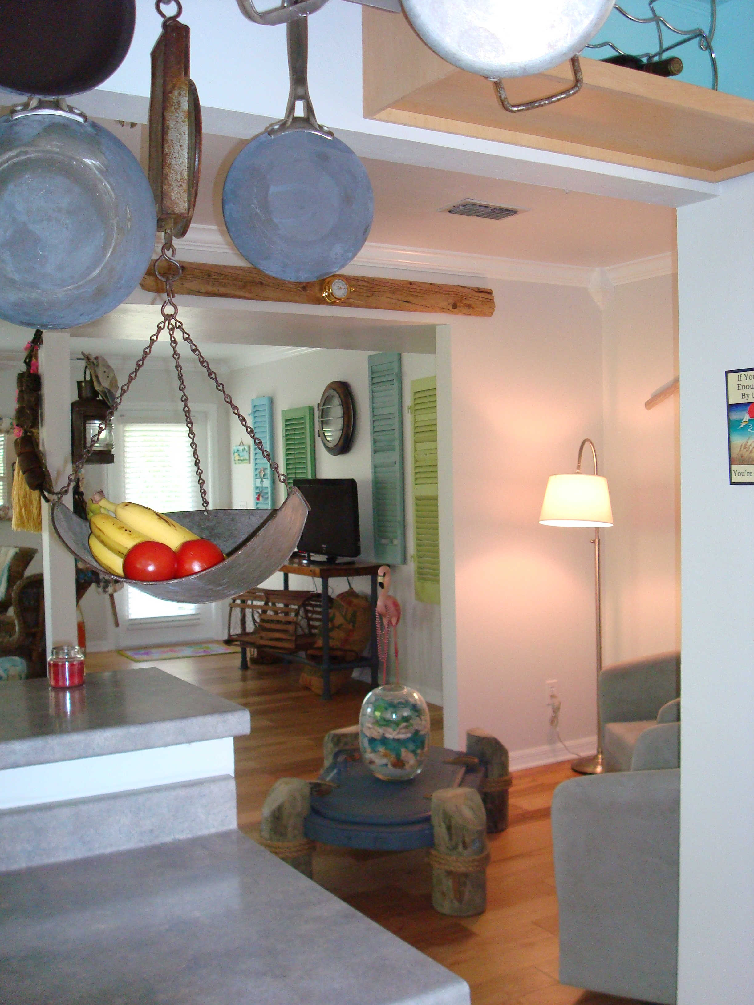
Vintage Ship door sits atop pilings and holds glass layered with sea glass. Photo: Wrenda Goodwyn.

Accessories, fabric, accents are beautiful when done in sea glass accents. Seafoam green/blues. And remember: a bit of turquoise in every room. Even if it's just a bowl of shells mixed with sea glass.

Beach-inspired kitchen

While my favorite kitchen is one done in all white, you can add contrast to white walls with pale grey/blue cabinets. Or bead board (so easy to do this and a great look) in a sea glass tone around the island or bar. Stainless appliances.

 Style a coffee table or entry table

If you don't do anything else, this is the one. It sets the tone of your home. This is where you display your favorite nautical elements: seashells, driftwood, glass jars with seaglass, art, books. I love working books into the mix. Some of my favorites: Island Life by India Hicks and Key West: A Tropical Lifestyle by Leslie Linsley.

Accent walls

For a little beach drama, select a wall in the entry or in a powder room. Cover it in one of the beautiful grass cloth wall coverings or something similar to the whimsical clown fish Cole & Son's Acquario Fornasitti ii. Place this behind your styled entry table or a gorgeous mirror and you don't need anything else to bring the beach home!

Windows

White shutters or light linen drapes are best.  When using drapes, I like to trim them with fabric tape in a sea glass hue. And remember, always hang drapes from just below the ceiling for as much height as possible.

Furniture

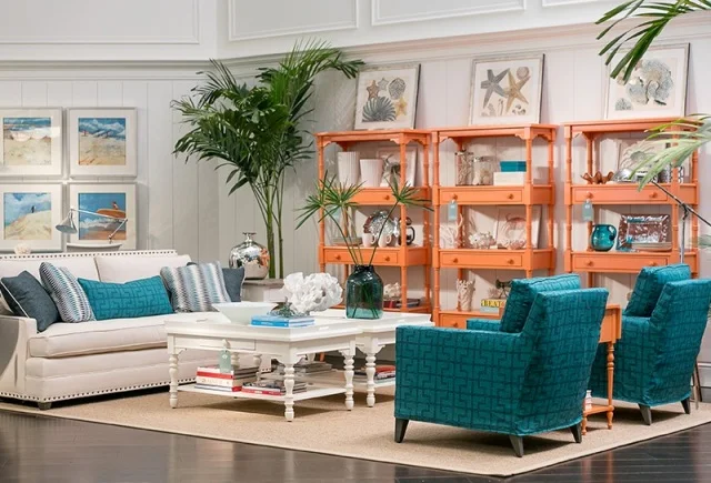
Style a bookcase or shelving with a tropical theme. Incorporate white furnishings, white walls and a jute rug. Photo: Pottery Barn. 

It's all about casual comfort. Cushioned or slip covered sofas and chairs will get you the look but you don't need to redo your furnishings. Just add a couple of bamboo chairs and maybe a stool with tropical or white cushions.(Bamboo can be painted: think flea markets). Add a couple of colorful garden stools. These can work as side tables for extra seating. Add colorful pillows.

It's 5 o'clock someplace!

Style a cart with a tiki bar theme. Include artwork on the walls behind the cart and add some of your favorite pieces along with beachy glasses and a plant or two. I like to include a colorful cloth awning over the cart to set it apart.  

Artwork

It's all about color and this is where the room comes to life. I have my clients look through magazines and on Pinterest to seek out paintings and photographs that speak to them and we work it into the mix. One of my favorites: take some your own favorite photographs and stretch them on canvas. This style is perfect for a casual look and is a great memory of someplace you have been.

Flooring

Sand would be perfect for a beach lover but it's best to incorporate natural fiber rugs such as sisal, jute or seagrass. They look great and some of the modern styles have a contemporary look, allowing for trim in coastal colors. Think: coral.

Design your bookshelf

This is one of my favorites. First, pick a sea-inspired color and paint the back of the bookcase or the wall. Creatively, arrange and showcase your artwork, books, driftwood, shells and other elements to give it that "just washed up on the beach look."

Accents

Display your shells in jars and bowls. I like a bowl of shells in every room. There is one by my computer as I write this article. They make me happy and take me someplace else when I have to work can't get to the beach!

Incorporate Capiz mirrors and lighting fixtures.

Purchase bamboo flatware and sea-inspired dishes to use every day.

Add a couple of palm trees to your decor...large or small. They say "tropical" and are good for the air quality in your home.


Wrenda Goodwyn is a Southwest Florida interior decorator, A.S.I.D. associate and certified gold member of the Interior Redecorators Network. Home Inspirations appears the first Saturday of each month. Visit her website at spectacularspaces.com. Call her at 949-1808 or e-mail wrenda@spectacularspaces.com. For more decorating tips and photos, visit spectacularspaces.com/blog 
 

Home Inspirations: Model behavior

Wrenda Goodwyn • special to the Fort Myers News-Press• February 7, 2015

It's happened to all of us. We walk into a model home and want to say "I'll take it."

Everything is so perfect and coordinated. The lighting, paint color, furniture, artwork, window treatments. It sparkles and says, "come in and stay a while."

As a Fort Myers interior decorator, I can't tell you how many times I receive a phone call that goes something like this: "I want my home to look like a model."

If only.

Here is a dirty little secret: It's not possible. It's like looking at  a photo in a fashion magazine and saying, "I want to look like that model."

Pottery Barn's organic Ikat medallion print with bright colors and a washed effect. Photo: Pottery Barn.

It won't happen. That model doesn't even look like that model.

And it's much the same with a model home. It's designed to be a model home. Not a home that anyone lives in. Therefore, you will never be able to achieve the exact look for your space.

But here is the good news: You can manage, with some help, to achieve the feeling that the model home gives you. Whether you are looking at home magazines in which the rooms are staged for photos or at a model home designed to "sell" the home, there are some tricks that will help you capture the feeling. But on a realistic, practical level.

Fabric headboard, styled nightstand, sconces and this beautiful, organic Ikat medallion print with bright colors and a washed effect create a model feeling in a bedroom. It's like I tell all of my decorating clients, show me the feeling that you want and I will help you get there. But remember, because a model home is not designed for anyone to live in it, we need to proceed cautiously!   

Here are my favorite tips for designing your space to capture the feel of a model home for real life living:

New lighting, fresh paint and a hand-painted framed mirror transform a bathroom. Photo: Pottery Barn.

•    Clean until everything sparkles. This is the trait of a model home: not a speck of dust anywhere! And polish the furniture and wipe down all appliances.

•    Declutter and organize. I know, you don't want to but you must. Clear the countertops and organize closets/drawers. You cannot have a model home feel with a lot of clutter. It just won't happen.

•    A fresh coat of paint changes everything.  Select a neutral color palette and give your walls a fresh coat. Add color with fabric, accessories and texture. One of my current favorites: grey walls with white, blue, green accents.

•    Notice how well lit and crisp model homes always look. One reason: lighting. Check out your ambient lighting, task and accent lighting. A carefully designed plan should include all three. And for those dark, tough to light areas: sconces and floor lamps.

•    Establish a focal point in the living areas. This can be a piece of art, a beautiful view of the outdoors, an antique or eclectic piece, a fireplace.

•    Drag the furniture away from the walls. You never see this in a model home! Establish a comfortable, easy flow conversation area and make sure your furniture is in scale with the room. Note: the furniture from your previous house may not work with scale of your new/current home.

•    Eliminate pieces that no longer work for you. If you have been hauling around furniture from home to home, it may be time to start over. If you want the feeling of a model home.

•    Include a large area rug to tie things together. It makes the room look more spacious.

•    Style your dining room table: set it for your next meal (like a model) or create a tablescape in the center that becomes permanent and you can enjoy it every day. Rather than a dining room table that just sets there unused. And unpretty!

•    Style your coffee table. I like to divide my tables into sections: books, flowers and a pretty tray with something that you love.

•    Refresh the bathroom: Hang a chandelier. Frame the mirror or replace with two single hanging mirrors. Add new sconces over the mirror.

•    Less is more. Always. Go for somewhat of a minimalist look but not to an extreme. It's one of the reasons that we love models homes: they are not filled with our everyday "stuff."

•    This is an easy one and it has to do with artwork. Go for large pieces over the sofa and think in terms of three's. Cut a large image into three sections or try it with a piece of fabric cur three times and stretched over canvas.

•    Add some drama to the bedroom. Paint an accent or add a wall covering to the wall behind the bed. Invest in a fabric headboard. Add sconces for lighting. Purchase new bed linens in a fresh, bold color. Declutter the nightstand.

Wrenda Goodwyn is a Southwest Florida interior decorator. Home Inspirations appears the first Saturday of each month. Visit her website at spectacularspaces.com. Call her at 949-1808 or e-mail wrenda@spectacularspaces.com. For more decorating tips and photos, visit spectacularspaces.com/blog
Art meets design for a walk on the wild side

Wrenda Goodwyn • special to the Fort Myers News-Press• January 24, 2015

It's whimsical and exotic with a touch of eclectic.  

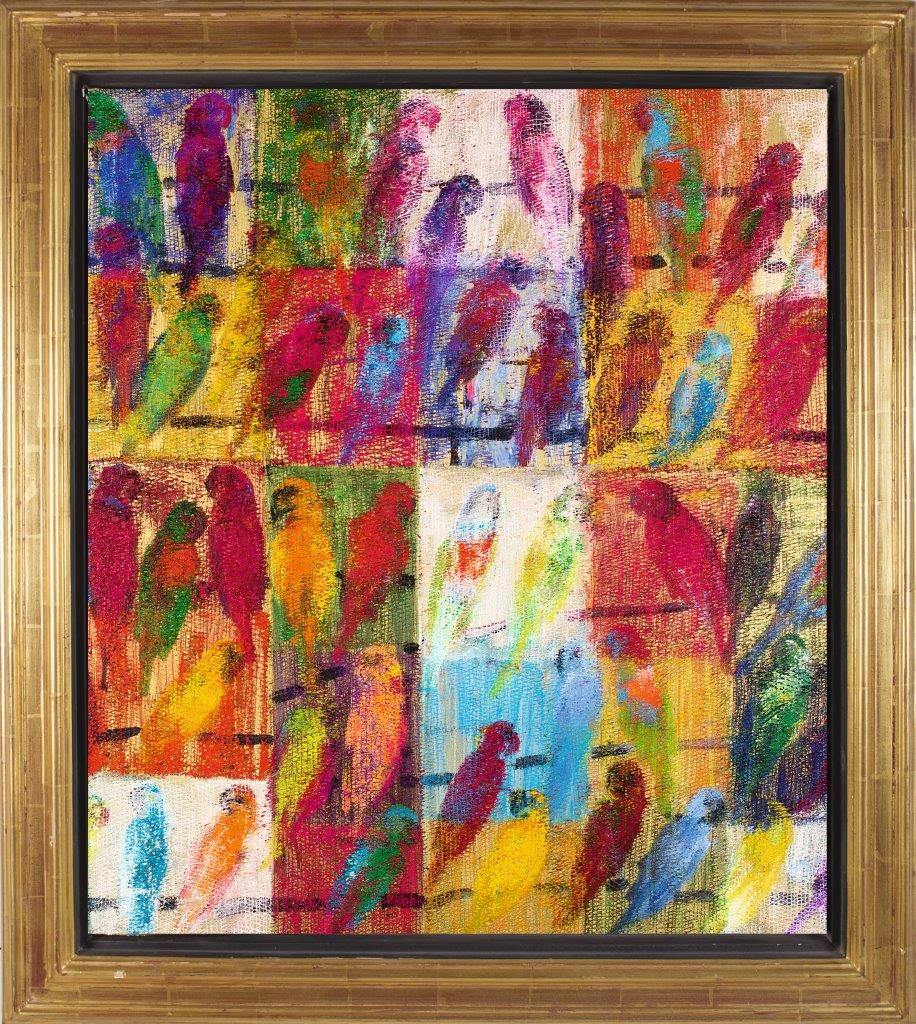
The collection contains vibrant and varied species of birds, butterflies, rabbits, tropical leaves and orchids all utilized in creating dynamic patterns in this art-meets-design collection.  In Lee Jofa's  first artist collaboration with Groundworks, they have introduced vibrantly colored and stunning fabrics, wallpapers, and carpets designed by Hunt Slonem, a world-renowned artist best known for his Neo-Expressionist paintings of exotic animals and tropical plant life.

And it's exciting because it puts some fun into interior design. It almost says, "yes I am gorgeous, but I don't take myself too seriously."

The result: Spectacular

Slonem's paintings are layered with thick brushstrokes of vivid color, and are often cut into in a cross-hatched pattern, adding texture to the overall surface of the painting. This technique has been replicated in the fabric collection through intricate jacquard weaving and digital printing techniques, resulting in a look that is graphically stunning.  For the Groundworks' collection, several of his most popular themes and iconic works have been translated into decor for the home.

Fritillery, the butterfly motif based upon specimens Slonem studied as a boy. Photo: Kravet/Lee Jofa.

As a celebrated painter, sculptor and printmaker with more than 350 exhibitions at prestigious galleries and museums internationally,  Slonem has traveled all over the world but it was his childhood spent in Hawaii, and a year studying in Nicaragua, that have had the most profound impact on his life’s work. The vivid color combinations and exotic wildlife he encountered there inspire him to this day.

The motifs he explored in his early works, tropical birds, butterflies, bunnies and portraits, have been reduced to their essence and have become recurring themes in his extraordinary art. His spiritual connection to the concept of metamorphosis led him to include the butterfly as one of the recurring themes in his work.

And there are those iconic bunnies.

Fascination with the rabbit occurred when he realized was born in the year of the rabbit, according to the Chinese calendar. In his New York City studio,  the bunny wall consists of   salon-style groupings of his small bunny paintings, some hung while wet. These signature paintings are now collector's items.  And Bunny Wall is a wallpaper that mimics the effect of the framed paintings against different colored backgrounds.

Slonem's spiritual connection to his recurring themes elevates the simple paintings to something more significant. To Slonem, repetition is divinity. Just like the act of repeating a phrase creates a mantra, the object is elevated and the act of repeating these forms becomes an act of worship. The process of painting is sacred to Slonem, and as a result, his body of work represents so much more than what's painted on the canvas.

And just how do we incorporate some of this exotic whimsy into our southwest homes? My suggestions:

A seamless series of bunnies, unframed and multiplied, on solid and metallic backgrounds. The repetition represents luck, abundance and the gentle traits represented by the rabbit. Photo: Kravet/Lee Jofa.

A seamless series of bunnies, unframed and multiplied, on solid and metallic backgrounds. The repetition represents luck, abundance and the gentle traits represented by the rabbit. Photo: Kravet/Lee Jofa.

•    The beautiful fabric is an elegant touch for upholstery and draperies.  My favorite is to take a chair or sofa piece that has become dated or an antique and reupholster  to give it a totally new look.  And the fabric makes beautiful window panels.

•    Who can resist the Bunny Wall as an accent wall covering in an office or dining room and for the entire powder room?

•    Pillows for accents add a bright, eclectic  touch to a solid color, traditional sofa.

•    The bunny wall coverings, Hutch, are available in pink or yellow and would be a great touch for a nursery.

•    Want just a touch of these fabulous creations in your home?  Stretch a piece of the fabric on canvas for a wall or frame a section of one of the wallpapers.

To see the entire collection, visit the Kravet/Lee Jofa showroom at the Miromar Design Center in Estero or visit www.leejofa.com/groundworks_wallcoverings.htm.

Hunt Slonem will sign his new book, When Art Meets Design from 4-6:30 p.m., January 26 at Harmon-Meek in Naples. Details: 239-262-2699.

Wrenda Goodwyn is a Southwest Florida interior decorator. Home Inspirations appears the first Saturday of each month. Visit her website at spectacularspaces.com. Call her at 949-1808 or e-mail wrenda@spectacularspaces.com. For more decorating tips and photos, visit spectacularspaces.com/blog

Design forecast: Fearless, bright, bold and brassy

Wrenda Goodwyn • special to the Fort Myers News-Press• November 8, 2014

 
Mid-century modern dining by Stanley Furniture. Photo: Wrenda Goodwyn

Mid-century modern dining by Stanley Furniture. Photo: Wrenda Goodwyn


At High Point Market in North Carolina, along with 75,000 other buyers and designers from all over the world, I did my best to cover 11.5 million square feet of space that provide dazzling displays of thousands of new products.

This home decor mecca is Disneyland for designers. It takes place for one week each fall and spring. With so much to see that it's easy to find yourself on visual overload. In addition, there are opportunities to meet famous designers, take courses from experts and there are lots of opportunities to meet your favorite television personalities (my design crush: Tom Filicia). There is even a seminar that teaches you how to navigate Market, as it is called, and to make the most out of your time.

 
Lots of creative uses of books. Photo: Wrenda Goodwyn.

Lots of creative uses of books. Photo: Wrenda Goodwyn.


But who has time for that course with all of the spectacular showrooms waiting with beautiful, pretty things. The temptation is to just take the plunge with your to do list. And so I did.

As a Fort Myers interior decorator, this is where I go for design inspiration, to look for new ways of creating beautiful rooms and to shop for my clients who are looking for something new and fresh. Whether it is an eclectic piece to be used as a focal point in a room or for to shop for furnishings and accessories for an entire home.

 
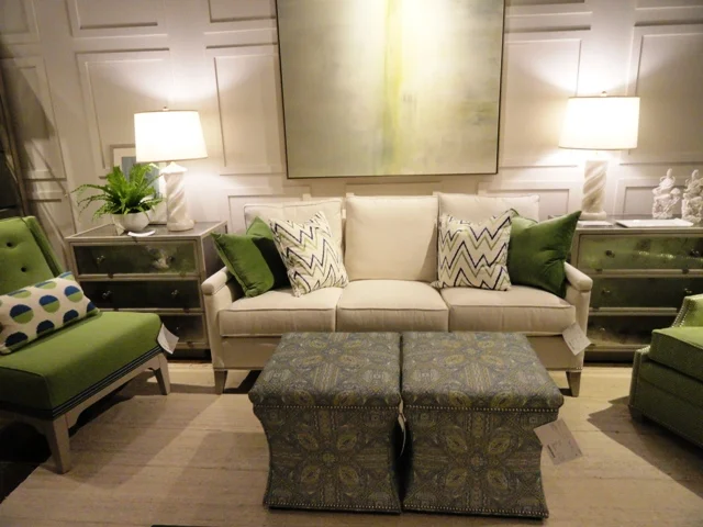
Pretty and popular apple green accents with neutral tones. Photo: Wrenda Goodwyn.

Pretty and popular apple green accents with neutral tones. Photo: Wrenda Goodwyn.


If you can't find it here, it doesn't exist. Not that every showroom can be covered. Despite the miles that I put on my new, sensible walking shoes. So take a trip with me as I offer a peek at a few of the amazing, edgy, stunning new trends that I saw at Market. You will soon be seeing these in your favorite retail spots and magazines.

Trends

The market spotters were predicting "bright, bold and brassy," and that sums it up perfectly. Home design has taken a turn that is not for the faint of heart. Fearless decorating with bright tones and accessories that don't take themselves too seriously.

Brass and gold continue to be very important in home décor----not shiny brass or gold but wonderful antiqued and textured gold as well as brass with a natural patina.

 
Bold and sassy! Photo: Curry & Company.

Bold and sassy! Photo: Curry & Company.


Lighting

The jewelry of interior decorating, lighting is the hottest accessory and it takes center stage in every room. Never has lighting been prettier with more sparkle and bling! The choices are stunning. Think gold.

In the Currey and Company showroom, a showstopper in itself, each piece hanging from the ceiling looked like a sparkling gold bracelet twisted into arty shapes.

 
Orli Chandelier of Wrought Iron finished in Contemporary Gold Leaf. Photo: Currey & Company.

Orli Chandelier of Wrought Iron finished in Contemporary Gold Leaf. Photo: Currey & Company.


Wrought Iron with contemporary gold leaf and brass are popular finishes. And the dazzling La Mer Wall Sconce of wrought iron, shell and glass is a perfect accessory for a sophisticated coastal look that blends beach-inspired design with a traditional or contemporary look.

 
La Mer Wall Sconce. Photo: Currey & Company.

La Mer Wall Sconce. Photo: Currey & Company.


Color

As we said, bold and fearless! Lots of blues including navy, indigo, robins egg.  Red is also trending in sofas and accessories along with corals and pinks. Orange, jade, teals and that beautiful apple green are everywhere.

Furniture

Lots of soft curves that soften the silhouette of a chair or sofa and add visual interest. Canopy beds are trending with a breathtaking, modern new look. Blending antiques with almost any style as an accent piece. Reclaimed/distressed pieces. Driftwood. Lot of gold and brass tables. Table bases and coffee tables have emerged as artwork with sculptured designs. Bar carts are the rage with lots of gold and glass. Ottomans in bold patterns and jewel tones.

 
Coastal living retreat. Photo: Stanley Furniture.

Coastal living retreat. Photo: Stanley Furniture.


Carved wooden coffee table. Photo: Wrenda Goodwyn.

Carved wooden coffee table. Photo: Wrenda Goodwyn.


And with furniture, it's all about customization. Changing the shape of a leg, an arm or a cushion, even changing the dimensions of a piece to fit a unique space, offers choices like never before to the consumer.

According to Kravet, premiering its new furniture showroom at Market, a lot of designers today are embracing an updated traditional look, which could mean a tufted sofa with a slim track arm, or a comfortable arm chair with sleek details.

 
Kravet Denham Chair. Photo: Kravet.

Kravet Denham Chair. Photo: Kravet.


There is a resurgence of the chaise lounge, and they are popular in today’s interior design schemes. With regard to pattern and color, Kravet embraces a bright bold fabric statement on furniture, however many designers are choosing upholstery that is durable and neutral, which is a great investment for the life of your furniture, and your room.

Brass and bronze occasional tableswere everywhere with some of the most popular at Vanguard Furniture to complement the extensive furniture collection that is popular with southwest Florida homeowners because of its personalization options. And furniture is painted every color imaginable!

Art and accessories

So many fresh, new choices here. Artifact decor is hugely popular as an accent. Buddha's in every color are a huge accent piece with all styles of decor. Books have taken on a huge role in artwork and accessories serving as a focal point and covered in papers and fabric. Glass is seen in bold colors and shapes.

 
Popular Buddha is incorporated into all styles of design. Photo: Wrenda Goodwyn.

Popular Buddha is incorporated into all styles of design. Photo: Wrenda Goodwyn.


Rugs

Bold and exotic. Intricate patterns. Lots of metallics. Washes and patinas create a soft look.  Viscose yarn is used with pearlescent shimmer to add dimension to neutral tones. Easy care with custom sizing, beautiful indoor/outdoor selections.

 
Blue Bye You. Photo: Company C.

Blue Bye You. Photo: Company C.


Summary:

Have fun with the latest trends and don't take your decorating too seriously!

DSC05219.JPG

For more details on trends and other fun sightings at High Point Market, visit www.spectacularspaces.com/blogor call Wrenda Goodwyn at 239-949-1808 or wrenda@spectacularspaces.com

Thanks Mr. Chihuly: You made my day in Seattle!

Photo of glass flowers at Chihuly Garden and Glass in Seattle

I knew this was going to be a great day.

The kind that people who live in Seattle never talk about. The skies were blue and the sun was shining.  l almost skipped to the Chihuly Garden and Glass exhibition that’s located at the base of the Space Needle.

Photo of Dale Chihuly and Wrenda Goodwyn at Chihuly Art and Glass in Seattle With Dale Chihuly at Chihuly Garden and Glass in Seattle.This was a day that I had looked forward to since the exhibition opened a year ago.  Stained glass has always been one of my passions and I have dabbled in it for years.  Dale Chihuly pushes the envelope with his dreamlike pieces. You want to stare at them for hours and that’s what I did.

The centerpiece is the Glasshouse. A 40-foot tall, glass and steel structure covering 4,500 square feet of light-filled space, the Glasshouse is the result of Chihuly’s lifelong appreciation for conservatories. The design draws inspiration from two of his favorite buildings: Sainte-Chapelle in Paris and the Crystal Palace in London.


The installation is an expansive 100-foot long sculpture in a color palette of reds, oranges, yellows and amber. Made of many individual elements, it is one of Chihuly’s largest suspended sculptures. The perception of the artwork varies greatly with natural light and as the day fades into night. It is inspiring and captivating.

So after going through the exhibition(45,000-square feet of colorful bliss) twice to take it all in, I entered the Glasshouse and there he was: Dale Chihuly. It was my lucky day.  He was talking about how he did the installation. I met him and we talked for a few minutes.  He was gracious and had his photographer take a photo of us. He made my day in Seattle.

Read More