Color matters: how to get it right in your home

Wrenda Goodwyn • special to the Fort Myers News-Press/USA Today Network • Feb. 4, 2023

Creating a spectacular space in your home doesn’t just happen. It takes thought, effort, planning and careful implementation for a quality result. This is especially true when coming up with a color plan.

It’s far from easy. It’s complicated. It’s not necessarily about your favorite color. It’s why home interior professionals study it for years and most are like me and don’t leave the house without a fan deck in their hand. We are passionate about color. Color is everything.

As a Fort Myers interior decorator, my most requested service is selecting color and creating personalized color palettes for the home. It’s the most difficult part of decorating for many homeowners and there are good reasons. The number one reason being the approach. It’s usually all wrong and results in mistakes and frustration.

Collage display of what goes into coming up with a design plan. Photo by Benjamin Moore.

Creating a spectacular space in your home doesn’t just happen. It takes thought, effort, planning and careful implementation for a quality result. This is especially true when coming up with a color plan. Before you head out to pick up color swatches, come up with a plan that considers flooring, light, furnishings and upholstery throughout the home. Photo: Benjamin Moore

Most rush out to a big box store, grab a hundred color swatches (all in their favorite colors), take them home, hold the one-inch color swatch up to their existing paint color, make a decision, call the painter and it all begins. And then wonder why it doesn’t look just right.

Trends and changes

Although I always recommend following what you love and a more timeless approach to home decorating, color trends are always fun and there are lots of changes in color choices.

Timeless and classic white bathroom in Benjamin Moore's Ice Mist in matte and wainscoting in white Diamond matt.. Aura Bath and Spa.b

Timeless and classic. A white bathroom with walls in Benjamin Moore’s Ice Mist in matte and wainscoting in White Diamond matte. Aura Bath & Spa. Photo: Benjamin Moore.

• Overall we are seeing warmer colors. Cozy and comfort seem to be what we are craving right now.

• Lots of beautiful earth tones. Be careful of too much of a good thing. Remember how long it took to escape the Tuscan trend.

• Reds, oranges, yellows.

• Neutrals warmed up with yellows, blues and greens. This is a popular choice in Southwest Florida homes.

• Moody hues on walls in darker tones. And lots of navy for kitchen cabinets.

Beautiful bathroom in moody popular color by Benjamin Moore, Charcoal Slate with Atrium White trim. ebe

Moody colors are popular such as Benjamin Moore’s Charcoal Slate (walls in matte) and Atrium White (ceiling in matte), trim in semi-gloss. All are Aura Interior Paint. Photo: Benjamin Moore.

Timeless and classic

• White for kitchens and bathrooms.

• Moldings for the entire home. These classic touches give a room what it needs to carry off all-white or dark colors.

Rule #1

When we speak of color and color palettes, we are not suggesting that color only be considered for walls. Your color palette should incorporate the entire look of your home. If your primary color in your living spaces is neutral, the color palette should incorporate other colors throughout to keep it from being boring.

An example is yellow. We are seeing this color return and it is everywhere. But let’s face it: yellow is a tough wall color if you don’t want to tire of it soon. So, work yellow into your palette with towels, linens, fabric, wall treatments and accessories.

And this really goes for any color that you fall in love with. Just because you saw that dark blue in a magazine and you want to try it on your walls, think about it. Consider lighting, architectural features, furnishings, trims and how you use the room before you paint. Most of these rooms in magazines are decorated from top to bottom with custom trims and architectural features. It simply will not look the same in a plain room.

So, what do we do?

Incorporate these beautiful splashes of color throughout your home in other ways. Here are a few:

• Try the color on a ceiling. I have been doing this in homes for years and it gives a splash of color without committing it to the entire room.

• Paint shelves and bookcases in a color against a neutral background. Or go monochromatic with everything in the same color.

• Use colors from your palette in rugs, pillows, window treatments, headboards, upholstery for sofa, and chairs, artwork, mural or wallcovering.

Why is color so important?

• It updates your home without spending a fortune.

• Pulls the space together.

• Makes your home look clean and fresh.

• Color creates a personalized look for your home.

• It makes you happy!

A few more tips

ALL color has undertones. This is where the mistakes are made. If your sofa (or flooring or counter tops) has green/beige undertones and you pick a pinky beige paint color for walls, you will not be happy. This is where a professional can help.

• Think about the rest of your home. Color needs to coordinate throughout. A good rule that I follow: No more than three paint colors in the home.

• What works: I like to select more neutrals for the main areas and incorporate ceiling and trim colors. Bathrooms and bedrooms lend themselves to accent colors.

Wrenda Goodwyn is a Southwest Florida interior decorator, A.S.I.D. associate and gold member of the Interior Redecorators Network. She helps homeowners throughout Southwest Florida with timeless, affordable ways to create beautiful spaces and solve decorating problems. Her articles appear the first Saturday of each month. For more information, visit her website at spectacularspaces.com. Call her at 239-850-5800 or e-mail wrenda@spectacularspaces.com. For more decorating tips, articles and photos, visit spectacularspaces.com/blog

Color Matters

Wrenda Goodwyn • special to the Fort Myers News-Press • August 3, 2019

Color. It makes us feel happy. It changes everything including how we feel about our space. Get it right and you will love your home. Mess it up and you will always wonder why it’s not feeling quite right. Photo: Thibaut Design

Color. It makes us feel happy. It changes everything including how we feel about our space. Get it right and you will love your home. Mess it up and you will always wonder why it’s not feeling quite right. Photo: Thibaut Design

There I was at the gym the other morning. Slogging away on the treadmill.

I love working out and couldn’t figure out why it was such a struggle. Too much effort. Painful.

Then it hit me. This was a new fitness center and I had only been there a few times. The colors were fairly horrid. Brown walls in a shade I have never seen, brown flooring (to hide dirt…need I say more), grey equipment (of course) and it looked out over a grey parking lot with no vegetation or color of any kind. And it was an overcast day. On a sunny day this might be tolerable. Maybe.

Contrast this with my yoga studio which is done in creams, soft blues and greens. A glass wall looks out over a beautiful garden with lots of greenery and a fountain. I can’t wait to get there in the early morning and I am never anxious to leave.

Color matters

From the time we get that first box of crayons, we are fascinated by color. It has the power to change everything.

You can’t go wrong with blue and white as the foundation for a color palette. Shown here: Thibaut Design’s Travelers palm printed fabric. Other colors available. Photo: Thibaut Design

You can’t go wrong with blue and white as the foundation for a color palette. Shown here: Thibaut Design’s Travelers palm printed fabric. Other colors available. Photo: Thibaut Design

As an interior decorator working in Southwest Florida, my most requested service is selecting color and creating personalized color palettes for the home. It’s the most difficult part of decorating for most people and there are good reasons.

It’s a fact

We are fortunate to live in a tropical paradise where beautiful color palettes surround us.

The right color scheme can make a room look larger, prettier, lighter, darker, cleaner or happier. Color can give your home a beach vibe, modern coastal look, add a little boho chic, a cottage feeling or farmhouse style.

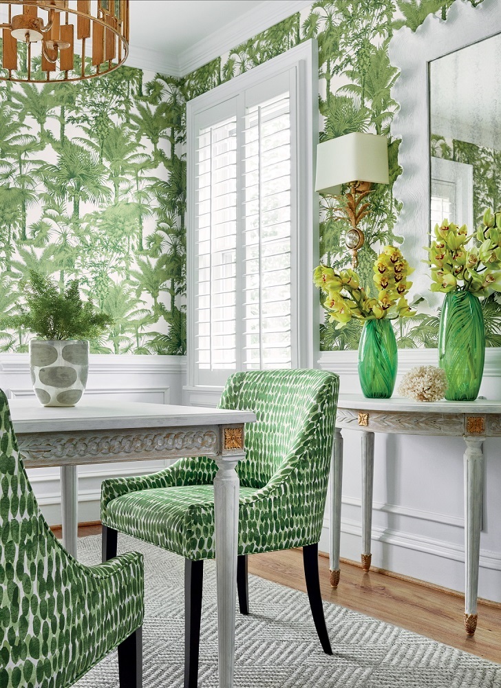
Palm Botanical wallpaper in Emerald Green from Thibaut Design’s Tropics Collection. Morgan Dining Chairs in Rain Water printed fabric in Green. Photo: Thibaut Design

Palm Botanical wallpaper in Emerald Green from Thibaut Design’s Tropics Collection. Morgan Dining Chairs in Rain Water printed fabric in Green. Photo: Thibaut Design

Limited budget? Pick color

Seriously. If you are on a limited budget and are able to only do one thing, select a new color palette. It will change everything and you’ll love your home again.

It makes us feel happy. It changes how we feel about our space (like that gym). Get it right and you will love your home. Mess it up and you will always wonder why it’s not feeling quite right.

It’s far from easy. It’s complicated. It’s why home interior professionals study it for years and most are like me and don’t leave the house without a fan deck in their hand. We are passionate about color. And we know all of the tricks.

Color don’ts

· Rush to make a decision.

· Go with the latest trends.

· Pick color from a tiny swatch.

· Paint without testing the color on the wall.

· Pick a paint color before you have anything else in the room.

· Think only about the room that you are painting. Color needs to flow in order to work.

· Paint every room a different color.

Color do’s

· Pick colors that are found in nature. You can’t go wrong.

· Create a color palette and work from there. Consider your window treatments, upholstery, pillows, artwork and accessories. Color is not just the paint that you put on the walls. Think about the big picture.

· With paint, buy the best quality paint you can afford. It makes a difference. And go with the lowest VOC or no VOC.

· Color challenged? Lots of homeowners are…magazines, Pinterest and vision boards all help.

· And when all else fails, call a professional. Our job is to keep you from making mistakes.

· Consider the ceiling. I often tint the paint for the ceiling so that it’s not such a stark white. Just a little splash links the ceiling to the walls. And if you have coffered ceilings, take advantage of this element with color.

Be fearless when it comes to color. It changes everything. Including how you feel. And who doesn’t want a happy home?

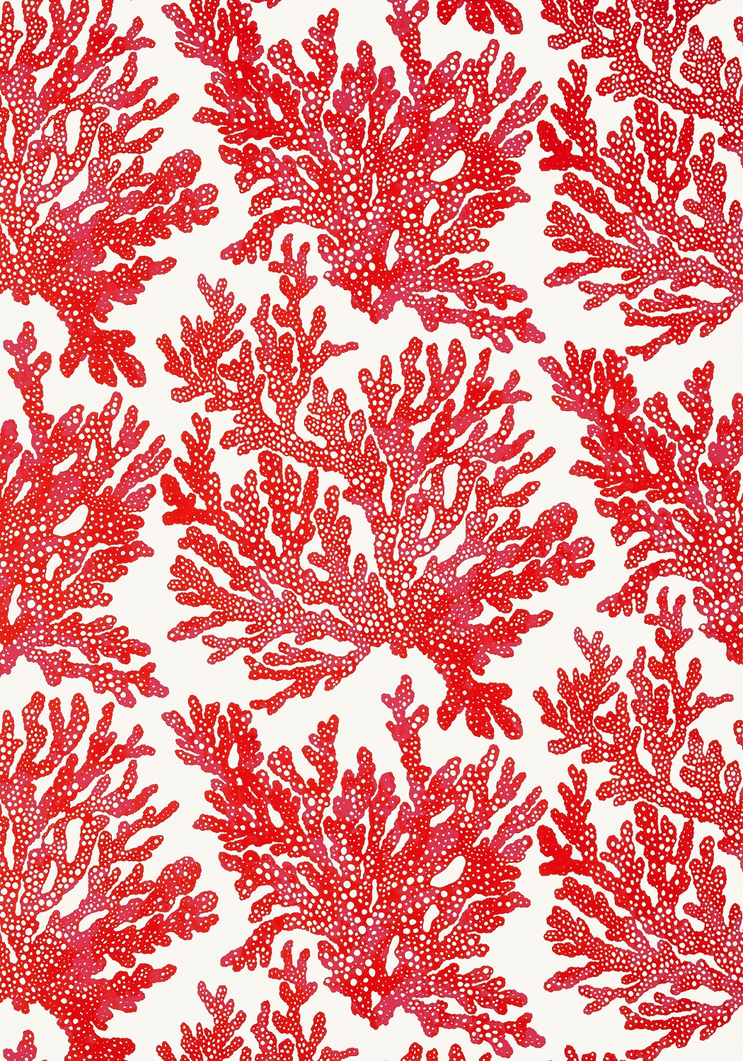
Photo: Thibaut Design

Photo: Thibaut Design


Wrenda Goodwyn is a Southwest Florida interior decorator, A.S.I.D. associate and gold member of the Interior Redecorators Network. She helps homeowners throughout Southwest Florida with timeless, affordable ways to create beautiful spaces and solves decorating problems. Her article appears the first Saturday of each month. For more information visit her website at spectacularspaces.com. Call her at 949-1808 or e-mail wrenda@spectacularspaces.com. For more decorating tips, articles and photos, visit spectacularspaces.com/blog

Giving thanks for your home

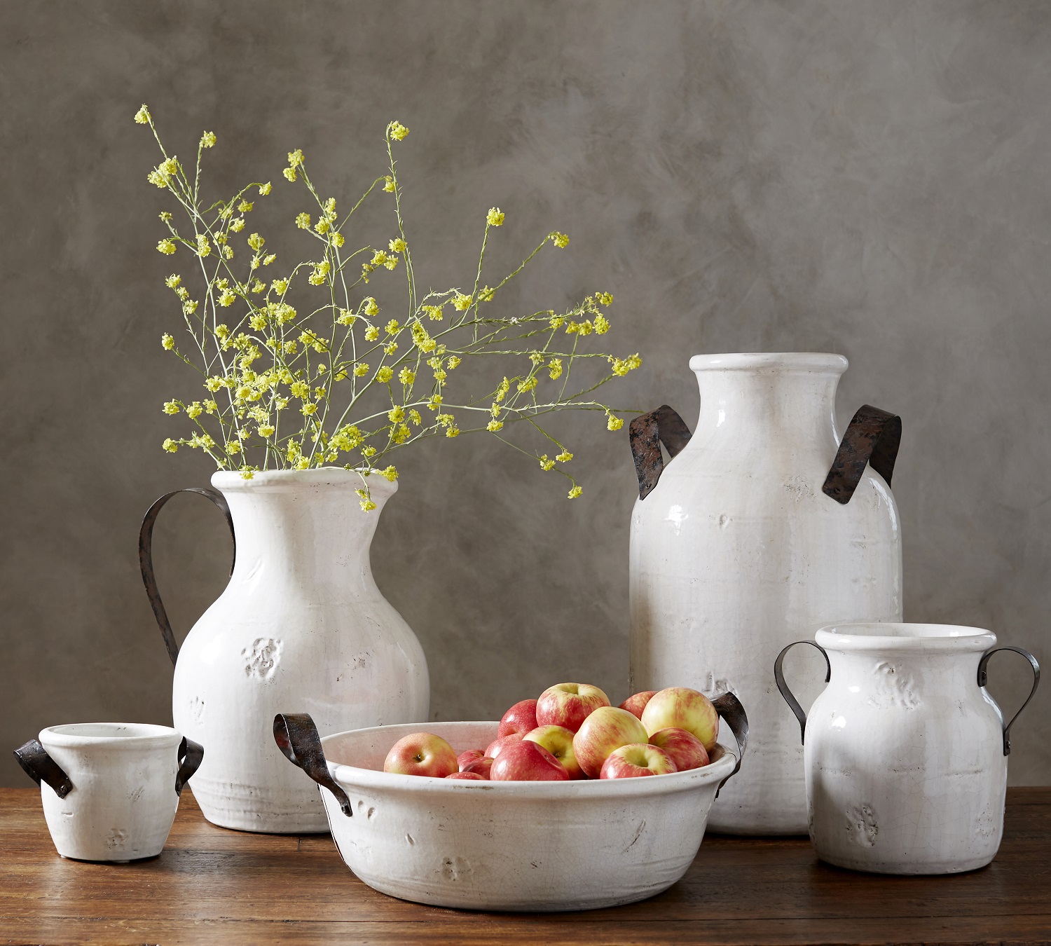
Keep it pretty and simple this Thanksgiving with handcrafted ceramics from Pottery Barn that let you bring nature into your home with botanicals and colorful fruit. Photo: Pottery Barn.

Keep it pretty and simple this Thanksgiving with handcrafted ceramics from Pottery Barn that let you bring nature into your home with botanicals and colorful fruit. Photo: Pottery Barn.


Wrenda Goodwyn • special to the Fort Myers News-Press • November 3, 2018

Even in our year-round tropical paradise where there is little change in the weather, fall brings a noticeable shift.

Unlike the rest of the country, the slight drop in temperature has most of us heading for the beach, sprucing up our lanais for the season and getting outdoors more. It means football games, antique markets, holiday open houses, the beginning of a series of celebrations and family gatherings. And Thanksgiving.

Sadly, Thanksgiving gets lost in the Halloween/Christmas shuffle. Wedged in between the two, it doesn’t get the recognition that it did when I was growing up in Virginia and it was a major family holiday.

In a time of many challenges, most people are stressed, shuffling too many obligations and trying to do it all, Thanksgiving is a good time to stop and take a breath. And to be thankful for where you live and for your home.

Bombarded by beautiful, professionally-styled homes featured in magazines, Pinterest and HGTV, we live in a constant state of wanting to do more, more, more. And a visit to model homes on a weekend sends most of us into a deep case of home envy. Everyone has a better, more gorgeous home. Or so we think.

Our homes provide comfort, safety, calm and happiness. And yet, we are never really satisfied

As a Southwest Florida interior decorator, I make homes pretty. Solve problems that bother the homeowner. Pull everything together for a calm, cohesive look. The ultimate goal: happiness when you walk in the door.

The right paint color helps to pull everything together for a calm, cohesive look and makes you happy when you walk in the door. Benjamin Moore: Wall in Mascarpone AF-20; trim in Whipple Blue HC-152. Photo: Benjamin Moore.

The right paint color helps to pull everything together for a calm, cohesive look and makes you happy when you walk in the door. Benjamin Moore: Wall in Mascarpone AF-20; trim in Whipple Blue HC-152. Photo: Benjamin Moore.

Sometimes this may only require a new color palette. Color is the big change in any home. And it can be the best investment for your money. But it may also require new furniture or a bath or kitchen redo. The most important thing: start with where you are and work from there. But don’t go crazy.

Take a minute to stop, look around and give thanks for what you have. A fresh perspective. Often it is the simple things.

A few things that you don’t need:

· Oversized coffee tables

· Too many chairs (eat-in kitchen, dining room, bar stools, patio chairs….how many chairs do you really need?) make a home look like a furniture store.

· Bar carts. Cute but unnecessary and take up space.

· Too many throw pillows.

· Media centers that span an entire wall. A lot of fuss for a TV.

· Layered rugs. One is enough.

· Dining room table and chairs that see use once a year (or less).

· To strive for perfection. It will never happen and you will just be exhausted all the time.

Giving thanks with a twist on the traditional napkin ring with these wraps from Frontgate. Photo: Frontgate.

Giving thanks with a twist on the traditional napkin ring with these wraps from Frontgate. Photo: Frontgate.

What you need:

· Keep it simple.

· Declutter something. You will feel better.

· A chandelier in your closet. It will make you happy.

· A calm space. A spa bath, a patio, a yoga nook, a chair with a reading lamp.

· Nature. Plants in the house have health benefits and make us feel good.

· Good lighting. Up the wattage.

· Decorate as though you will live there forever.

· A pretty guest room. Company is coming!

· Aim for timeless and affordable.

· Don’t live in a storage garage for someone else’s memories. Your home is about you.

Wherever you are spending the holiday, be thankful for your home sweet home.


Wrenda Goodwyn is a Southwest Florida interior decorator, A.S.I.D. associate and certified gold member of the Interior Redecorators Network. She has helped homeowners throughout Southwest Florida with timeless, affordable ways to create beautiful spaces and to solve decorating problems. Her article appears the first Saturday of each month. For more information visit her website at spectacularspaces.com. Call her at 239-949-1808 or e-mail wrenda@spectacularspaces.com. For more decorating tips, articles and photos, visit spectacularspaces.com/blog


Eliminate color confusion! Tips for getting it right

Wrenda Goodwyn • special to the Fort Myers News-Press • June 2, 2018

So many choices! A few tips will keep you from making mistakes and will help select just the right color to create a beautiful interior. Photo courtesy of Benjamin Moore.

So many choices! A few tips will keep you from making mistakes and will help select just the right color to create a beautiful interior. Photo courtesy of Benjamin Moore.

It makes us feel happy. It changes everything including how we feel about our space. Get it right and you will love your home. Mess it up and you will always wonder why it’s not feeling quite right. 

Color.

It’s far from easy. It’s complicated. It’s not necessarily about your favorite color. It’s why home interior professionals study it for years and most are like me and don’t leave the house without a fan deck in their hand. We are passionate about color.

As a Fort Myers interior decorator, my most requested service is selecting color and creating personalized color palettes for the home. It’s the most difficult part of decorating for most people and there are good reasons. The number one reason being the approach. It’s usually all wrong and results in mistakes and frustration.

Most people rush out to a big box store, grab a hundred color swatches (all in their favorite colors), take them home, hold the one-inch color swatch up to their existing paint color, make a decision, call the painter and it all begins. And then wonder why it doesn’t look just right.

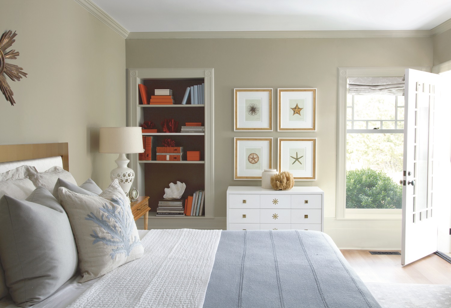
Neutrals and beiges are popular in Southwest Florida and can be paired with accent colors in accessories. Wall: Pashima (AF-100). Trim: Winds Breath (OC-24). Bookcase back wall: Silhouette (AF-655).Ceiling: White Heron (OC-57). Photo courtesy of Ben…

Neutrals and beiges are popular in Southwest Florida and can be paired with accent colors in accessories. Wall: Pashima (AF-100). Trim: Winds Breath (OC-24). Bookcase back wall: Silhouette (AF-655).Ceiling: White Heron (OC-57). Photo courtesy of Benjamin Moore.

Here’s the good news

As we head into summer in Southwest Florida, things have quieted down a bit. All of the company is gone and it’s a great time to think about giving your home a little refresh. If you’re on a decorating budget (who isn’t?) and can only do one thing to you home, this is it. Color.

Books about color fill the shelves. I just have space in this article for some key tips to set you off on the right path.

Selecting the right color

Updates your home without spending a fortune.

Pulls the space together.

Makes your home look clean and fresh.

Creates a look for your home.

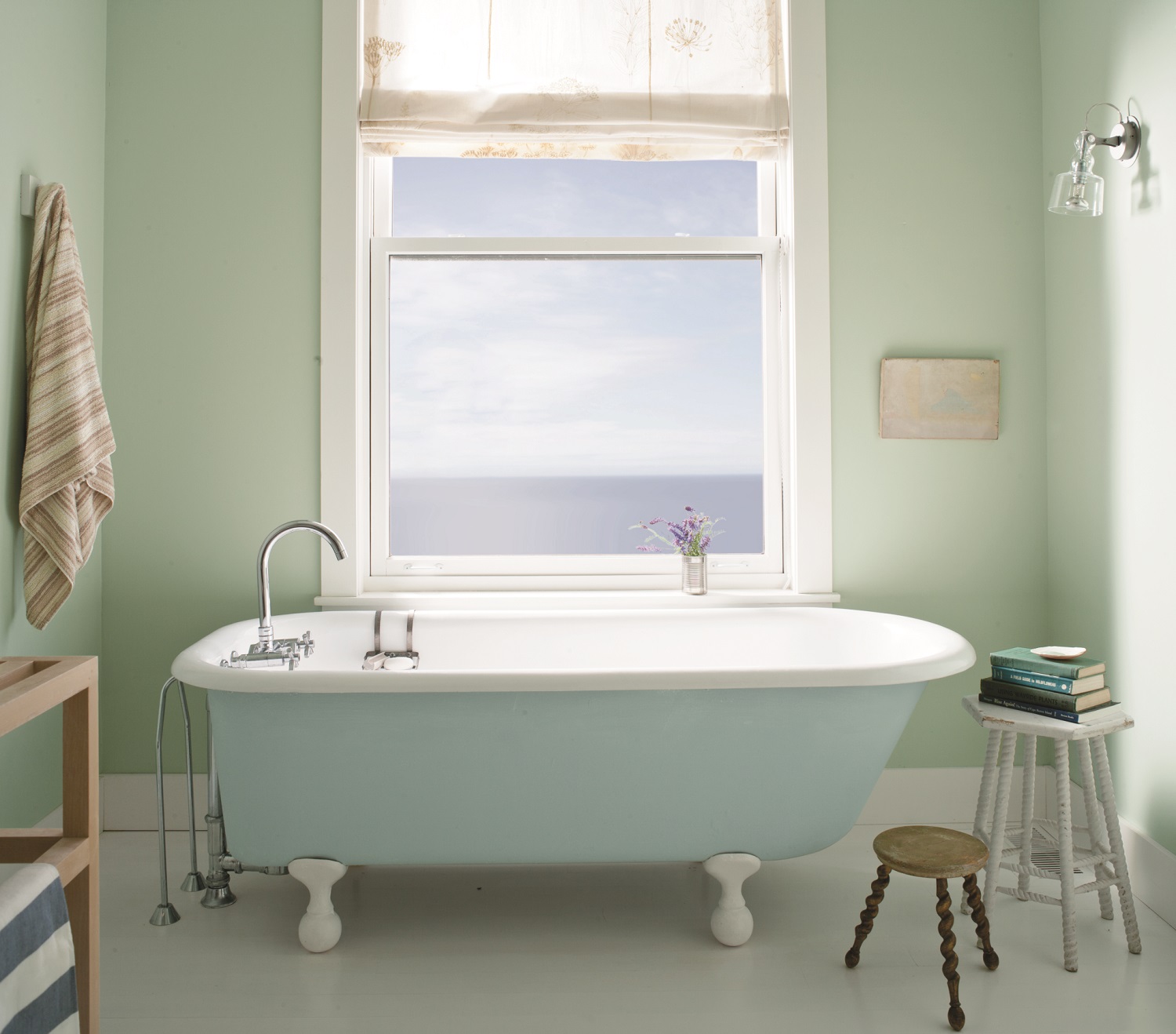
Serene colors in this bath are done with Benjamin Moore’s Aura Bath & Spa paint that withstands warm, humid environments. Walls: Palladian Blue (HC-144). Trim: Distant Gray (22124-70). Tub: Breath of Fresh Air (806).   Photo courtesy o…

Serene colors in this bath are done with Benjamin Moore’s Aura Bath & Spa paint that withstands warm, humid environments. Walls: Palladian Blue (HC-144). Trim: Distant Gray (22124-70). Tub: Breath of Fresh Air (806).   Photo courtesy of Benjamin Moore.

Don’t do this!

Go with the latest trends.

Pick your favorite color.

Select color like you pick out your clothes (grab what you like at the moment).

Pick color from a tiny swatch.

Paint without testing the color on the wall.

Pick a paint color before you have anything else in the room (there are exceptions to this).

Rush to make a decision.

Think only about the room that you are painting.

Select paint without coming up with a complete color palette for the room.

Do this!

Buy the best quality paint you can afford. It makes a difference. Trust me on this.

Go with the lowest VOC or no VOC.

Color challenged? Magazines, Pinterest and vision boards all help.

Process: Select swatches. Order large swatches. Test your final selections on the actual wall. Leave the test colors up for a few days and see how they change with lighting.

Selecting paint color is challenging for most homeowners. It’s important to test your final selections on the actual wall. Leave the test colors up for a few days and see how they change with lighting. Photo courtesy of Benjamin Moore.

Selecting paint color is challenging for most homeowners. It’s important to test your final selections on the actual wall. Leave the test colors up for a few days and see how they change with lighting. Photo courtesy of Benjamin Moore.

Consider the ceiling. I often tint the paint for the ceiling so that it’s not such a stark white. Just a little tint links the ceiling to the walls. And if you have coffered ceilings, take advantage of this element with color.

Sometimes less is more. A beautiful white on the walls with trim in a carefully selected neutral color is classic and timeless. Hint: Benjamin Moore’s “Simply White” was the 2016 color of the year. It’s a warm white that pairs well with neutrals.

Select furniture, fabric, flooring first. Then paint color. Then accessories.

ALL color has undertones. This is where the mistakes are made. If your sofa (or flooring or counter tops) has green/beige undertones and you pick a pinky beige paint color for walls, you will not be happy.

Think about the rest of your home. Color needs to coordinate throughout. A good rule that I follow: No more than three paint colors in the home.

Create a color palette and work from there. Consider your window treatments, upholstery, pillows, artwork and accessories. Color is not just the paint that you put on the walls. Think about the big picture.

What works: I like to select more neutrals for the main areas and incorporate ceiling and trim colors. Bathrooms and bedrooms lend themselves to accent colors.

Here’s a little trade secret

When redoing the color in a room, follow the 60-30-10 color rule. Many decorators use this rule and it works every time. The 60 percent should be your wall color. Furniture and fabric should be 30 percent. The remaining 10 percent should be your accessories, pillows and rugs. When you see a room or photograph in a magazine and it seems to work, chances are that this rule applies.

Where to use your favorite color?

Your sofa! I see far too many heavy brown leather sofas in Southwest Florida! Pick out your favorite color in the most gorgeous fabric you can find. Yellow. Jewel tones. A color that is not on your wall or floor.

Don’t be afraid of color

It changes everything. Including how you feel. And you want to feel happy in your home. If it’s a struggle, call a professional. The goal is to keep you from making mistakes and to help you bring out the best in your home!


Wrenda Goodwyn is a Southwest Florida interior decorator, A.S.I.D. associate and certified gold member of the Interior Redecorators Network. She has helped homeowners throughout Southwest Florida with timeless, affordable ways to create beautiful spaces and to solve decorating problems. Her article appears the first Saturday of each month. For more information visit her website at spectacularspaces.com. Call her at 949-1808 or e-mail wrenda@spectacularspaces.com. For more decorating tips, articles and photos, visit spectacularspaces.com/blog


Yellow: a burst of sunshine for your home

Yellow: a burst of sunshine for your home

Wrenda Goodwyn • special to the Fort Myers News-Press • June 3,  2017

If you’ve seen any of the award shows lately, you know that one color has popped up all over the red carpet: yellow. Muted. Cobalt. Sequined. Think about the gowns worn by Viola Davis and Natalie Portman. And there is Bella’s unforgettable gold/yellow ball gown in Beauty and the Beast.

And that means one thing: home interior colors follow fashion so here it comes into your home. For many, it never left.

Because I believe that current color follows what is happening in the world, it’s no surprise that yellow is popping up everywhere. A little yellow may be just what we need right now.

Read More

Benjamin Moore's "Color of the Year" casts a dramatic Shadow

As someone who lives, sleeps and breathes color, I have always believed that popular color trends somewhat reflect what is happening in the world around us.

When Benjamin Moore Benjamin Moore announced its Color of the Year 2017 – Shadow 2117-30, a rich, royal amethyst, I thought, this is it. A shadowy, brooding, deep color that speaks for itself.

Read More