Benjamin Moore's "Color of the Year" casts a dramatic Shadow

As someone who lives, sleeps and breathes color, I have always believed that popular color trends somewhat reflect what is happening in the world around us.

When Benjamin Moore Benjamin Moore announced its Color of the Year 2017 – Shadow 2117-30, a rich, royal amethyst, I thought, this is it. A shadowy, brooding, deep color that speaks for itself.

Read More

Mini makeover tips for a big change

Wrenda Goodwyn • special to the Fort Myers News-Press • February 6, 2016

Is your home feeling, well, a little boring?

It happens the first couple of months of every new year. The sparkle has all gone and here we are, back to the same old house.  And a few cloudy, rainy days that we have had lately are enough to make us spoiled Southwest Florida residents screaming for something to brighten things up a bit.

Your home needs, well, a new vibe. Some color. Some wow.

Claire Scarf print bedding from Pottery Barn makes a colorful splash in this bedroom along with Lara chandelier made of handblown glass on an iron frame. The Zimmer trunk is a nice accent piece with a mahogany frame accented with hand-hammered aluminum edging and leather handles. Photo: Pottery Barn.

Some of my favorite makeover tricks that I use for my clients might be exactly what you need to take it from the same old house to a happy, refreshed home. Here are a few changes that result in a big impact:

New color palette

Many of my clients are painting their interiors in whites and neutrals. So, reimagine a new color palette in your home. A splash here and there to give it a little wow factor. New sofa pillows in a springy color. And this is a great time to replace your master bedroom linens. Vibrant new comforter or duvet, sheets, rugs. It changes everything. Maybe even how you sleep!

Rearrange a room

Is a living room or a den bothering you? Take everything out of the room. Seriously. Give it a deep cleaning. Put everything back with a few changes. Declutter. Maybe you arrange the furniture so that the flow and conversation area works better. Add a green tree or plant in a forgotten corner and string some white, twinkly lights (you know you are missing these from the holidays).

Add some contrast

Pick a new color palette! Bold and beautiful patterns have been used to create bedding, pillows and more from Pottery Barn for this first collection of it's kind. Photo: Pottery Barn.

Pick a new color palette! Bold and beautiful patterns have been used to create bedding, pillows and more from Pottery Barn for this first collection of it's kind. Photo: Pottery Barn.

If wow is what you are looking for, this is my favorite, inexpensive trick. Paint the baseboards and trim a contrasting color. It will make your walls pop and it gives the room a completely new look.

Shed some light on your rooms

Evaluate lighting.  It's amazing but 80% of the homes I visit do not have enough light. Two lamps in each room. That's not enough!  Most rooms need six sources of light. This one is really easy. And while you are at it, increase the bulb strength.

Need some drama?

When was the last time you purchased new lamp shades? I thought so. And try something different. Like black. Seriously, they are beautiful. And dramatic.

Rotate your artwork

Instead of putting it all out at once and creating visual overload, rotate it seasonally. Think about different ways to rearrange it. For example, on a fireplace mantle, leanpieces against the wall instead of hanging.

Style a bookcase

Paint or wallpaper the back wall of the bookcase. Rearrange books in combination with pottery, favorite collectibles to add visual interest.

Just try one small makeover for your home and see what a difference it makes!   


And speaking of makeovers, it was time for me to practice what I tell my clients and do my own. As a Fort Myers interior designer, my mantra is to let  go of what no longer works to make space for something better and more beautiful.  It takes courage to embark on a makeover. We all want an amazing, blissful and beautiful space. It means that you have to be fearless. Whether designing a room in your home or a new website. And that's what I did. You be the judge. Visit spectacularspaces.com and tell me what you think of my site makeover.


Wrenda Goodwyn is a Southwest Florida interior decorator. Home Inspirations appears the first Saturday of each month. Visit her website at spectacularspaces.com. Call her at 949-1808 or e-mail wrenda@spectacularspaces.com. For more decorating tips and photos, visit spectacularspaces.com/blog


Simply white: How to get it right in your home

Wrenda Goodwyn • special to the Fort Myers News-Press • November 14, 2015

When Benjamin Moore recently announced its 2016 Color of the Year – Simply White OC-117, there was a lot of surprise among designers and homeowners. Many wondered why Benjamin Moore had selected a color that was lacking in color. Others love it for its versatile, crisp, cleanliness.

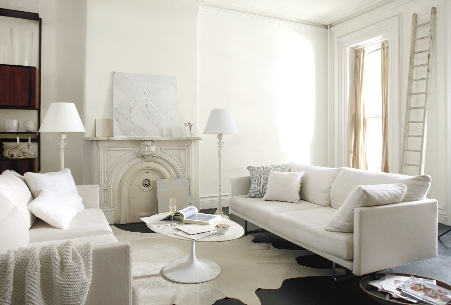
 All white family room walls are done in Simply White )C-117, matte finish. Trim is Simply White semi gloss. Photo: Benjamin Moore.

 All white family room walls are done in Simply White )C-117, matte finish. Trim is Simply White semi gloss. Photo: Benjamin Moore.

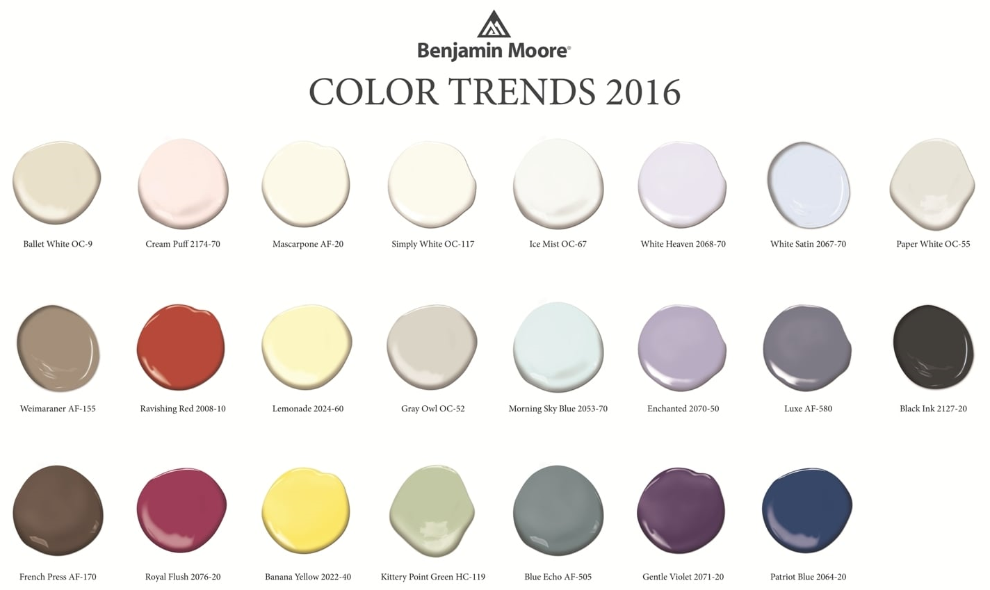
At the same time, the company also unveiled Color Trends 2016, a corresponding palette of 23 colors to illustrate how white works within the color spectrum. The selections include a variety of yummy hues like Lemonade, Patriot Blue, French Press, Creme Puff, Ravishing Redand Gentle Violet. And this is where white really shines.

Where do these trends come from?

The Benjamin Moore Color Studio forecasts color trends after a year of research attending major industry shows around the world, while also taking cues from standouts in architecture, fashion, textiles, home furnishings and the arts. White transcends style, and is seen in traditional, transitional and modern interiors.

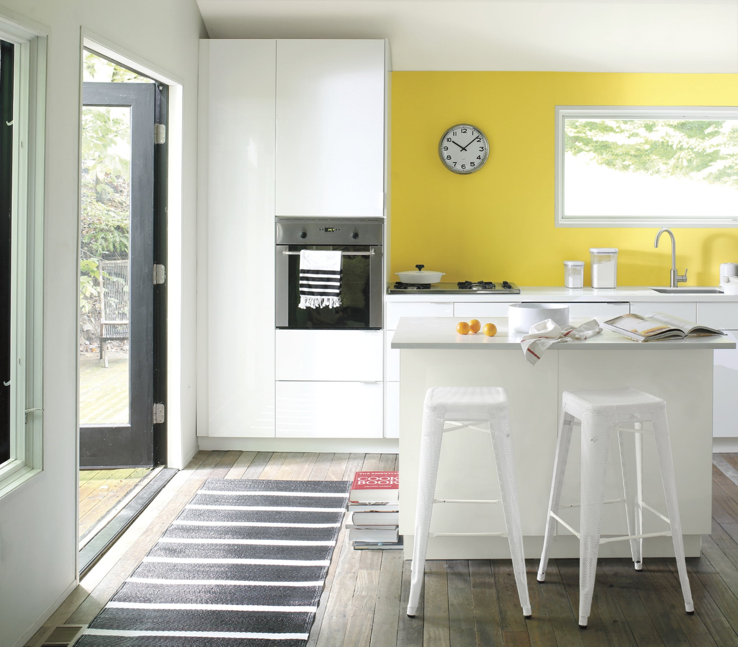
White with a pop of cheerful yellow. Accent wall in Banana Yellow 2022-40, eggshell finish.  Wall and ceiling in Paper White OC-55, eggshell finish. Ceiling in Waterborne Ceiling Paint, ultra-flat finish. Photo: Benjamin Moore.

White with a pop of cheerful yellow. Accent wall in Banana Yellow 2022-40, eggshell finish.  Wall and ceiling in Paper White OC-55, eggshell finish. Ceiling in Waterborne Ceiling Paint, ultra-flat finish. Photo: Benjamin Moore.

As a Fort Myers interior decorator who spends every waking moment thinking about color and creating color palettes for my clients, I can tell you two things about white:

·       It's not boring. That would be beige but not white. It's like an artist's canvas. Start with white and you can go anywhere without a commitment that will come back to haunt you. And there is no color that doesn't work with white. The right white.

Normal
0


false
false
false

EN-US
X-NONE
X-NONE


MicrosoftInternetExplorer4


 <w:LatentStyles DefLockedState="false" DefUnhideWhenUsed="true"
DefSemiHidden="true" DefQFormat="false" DefPriority="…

Create a beautiful color palette for your home using white and Benjamin Moore's Color Trends for 2016. Photo: Benjamin Moore.

·       Depending upon the room, the light, the furnishings, the artwork, white can be bit tricky to pull off.  Done well, it's spectacular. Done poorly, it leaves a lot to be desired. I like to start with white as a backdrop and build the room from there with lots of texture, accents and accessories.

My favorite white rooms

·       Master bathrooms. No color gives a master bath a cleaner, more spa-like feel that white. Combine it with white tile, towels, rugs, accessories and beautiful white sconces and you have a total makeover.

·       Kitchens. Dark flooring, white cabinets and countertops, stainless pendant lighting, white or stainless appliances. Perhaps a yellow or blue accent wall. Beautiful.

Try either of these options and you will have friends asking for the name of your interior decorator.

Add drama to a white room with a wall done in Mascarpone AF-20, eggshell finish. Entry is in Royal Flush 2076-20 in eggshell finish. Trim (semi gloss) and door (satin finish) in Ballet White OC-9. Photo: Benjamin Moore.

Add drama to a white room with a wall done in Mascarpone AF-20, eggshell finish. Entry is in Royal Flush 2076-20 in eggshell finish. Trim (semi gloss) and door (satin finish) in Ballet White OC-9. Photo: Benjamin Moore.

If you are thinking about a white room in your home

·       White can be very dramatic by itself or with accent walls or just the right furnishings.

·       White gives you a chance to start with a clean palette. To experiment with other colors, accent walls. All without the commitment of an expensive wallpaper.

·       Yes, white is a color.  There are 200 whites at Benjamin Moore. Five of the top ten selling paints in their collection are whites.

·       Beware of undertones. Yes, those pesky shades of green, pink, blue, gray...depending upon the color and the lighting. Get around making a mistake by painting a portion of a wall as a test and check it out as the light changes during the day. This is something that I tell my clients to do with any color but with white it's especially important.

·       White is forgiving. It can make flaws in your walls fade away where a bright color calls attention to every detail.

·       If white frightens you, start with white sofas, chairs. Then see if you want to go further. White can be in your accessories and furnishings. It does not have to be on your walls.

·       A white room requires lots of textures and accessories. My favorite: white walls, dark flooring, area rugs,  white comfy sofas, lots of colorful pillows, green plants, colorful art on walls,  white shutters. This is a room that if pulled together correctly, screams "come in and make yourself at home."

And that's what it's all about.

Wrenda Goodwyn is a Southwest Florida interior decorator. Her column, Home Inspirations appears the first Saturday of each month. Visit her website at spectacularspaces.com. Call her at 949-1808 or e-mail wrenda@spectacularspaces.com. For more decorating tips and photos, visit spectacularspaces.com/blog

Tips for creating a calm space in a not-so-calm world

Wrenda Goodwyn • special to the Fort Myers News-Press • August 29, 2015

It's all about how you feel when you walk in the door.

Does your home make you happy? Is it a calm retreat from the chaos and over stimulation of the outside world? Do you constantly feel overwhelmed by projects that you just can't quite complete? Are you tired and drained and not sure why?

We all want a nurturing home that offers a refuge. Not one that leaves you frustrated and exhausted.

Relaxing and pretty. Suzanne Kasler curated softly colored abstract art that pairs with her signature fabrics and finishes for Ballard Designs. Photo: Ballard Designs.

Relaxing and pretty. Suzanne Kasler curated softly colored abstract art that pairs with her signature fabrics and finishes for Ballard Designs. Photo: Ballard Designs.

As a Southwest Florida interior decorator, I have my clients fill out a brief questionnaire before I meet with them.  The first question: "How do you want your home to feel when you walk in the door?"

Tell me how you want your home to feel and I will make everything else fall into place.

Each answer is the same. Everyone wants a "calm" home. Of course we do.

It's not about "stuff."  You may have everything that you could dream of in your home and it still doesn't feel right. Check out these tips that I use for my clients and see how it changes your space.

Declutter.

We talk about this a lot in design and decorating but if you don’t do anything else, do this one. It costs nothing. And it has the most impact. Do it today!

Delete some of the visual stimulation. Pare down your accessories. Eliminate or rearrange some furniture and establish a comfortable conversation area that is relaxing.

And your closet. Most of us wear 10% of what is in our closets. So why not just have the 10% in your closet? Instead of the piles of clothes that you never wear any more. It’s all visual clutter and it’s exhausting to look at and to think about.

But sometimes the thought of decluttering itself is overwhelming. Just the physical aspect of getting rid of things and deciding what to do with them is difficult and stops homeowners in their tracks. Because it requires sorting it into what gets donated, given away and tossed. The solution: leave that part for another day. Remove it all from your house. Stash it in the garage until you have time to make the decisions.  Meanwhile, you will love your decluttered home so much that you won’t mind saying goodbye to the clutter when the day comes.

Don't over decorate.

The eyes need a place to rest. Don't cover every surface and every wall.  Don't be afraid of space. It is what most of our homes are lacking and it's the very thingthat creates a calm home.

Splurge in the bedroom.

Create a space to end your day with comfortable linens and fresh colors. Photo: Pottery Barn.

Create a space to end your day with comfortable linens and fresh colors. Photo: Pottery Barn.

Comfortable pillows. Nice sheets and comforter. A window treatment that blocks out the light. Pretty, restful artwork and accessories that make you feel good. We all spend a lot of time in this room and it's not the place to cut corners.

Transform with soothing colors.

Rethink your color palette and drop it down a notch. Soothing colors and more muted fabrics equal a calmer home. Save the bold colors for your family room and outdoor spaces. Of course this does not mean that a well-place splash of color against the most toned down backdrop is not gorgeous!

Design a spa bathroom for relaxation.

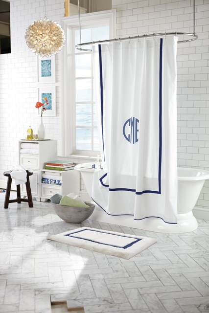
This is a service that I have done for my clients since I have been decorating homes. And it’s really easy. You can do it today. Think about what you love at a luxurious hotel or spa. Lots of white. Clean and crisp. Fluffy towels. Thick rugs. Plants.  Candles. Soaps and aromatherapy.  And don’t forget a spa robe. White is the key here and it must be done in a spotlessly clean bathroom. This should be your calming retreat at the end of the day.

For a spa look, try this Morgan shower curtain of soft cotton with a band of color, along with organic cotton towels. Photo: Pottery Barn.

For a spa look, try this Morgan shower curtain of soft cotton with a band of color, along with organic cotton towels. Photo: Pottery Barn.

Lighting.

Forget the harsh, overhead lighting and install dimmers on all lighting.

Remove the bad vibes.

We all have them. Something that you carry around from home to home. You don’t like it but you don’t feel like you can get rid of it. Give yourself permission. Keep what makes you happy and anything with a negative or tiring association, send it out into the world where someone else will find it useful. It may be art, a photo or a piece of furniture that no longer serves you. Remember: it’s your home and you are not obligated to keep anything.

Create a space for solitude.

Give yourself permission to have a nook or part of a room where you can relax. Just you. Maybe it’s space for a yoga mat or a lounge chair where you can read. Create a corner in your home where there are no electronics or noises. A place where you can think and start to wind down from the day.


Wrenda Goodwyn is a Southwest Florida interior decorator. Home Inspirations appears the first Saturday of each month. Visit her website at spectacularspaces.com. Call her at 949-1808 or e-mail wrenda@spectacularspaces.com. For more decorating tips and photos, visit spectacularspaces.com/blog
 

Make an entrance: doors that say "welcome home"

Wrenda Goodwyn • special to the Fort Myers News-Press• August 1, 2015

If you are looking for a summer pick-me-up for your home, you've come to the right place! The front door of your home.

This will change everything. It's one of my favorite decorating tricks that gives you a big change for little investment.  It will make you happy every time you walk in front door. It sets the tone for your home. It doesn't cost much. And you can do it today!

Benjamin Moore's Crete Countryside is a beautiful green tone for a front door. Photo: Benjamin Moore

It's simple. Pick out a gorgeous color and paint your front door.

Some doors just speak to you. A bright bold color in a high gloss finish. Perhaps with shutters. A wreath on the door. It just screams "welcome everyone."

Think about it.  It's the first thing people see and the last one on many homeowners' to do list. The  color of the front door offers a teasing glimpse into your home. It gives you a chance to do something bold, fun and playful. As a Fort Myers interior decorator who spends a lot of time helping clients with color palettes, I always encourage homeowners to start at the front door.

Take a step back and think about  the style of the door, along with the trim and siding that frame it.  But don't over think it! This is the one place where you really can't make a mistake and it should be fun.

It's a chance to use a color that you may be a little tentative about putting on your walls or in fabric for your sofa. But you love the color so try it on the  door. Front doors should be an accent color. A dramatic, bold shade.  And it can be a color that is not repeated anywhere else in your home although this is not a rule!

So now is good time to think about your favorite front door colors. And make a statement.

Pick a bold, fun color for your front door. One that you love but might not use inside your home.

You may love a deep dark purple but it's just too much for your living room. But not for your front door. My front door is currently a bright, bold turquoise that would be too much for my interior walls. But as a front door color, it is pure happiness and makes me smile when I pull into the driveway.

Benjamin Moore's wildberry in high gloss. Photo: Benjamin Moore.

Benjamin Moore's wildberry in high gloss. Photo: Benjamin Moore.

Some of my favorite front door colors: red, indigo, orange, black, green, yellow, dark gray, blue. Done in high gloss so it pops!

A front door color makes an immediate impact, complementing the style of the home and improving curb appeal. Your home is a good guide for what works and what doesn't when it comes to choosing front door colors. Take into account the materials, colors inherent in those materials, style, and surrounding landscape.

And to really make it fun: carry the color around to the interior side of the door! Be brave!

The color you choose for your door says a lot about you. All for the investment of a can of paint. And the best news of all: if you don't love it, you can easily change it tomorrow!


Wrenda Goodwyn is a Southwest Florida interior decorator. Home Inspirations appears the first Saturday of each month. Visit her website at spectacularspaces.com. Call her at 949-1808 or e-mail wrenda@spectacularspaces.com. For more decorating tips and photos, visit spectacularspaces.com/blog. And to see a selection of her favorite color palettes, go to www.pinterest.com/ wrendagoodwyn

Color your home with happiness

Wrenda Goodwyn • special to the Fort Myers News-Press• June 6, 2015

Color is the first thing we notice about a home. Does your color make you happy every time you walk in the door? Photo: Benjamin Moore.

Color is pretty much my life.

I live with a fan deck in my hand and I constantly pull it out wherever I go to match colors, to plan a color palette or just because I see a color or a fabric that I want for a client.

As a Fort Myers interior decorator, I do more color consultations than any other design service.  And there is one big reason for that: Color is the most difficult challenge for most homeowners. Get it right and the results are pure joy. Get it wrong and you will always feel like something is off in your home. And it is. Really off. If the color is not right, nothing else matters. Trust me on this.

Color is the first thing we notice about a home. Does your color make you happy every time you walk in the door?

Having the right color palette in your home is the difference between a happy home and one that says "hope you can live with me."

So many colors! How do you select the right ones? Photo: Benjamin Moore.

And it's not easy. It can be daunting. Color just plain stumps most people. So, if you are one of those people, and most of you are, I have a few tips to consider when selecting color.  Follow these tips and you will be ready to take the plunge. Or not. You may also be ready to call in a professional who can help you sort it all out and remove the stress.  After all, color creates a happy home and process should be fun.

Here we go with my favorite "don'ts."

  • Don’t ask a painter or a paint store to help you select color. They sell paint. Not color. They are not decorators or designers. They are painters who put paint on the wall  or paint sellers. Simply put, they know how to paint a house and can tell you the best kind of paint to use but they just don't know how to select color.
  • Don’t select a color from one of those itsy bitsy fan deck samples or tiny swatches. You must (and this is non-negotiable) test the color by painting a large area or a foam core board.
  • Don't just throw the paint on the wall and make a decision. I insist  that my clients "live" with the test color for a few days. Light changes throughout the day and is different in each room and that must be taken into consideration.

Now for some do's.

&nbsp;Color palette from the Benjamin Moore Williamsburg Collection.

 Color palette from the Benjamin Moore Williamsburg Collection.

  • Make a plan for the room (or house) before you look at color. You have to start somewhere when designing an empty room and that should not be with the paint color. Select furnishings,  fabric, counter tops and other finishesand even a few accessories and THEN look at color. I have clients who call and ask me to have an entire new home painted by next week before they select furniture. You may love that pretty coral paint but what happens when you fall in love with a sofa that doesn't relate to the color? Answer: you have to repaint. We want to avoid that costly mistake!  If you want coral, accessories may be the best way to go.
  • Forget this rule. It's just not true. I don't know who started it but painting small spaces a dark color does NOT make the room look smaller. My favorite: powder rooms done in dark hues.
  • It's fun to break decorating rules but this is one I never stray from: when selecting a color palette,  follow nature as your guide. Mother Nature has perfected the color palette soimitate her. This is a rule I always follow. If it's not a color found in nature, forget it.
  • Stick with two or three (at the most colors for your home. The result: Beautiful and restful. You can add more color with accessories.  Don't try to put all of your color on the walls. Tip: the right pillows will change any room!
  • Connect your rooms.  Don't make each room a completely different color. You want to have a plan so the house makes sense. An idea my clients seem to like: paint all of the main rooms (living room, entry, kitchen) a neutral shade. Use color in the bathrooms, bedrooms and den. I also like to paint the master bedroom and bath in coordinated shades to give it a hotel/master suite feeling.
  • One current trend that I love and encourage my clients to try: No more white ceilings! Check out the decorating magazines.  We are now using color on the ceilings or a cream shade. No more super white.
  • My latest color crush: Boca Raton Blue by Benjamin Moore. I can't think of a room that shouldn't have a little of this color. At least paint a front door (on both sides) or an entry ceiling.
  • Consider undertones. All color is not created equal. Look at the number of whites that you can select from on a fan deck. The reason a color works or does not work: undertones.
  • When in doubt, go neutral. This never fails. Neutral walls with stronger hues in fabric and accessories.  And if you really have doubts and don't know where to start, call a professional. They will help you nail it.

Wrenda Goodwyn is a Southwest Florida interior decorator. Home Inspirations appears the first Saturday of each month. Visit her website at spectacularspaces.com. Call her at 949-1808 or e-mail wrenda@spectacularspaces.com. For more decorating tips and photos, visit spectacularspaces.com/blog. And to see a selection of her favorite color palettes, go to www.pinterest.com/wrendagoodwyn