Eliminate color confusion! Tips for getting it right
/Wrenda Goodwyn • special to the Fort Myers News-Press • June 2, 2018
So many choices! A few tips will keep you from making mistakes and will help select just the right color to create a beautiful interior. Photo courtesy of Benjamin Moore.
It makes us feel happy. It changes everything including how we feel about our space. Get it right and you will love your home. Mess it up and you will always wonder why it’s not feeling quite right.
Color.
It’s far from easy. It’s complicated. It’s not necessarily about your favorite color. It’s why home interior professionals study it for years and most are like me and don’t leave the house without a fan deck in their hand. We are passionate about color.
As a Fort Myers interior decorator, my most requested service is selecting color and creating personalized color palettes for the home. It’s the most difficult part of decorating for most people and there are good reasons. The number one reason being the approach. It’s usually all wrong and results in mistakes and frustration.
Most people rush out to a big box store, grab a hundred color swatches (all in their favorite colors), take them home, hold the one-inch color swatch up to their existing paint color, make a decision, call the painter and it all begins. And then wonder why it doesn’t look just right.
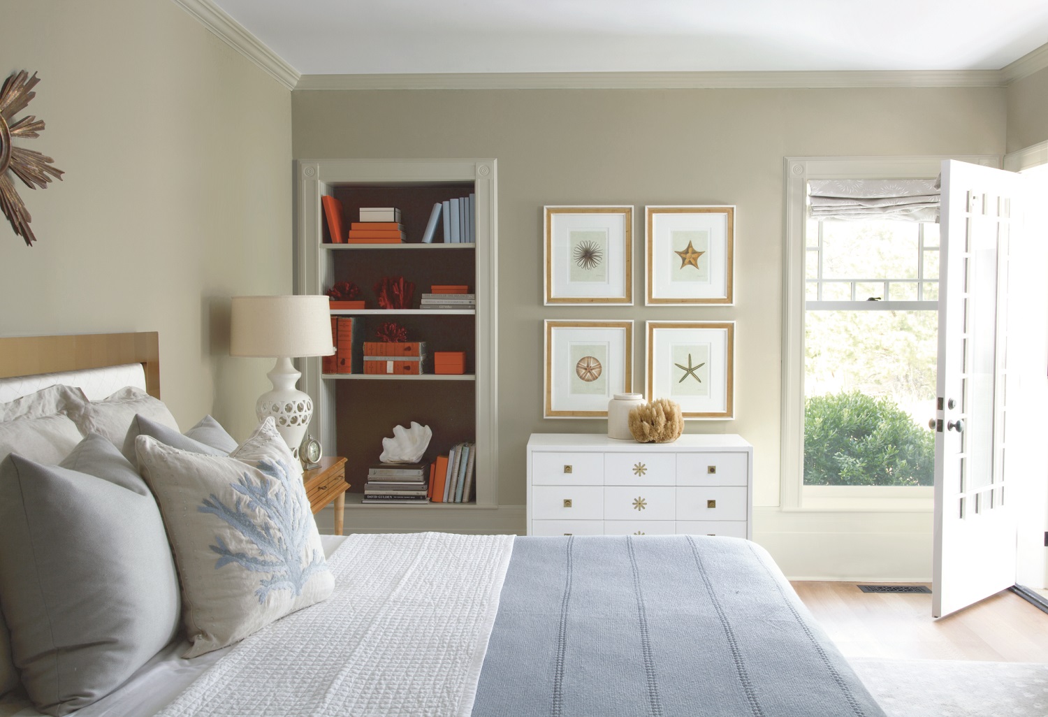
Neutrals and beiges are popular in Southwest Florida and can be paired with accent colors in accessories. Wall: Pashima (AF-100). Trim: Winds Breath (OC-24). Bookcase back wall: Silhouette (AF-655).Ceiling: White Heron (OC-57). Photo courtesy of Benjamin Moore.
Here’s the good news
As we head into summer in Southwest Florida, things have quieted down a bit. All of the company is gone and it’s a great time to think about giving your home a little refresh. If you’re on a decorating budget (who isn’t?) and can only do one thing to you home, this is it. Color.
Books about color fill the shelves. I just have space in this article for some key tips to set you off on the right path.
Selecting the right color
Updates your home without spending a fortune.
Pulls the space together.
Makes your home look clean and fresh.
Creates a look for your home.
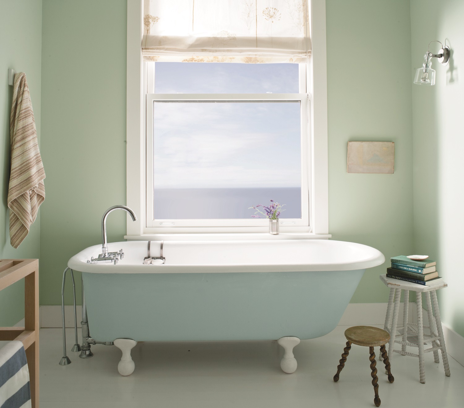
Serene colors in this bath are done with Benjamin Moore’s Aura Bath & Spa paint that withstands warm, humid environments. Walls: Palladian Blue (HC-144). Trim: Distant Gray (22124-70). Tub: Breath of Fresh Air (806). Photo courtesy of Benjamin Moore.
Don’t do this!
Go with the latest trends.
Pick your favorite color.
Select color like you pick out your clothes (grab what you like at the moment).
Pick color from a tiny swatch.
Paint without testing the color on the wall.
Pick a paint color before you have anything else in the room (there are exceptions to this).
Rush to make a decision.
Think only about the room that you are painting.
Select paint without coming up with a complete color palette for the room.
Do this!
Buy the best quality paint you can afford. It makes a difference. Trust me on this.
Go with the lowest VOC or no VOC.
Color challenged? Magazines, Pinterest and vision boards all help.
Process: Select swatches. Order large swatches. Test your final selections on the actual wall. Leave the test colors up for a few days and see how they change with lighting.
Selecting paint color is challenging for most homeowners. It’s important to test your final selections on the actual wall. Leave the test colors up for a few days and see how they change with lighting. Photo courtesy of Benjamin Moore.
Consider the ceiling. I often tint the paint for the ceiling so that it’s not such a stark white. Just a little tint links the ceiling to the walls. And if you have coffered ceilings, take advantage of this element with color.
Sometimes less is more. A beautiful white on the walls with trim in a carefully selected neutral color is classic and timeless. Hint: Benjamin Moore’s “Simply White” was the 2016 color of the year. It’s a warm white that pairs well with neutrals.
Select furniture, fabric, flooring first. Then paint color. Then accessories.
ALL color has undertones. This is where the mistakes are made. If your sofa (or flooring or counter tops) has green/beige undertones and you pick a pinky beige paint color for walls, you will not be happy.
Think about the rest of your home. Color needs to coordinate throughout. A good rule that I follow: No more than three paint colors in the home.
Create a color palette and work from there. Consider your window treatments, upholstery, pillows, artwork and accessories. Color is not just the paint that you put on the walls. Think about the big picture.
What works: I like to select more neutrals for the main areas and incorporate ceiling and trim colors. Bathrooms and bedrooms lend themselves to accent colors.
Here’s a little trade secret
When redoing the color in a room, follow the 60-30-10 color rule. Many decorators use this rule and it works every time. The 60 percent should be your wall color. Furniture and fabric should be 30 percent. The remaining 10 percent should be your accessories, pillows and rugs. When you see a room or photograph in a magazine and it seems to work, chances are that this rule applies.
Where to use your favorite color?
Your sofa! I see far too many heavy brown leather sofas in Southwest Florida! Pick out your favorite color in the most gorgeous fabric you can find. Yellow. Jewel tones. A color that is not on your wall or floor.
Don’t be afraid of color
It changes everything. Including how you feel. And you want to feel happy in your home. If it’s a struggle, call a professional. The goal is to keep you from making mistakes and to help you bring out the best in your home!
Wrenda Goodwyn is a Southwest Florida interior decorator, A.S.I.D. associate and certified gold member of the Interior Redecorators Network. She has helped homeowners throughout Southwest Florida with timeless, affordable ways to create beautiful spaces and to solve decorating problems. Her article appears the first Saturday of each month. For more information visit her website at spectacularspaces.com. Call her at 949-1808 or e-mail wrenda@spectacularspaces.com. For more decorating tips, articles and photos, visit spectacularspaces.com/blog


