Color Me Pink: a splash of happiness
/Wrenda Goodwyn • special to the Fort Myers News-Press • May 6, 2017
It’s everywhere: Pink. The color.
Fashion designer Lilly Pulitzer said that “Anything is possible with sunshine and a little pink.”
We are tickled pink. In the pink. Pretty in pink. And there is pink champagne.
And it’s no wonder we are seeing so much of it in home decor. It’s a happy, light-hearted color. It makes us feel good.
As a Southwest Florida interior decorator, my take on it is very simple: Can’t we all use a little splash of color happiness about now?
With pink, you have choices. Go bold. Or not.
There are other reasons to use pink. Everyone looks good in a pink glow. Think: closet. Pink blush walls and a sparkly chandelier. Remember Carrie in Sex in the City?
And pink goes with so many colors that it almost becomes a neutral.
It takes a bit of creativity to pull it off. But the result can be oh so chic.
Pink drapes become the focal point of this beige and crème palette. Photo courtesy of Ballard Designs.
Want to test pink? Try these gorgeous ideas:
Accent pillows. These are beautiful on a white sofa.
Artwork. Just a splash of pink.
Pink in a vase. Who can resist peonies? Just thinking about them makes me happy.
Stacked bubbles make this Tilda Bubble Lamp from Pb Teen, a playful accent on a bedside table or dresser. Featuring hand blown glass and a linen shade, paired with flowers and artwork, it will brighten your space with a relaxing and whimsical glow. Photo courtesy of Pottery Barn.
Suzanne Kasler’s Peony linen fabric is available by the yard from Ballard Designs. Pair it with pink throw, flowers and books against a white or neutral background. Photo courtesy of Ballard Designs.
Accessories. Light fixtures, accent rugs, dishes, trays, table cloth, napkins, pink chandelier, mirror frame.
Pink drapes. This brings instant life to a room with a neutral palette. They become the focal point of the room.
Add a little more pink:
Pink upholstered chair or sofa. If you just want to add a pink accent, try pink piping on a white sofa.
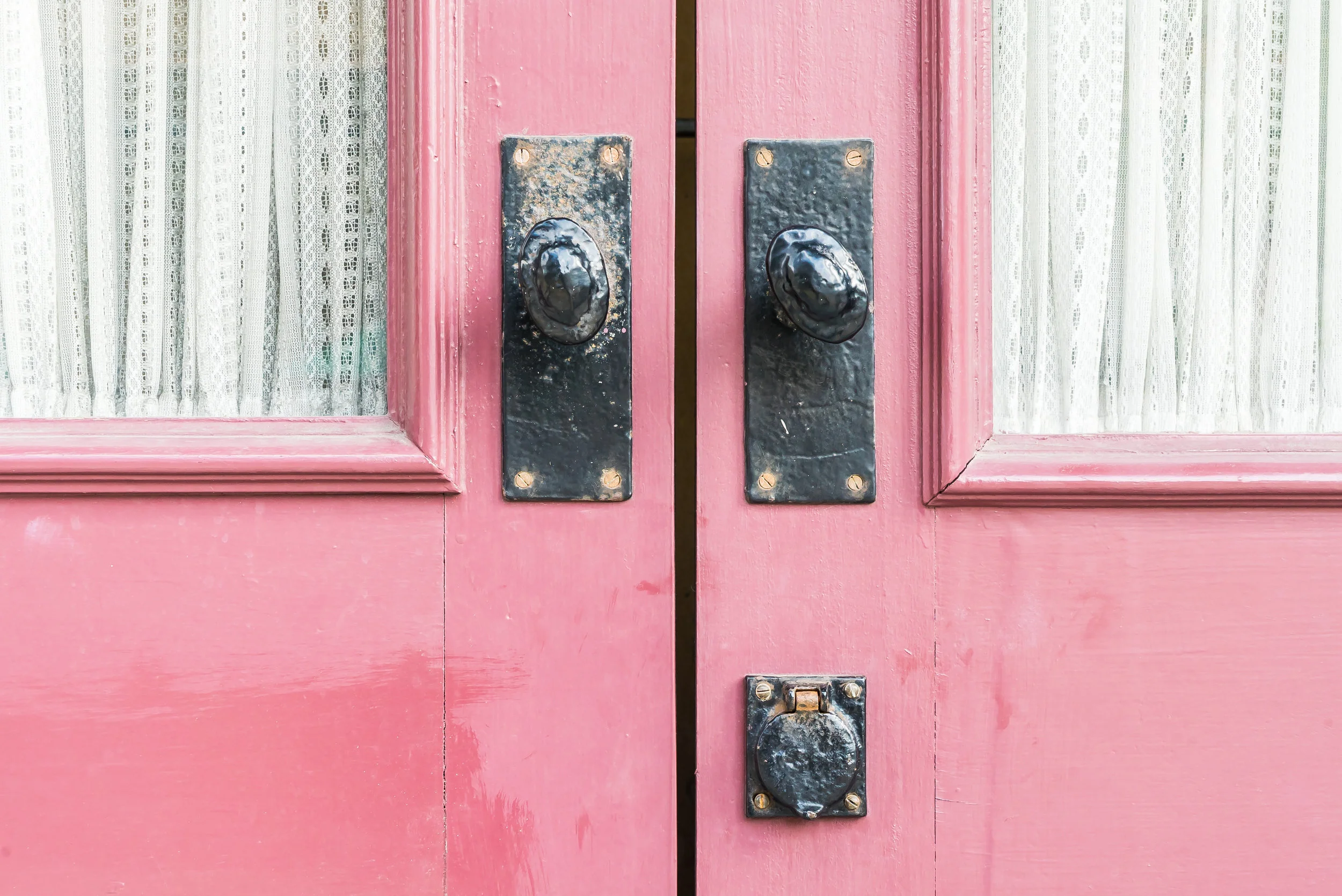
Paint the front door. Go bold or a soft blush.
Accent walls. In a hallway or a bedroom. A wallcovering on one wall and pick up the pink accent color in a muted pink on the other walls.
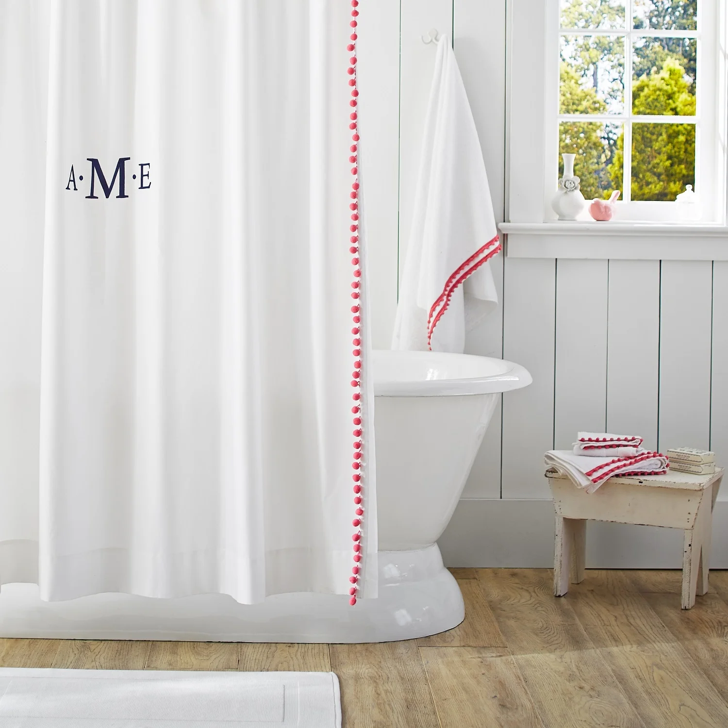
Shower curtain. White with pink pom pom fringe.
pom-poms line the edge of this sheer panel to provide a bath with a pop of playful color. From Pb Teen. Photo courtesy of Pottery Barn.
Powder room. Go for it. Paint the entire room and fill it with silver fixtures. Huge mirror and capiz light hanging from the ceiling. Your guests will love it. And so will you.
What shade of pink? There are so many.
And this is really the key, depending upon where you want to use it. Some of my favorite yummy pinks from Benjamin Moore (you can look them up at www.Benjaminmoore.com):
Sugarcane-soft and delicate.
Bashful-muted and a beigey neutral.
Peony framed print from Pottery Barn.
Strawberry-n-cream-gray undertone makes it almost neutral.
Pink Hibiscus-pairs well with greens.
Pink Flamingo-coral pink. Think powder room. Yummy.
Add a splash of pink to your color palette. Color happiness. And there is always pink champagne!
Lupen Grainne print from Pottery Barn.
Wrenda Goodwyn is a Southwest Florida interior decorator, A.S.I.D. associate and certified gold member of the Interior Redecorators Network. She has helped homeowners throughout Southwest Florida with timeless, affordable ways to create beautiful spaces and to solve decorating problems. Her article appears the first Saturday of each month. For more information visit her website at spectacularspaces.com. Call her at 949-1808 or e-mail wrenda@spectacularspaces.com. For more decorating tips, articles and photos, visit spectacularspaces.com/blog


