It's complicated: selecting the right white
/Wrenda Goodwyn • special to the Fort Myers News-Press • August 4, 2018
White. It’s everywhere.
All of the design magazines style the most beautiful white rooms and make them all look perfectly gorgeous.
Crisp white walls, dark hardwood flooring. Perfect lighting in the room. Subtle pops of color. Bold artwork on the walls that make it look like a museum gallery. Stunning.
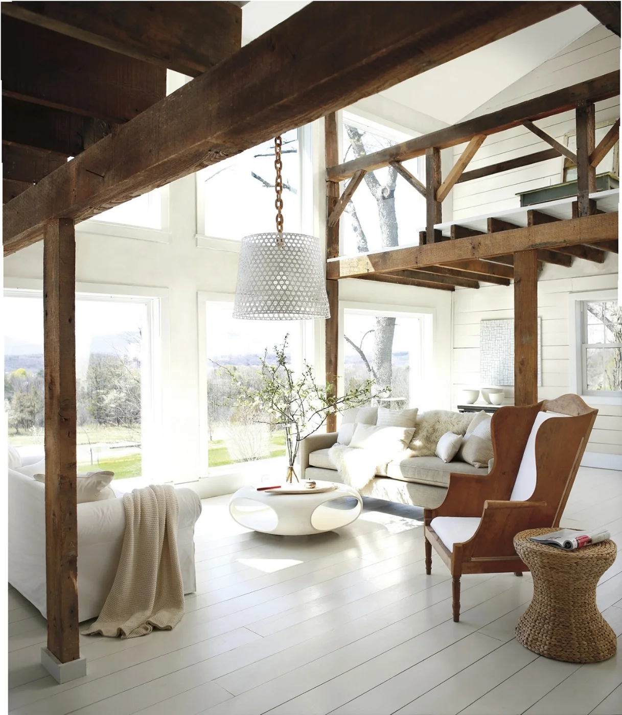
Light floods this room and Benjamin Moore’s Simply White OC-117 (aura interior paint-matte) is the perfect white with warm textures. Floor is Ice Mist OC-67 (advance interior paint-satin). Photo courtesy of Benjamin Moore.
And then we have photos of white kitchens with pure white cabinets and island that coordinate with white marble or quartz countertops. Light beaming through the room. These are the rooms that homeowners dream about.
And then reality enters the room when we try to make white walls work.
It’s a little bit of a trick. As a Fort Myers interior decorator, I can tell you from doing hundreds of color consultations, white is the most complicated color (yes, white is a color) to make work and there are some good reasons for this. Done well, it's spectacular. Done poorly, it leaves a lot to be desired. My favorite way to work with white is to start with white as a backdrop and build the room from there with lots of texture, accents and accessories.
The good news:
· White is popular right now with the trending coastal style that so many homeowners are incorporating into homes. It can be very dramatic by itself or with accent walls or just the right furnishings.
· White serves as a backdrop (think museum walls) instead of a color that takes over the entire room. It’s a clean palette that offers plenty of room to incorporate a color palette.
· White makes a kitchen clean and classic. Especially with quartz or marble counters.
· It’s a great backdrop for an industrial look: stainless appliances and pendants.
Wood and rattan warms up a white shiplap wall along with Grandin Road’s “colored birds on a wire” wall art and colorful “watercolor” rug. Photo courtesy of Grandin Road.
Don’t make these mistakes:
· White is an all or nothing color. It requires commitment! If you paint just one room in your home white it will look like you put primer on the walls and forgot to paint the real color.
· White highlights everything that you don’t like in a room. Shabby furniture, worn carpets. Flaws on the walls. They are all magnified. Think about it before you try it.
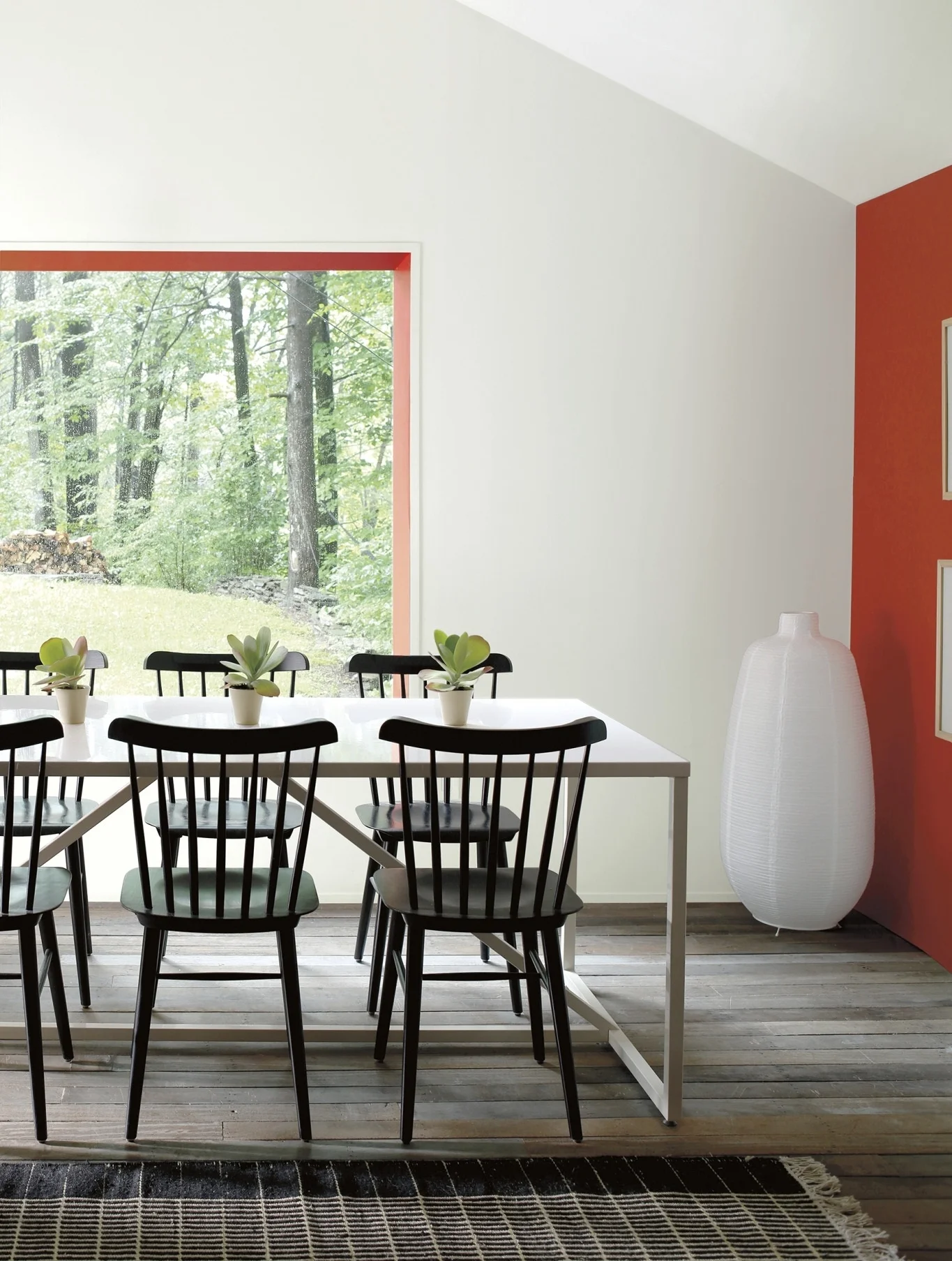
Be bold! Make a statement in a white room with Benjamin Moore Paper White OC-55 (aura bath & spa) in matte and accented in Ravishing Red 2008-10. Photo courtesy of Benjamin Moore.
· All whites are not created equal. Beware of undertones. Yes, those pesky shades of green, pink, blue, gray...depending upon the color and the lighting. Get around making a mistake by painting a portion of a wall as a test and check it out as the light changes during the day. This will help avoid a stark or dingy tone.
There are 200 whites at Benjamin Moore. Five of the top ten selling paints in their collection are whites. In 2016 Benjamin Moore named Simply White OC-117, the Color of the Year. It’s an important part of design.
Tips for a white room:
· If the lighting is not great in your home, don’t try white. Most of the magazine photos are done with rooms that have floor to ceiling windows or huge glass walls.
· Use textures and accessories. My favorite: white walls, dark flooring, area rugs, white comfy sofas, lots of colorful pillows, green plants, colorful art on walls, white shutters.
· Try white shiplap on an accent wall to get the same effect without a whole room commitment.
· Start with a white master bathroom. No color gives a master bath a cleaner, more spa-like feel than white. Combine it with white tile, towels, rugs, accessories and beautiful capiz sconces.
And if you want to go” light” but maybe not quite “white”…try Benjamin Moore’s Silver Satin 856. It’s my go-to neutral color. A touch of silver-grey with a slight shimmer. Perfect with blue sea glass accents.
Wrenda Goodwyn is a Southwest Florida interior decorator, A.S.I.D. associate and certified gold member of the Interior Redecorators Network. She has helped homeowners throughout Southwest Florida with timeless, affordable ways to create beautiful spaces and to solve decorating problems. Her article appears the first Saturday of each month. For more information visit her website at spectacularspaces.com. Call her at 949-1808 or e-mail wrenda@spectacularspaces.com. For more decorating tips, articles and photos, visit spectacularspaces.com/blog


